This week Glassnode presented its subscribers with a very thorough review, in which they tried to highlightboth the micro and macro structure of the market, combining into a coherent picture many ideas about what phase of the current bull cycle we are in.We will try to present this data in such a wayin a way to help you navigate the still unexplored territories of the cryptocurrency market for price determination and to walk through this minefield, if possible, without loss.
We will start with a summary of the observationsmade by Glassnode analysts over the past couple of weeks, consider the current phase of consolidation, and then try to analyze the dynamics of the market in terms of its structure, which is increasingly important for understanding and navigating it.
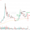
Well, let's start with the most recent rally to new all-time highs, which seems to be driven primarily by retail demand.
This assumption is based on the analysis of trends in logins to existing and registration of new accounts on the largest exchanges.
What becomes clear here is that ifjudged by the number of logins [users to existing accounts], the first two large capital inflows appeared to be behind the big whales and institutional investors; the third wave of price growth was mainly caused by retail demand. This is supported by 5 times more new registrations on Binance compared to Coinbase.

Login page views (by exchanges, left scale) and BTC price (right scale)

Number of views on the registration page (by exchanges, left scale) and BTC price (right scale)
In addition, when comparing the two largest exchanges(Coinbase and Binance) it is clear that the amount of bitcoins held on Binance has grown by 38% since March 2020, and that growth accelerated significantly in early 2021.
As the total supply of Bitcoin across all exchanges has dropped by over 800K BTC, the relative importance of spot exposure on Binance has increased overall.
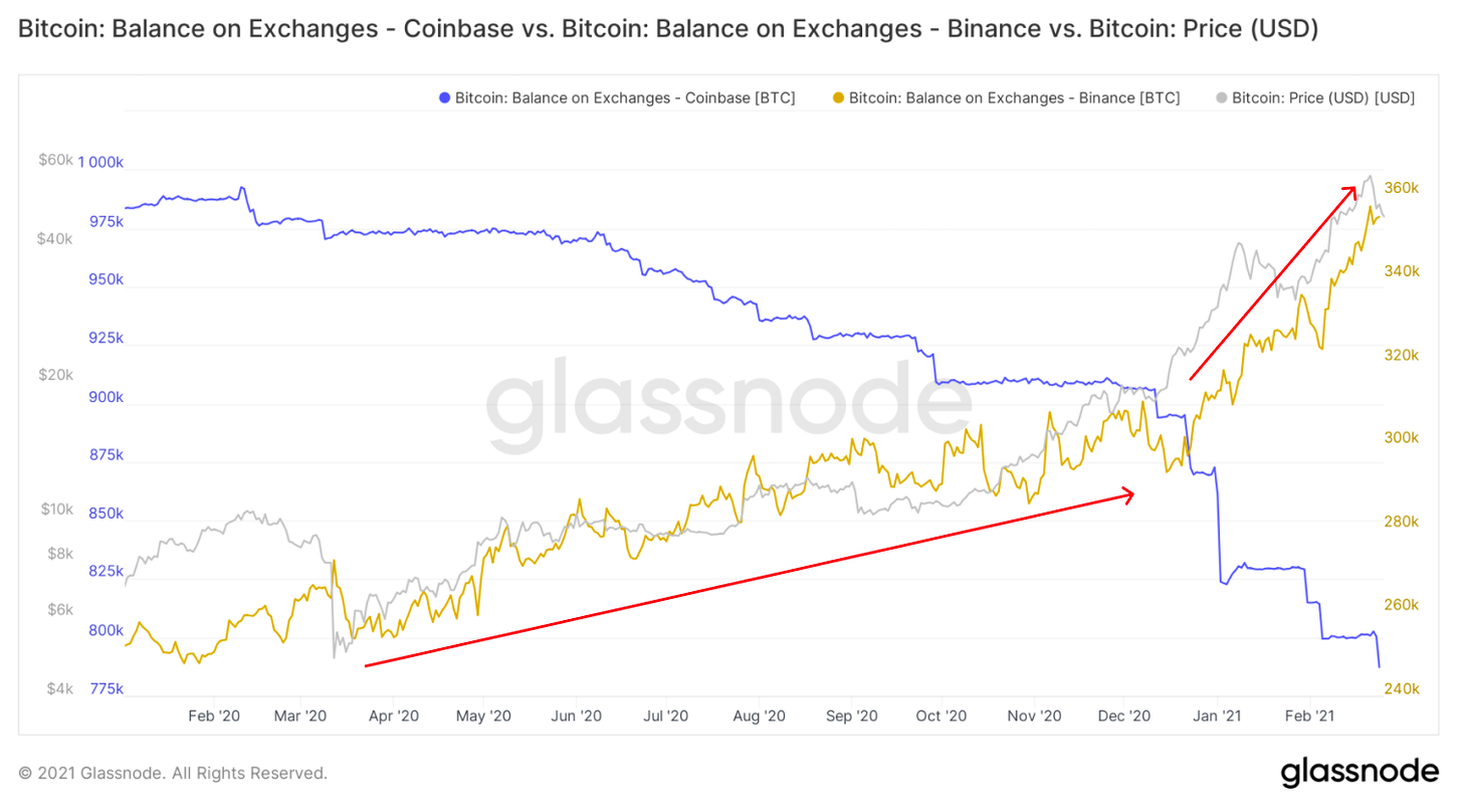
Bitcoin balance on exchange accounts - Coinbase (blue graph), Binance (yellow) - and BTC / USD price (gray)
On the other hand, the institutional demand forBTC spot buying seems to have slowed down as its price rises. Grayscale has reduced the rate of accumulation of bitcoins, and their premium to the BTC market rate this week briefly dipped to negative values.

BTC managed by Grayscale (blue chart), Grayscale premium to BTC price (green) and BTC / USD price (gray)
OTC market volumes in 2021 have also leveled off from sharp spikes in early and mid-2020.

Despite the decline in spot demand, the general interest from institutional investors has not disappeared - it has only shifted towards derivatives and leveraged trading.
This, together with the increase in retail volumes,led to two spikes in early 2021, when the ratio of derivatives trading volume to spot volume reached almost 1.2, meaning that derivatives trading volume exceeded the volume of spot transactions.

BTC futures to spot trading volume ratio (7d MA) (purple chart)
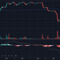
And due to the rapid growth in leverage in such a short period of time, the market has retraced sharply several times to liquidate short-term over-leveraged positions.

Liquidation of longs in BTC futures - total volume on all exchanges (24h MA, orange chart) - and BTC / USD price (gray chart)
In general, starting from mid-December, the mainthe driver of price rallies appears to be retail demand, while institutional capital buys out price corrections, creating new support levels on the way up.

Today, short-term consolidationlooks like a really healthy phenomenon, increasing the chances of reaching higher levels soon. New purchases have a higher base price and against the background of general FOMO no one is going to sell at a loss.
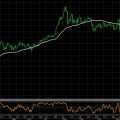
Over the past week, tactical indicators such as SOPR and funding rates have had the opportunity to cool off somewhat and slow down, creating room for the next wave of growth.

aSOPR (pink chart), perpetual swap funding rate (all exchanges, blue chart) and BTC / USD price (gray chart)
It is interesting to note that the gap in CME futures has also been zeroing during the last consolidations - another sign of a likely continuation of the trend.

Gap CME
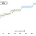
Expectations for the next couple of months seem to be quite high, as the time spread increasingly turns into contango, and investor confidence in the further rise in price is strengthening.

Time Spread CME (1w MA)
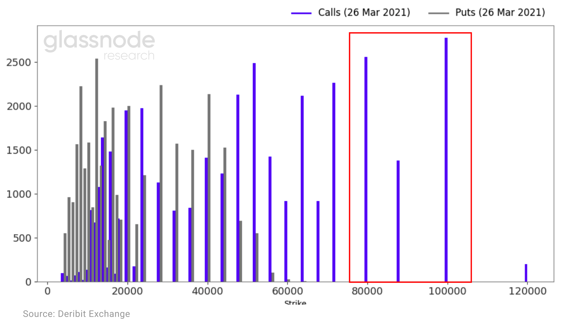
This growth expectation is further highlighted by open interest in options. As of February 24, there were 6 thousand call options on the market with strike prices in the range of $80-100 thousand.
This sets the stage for another wave of BTC price rallies in the coming weeks, as the spot price rally could begin to accelerate due to the gamma squeeze, similar to what we saw in December 2020.
Moving on to the analysis of the market structure, you canNote that the Liquid Supply Change graph, one of Glassnode's most powerful metrics, shows that despite the price increase, Bitcoin's supply continues to decline.
Never before has this happened for such a long time and, as many have already mentioned, soon it can lead to a strong and sharp reduction in supply.
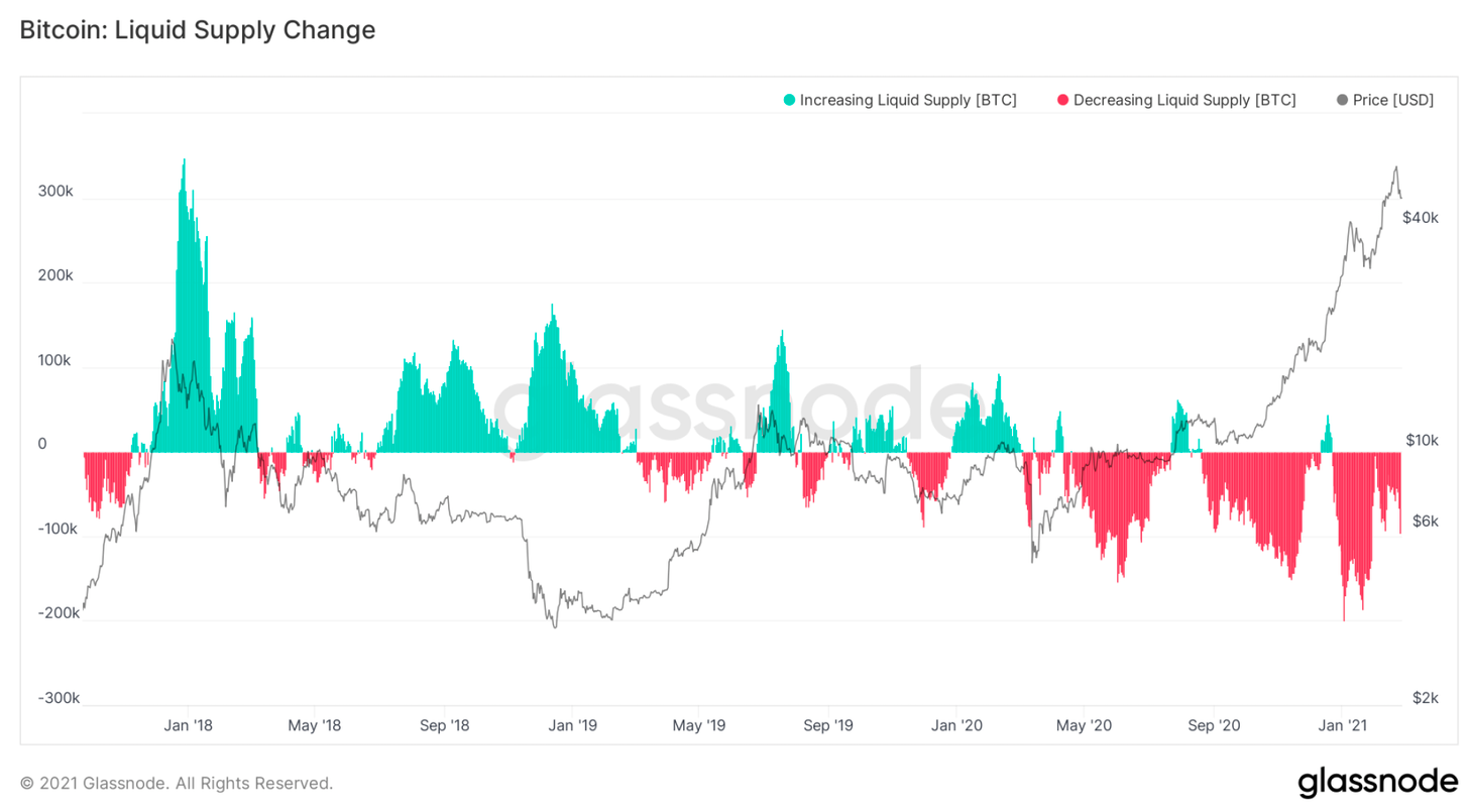
Change in BTC liquid supply (green - increase, red - decrease) and BTC / USD price (gray chart)
The current pullback seems to inspire long-terminvestors are less worried than before, from $42k to $29k, as they are not trimming positions or taking profits as aggressively as they were in January.

Long-term BTC holders seem to become increasingly convinced that this is not the top yet, and are starting to correlate this 30% retracement with previous bullish cycles.

Price corrections from all-time highs (red area) and BTC / USD price (gray chart)
At this point in the cycle, supply begins to gradually shift from the hands of long-term investors to short-term investors.
However, this time also short-term investorsfundamentally different from those during the 2017 bull rally. Institutional investors who accumulate strategic positions over the long term are unlikely to flood the market with supply at later stages this year. So to some extent, new short-term holders are also long-term ones.
For all those who wonder who canto buy so many bitcoins at these prices, it's important to understand how these large firms operate under the hood and how they approach risk management. Counterintuitively, for many of them, Bitcoin at $40K is a more attractive investment than the unproven success of Bitcoin at $8K.
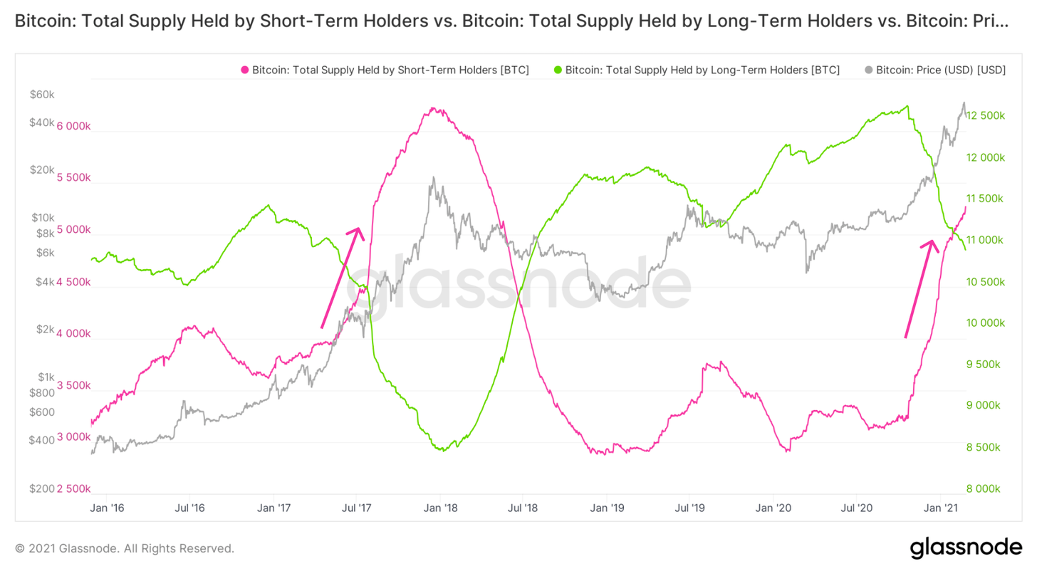
BTC supply held by short-term holders (red chart), long-term holders (green) and BTC/USD price (gray)
Now some very big guys come in.On Wednesday this week, another mutual fund (Stoneridge) filed with the SEC to invest in bitcoin via futures and investment pool put options.

And we come to, perhaps, the most interesting. So, at a macro-structural level, where are we at?
It is not hard to understand that a significant reductionsupply with an increase in demand leads to an increase in prices. Since March 2020, the price of BTC has increased 10 times - an unprecedented move that pushed Bitcoin's capitalization towards the trillion dollar mark. From the point of view of the S2F model, this price increase appears to be somewhat premature. Structurally, it seems to be more reminiscent of the 2013 rally than 2017.
The current price movements are not as extreme as in2013, however, is significantly faster than 2017. At the current pace, we are 1–2 weeks ahead of schedule if we consider only the S2F model, which indicates that the effect of the supply deficit and the effect of demand is rather underestimated.

Who and what is causing this rise?To understand this, we need to look at the "age" of the coins being moved on-chain. More specifically, we need to look at how short-term held (24 hours to 6 months) on-chain bitcoins behave differently from longer held coins (1 to 5 years).
As you can see from the RC-HODL Waves indicator(HODL waves, weighted by the selling price), major market tops are determined mainly by short-term holders of bitcoins. At the macro level, when Bitcoins 1 month old or less start to account for more than 60% of realized capitalization, this indicates that we are approaching a major top of the cycle.

Realized Cap HODL Waves - HODL waves weighted by the selling price
If you look closely at bitcoins thatmoved for the last time in a month or less, you can see that by the middle and the end of the main macrocycle, we tended to see three separate tops on this chart. Each time they are slightly different, but each time there are three of them.

To understand the significance of each peak, you needalso take into account the impact that older coins have on the realized capitalization. What seems clear is that towards the end of the cycle, when most of the price-influencing on-chain activity comes from short-term Bitcoin moves, all coins older than 6 months make up a total of 6% or less of the total realized capitalization.
This indicates the achievement of structuralextremum and, like an elastic band stretched to the limit, this situation cannot be stable for a long time without the necessary correction. We are now at the 20% level, which means there is still room for the uptrend to continue until we see strong structural resistance.

How do we know that we have reached the main top, and not just a pause before the next upward movement?
To answer this question, you need to doa small digression on the topic of opportunity cost mechanics. It is important to understand how the network as a whole perceives current price levels. In other words, when more coin-days are destroyed than are created, market participants begin to think that the opportunity cost, or the risk of holding coins until tomorrow, becomes too high, which means they are ready to sell them today at the current price. This concept is encapsulated in the Reserve Risk metric, which presents this opportunity cost ratio visually to the market as a whole.
According to historical records, whenever thisthe indicator exceeded 0.02, this signaled that the instability region had been reached. Assuming the potential formation of two tops, as discussed above, we are now in the middle of a bullish cycle compared to 2017 and one-third of the way from 2013.

BTC reserve risk (orange area) and BTC / USD price (gray chart)
To determine the difference between local and global peaks, one must turn to market psychology. Namely, you need to understand how human greed and fear govern the behavior of market participants.
This concept is well encapsulated in the metricaSOPR (Adjusted SOPR). In a bull market, most participants will not sell the asset below their buy price (indicated by line 1) as they expect the price to rise in the future. Only when fear of losses appears, market participants begin to neglect expectations about the future and even short-term losses and flee. Only then will we really end this cycle and, probably, the value of the metric aSOPR at this moment will approach 1.3-1.4 - historically this has been the case for all bullish cycles in Bitcoin.

So which of the previous bullish cycles is more reminiscent of the current one - 2013 or 2017?
I believe that at a structural level, the current loop isIs a cross between them, and that in the next 12 months characteristics of both previous cycles may be observed. What is clear is that many technical and structural indicators point to at least one more step up before we begin to approach the margins of the first half of this 2020/2021 bull cycle. We plan to continue to monitor these metrics closely as Bitcoin and the crypto market continue to move through uncharted territories. Until next time!
The article does not contain investment recommendations,all the opinions expressed express exclusively the personal opinions of the author and the respondents. Any activity related to investing and trading in the markets carries risks. Make your own decisions responsibly and independently.
</p>
Read this:
 Bitcoin Market Structure Analysis
 Growth of the crypto market volume – one of the reasons for the correction in gold, analysis of the dynamics of the crypto market volume
 Bitcoin Futures Market Analysis Indicates BTC Growth By Summer 2020
 The Effective Market Hypothesis and the Bitcoin Stock-to-Flow Model
 Bitcoin price has fallen below $ 6,000. Market capitalization dropped to $ 150 billion
 The price of bitcoin fell below $ 8,000. Market capitalization decreased by 10%