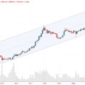
…okay. The candle is not particularly bullish or bearish - a "spinning top" or a "doji" - whatever you call it. This formcandles indicate some market indecision. The price on the weekly chart is still above the 50 MA and the descending support line.
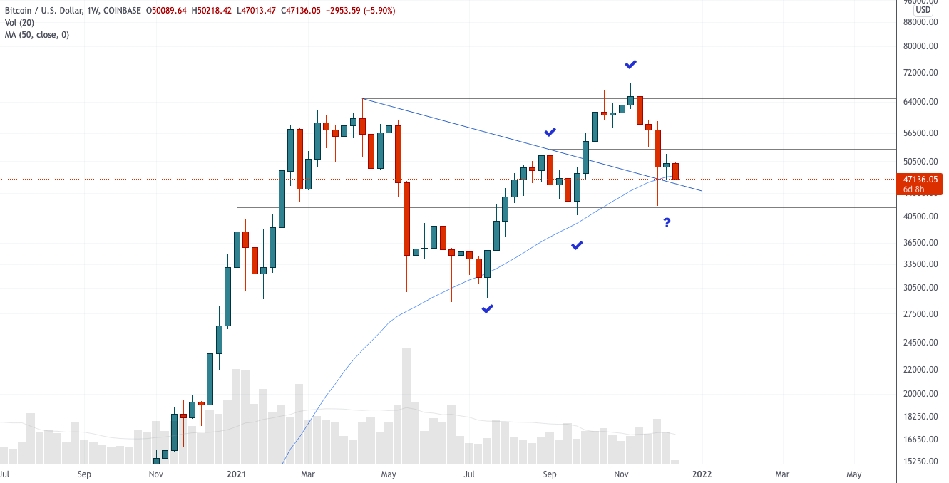
Chart executed in TradingView
It takes another week for clarity.
As I said in previous posts, trading in a range for a while after such a drop is quite expected. What we are seeing so far.
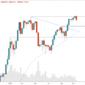
Daily chart

Chart executed in TradingView
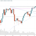
There's not much to see here yet.Still looks like a bearish consolidation after a significant decline, with trading volume declining and price moving sideways. I added a descending confirmed resistance line on the chart with three price touches. You can use it as a signal that the market is ready for a reversal. We are not yet close to breaking through it. The 200 MA is holding as support for now, with a much larger historical support area between $39k and $42k.
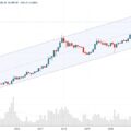
12 hour chart
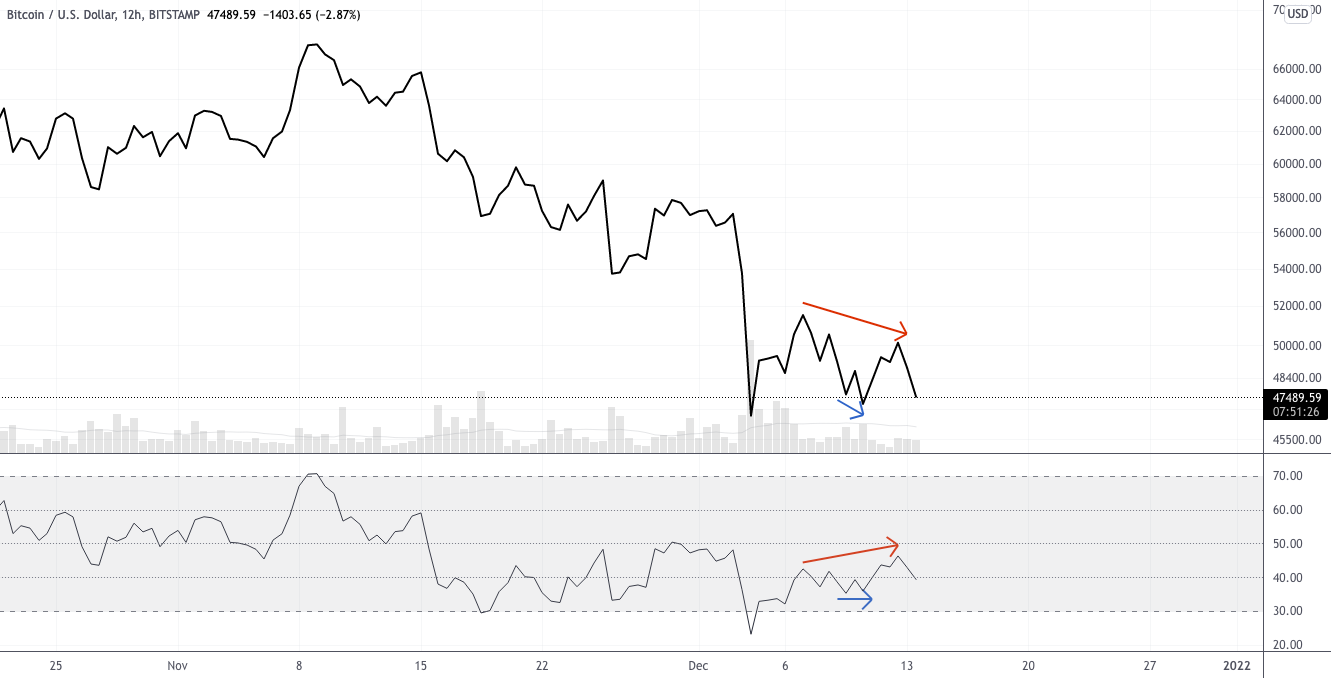
Chart executed in TradingView
On the 12 hour chart I want to show you thatviewed on many timeframes. A couple of days ago, a small local bullish divergence could be observed, which sent the price briefly to $50 thousand. As you can see, now we have rather a hidden bearish divergence, observed from the daily decline. This indicates the presence of bearish momentum and the likelihood of continued decline.
Nothing fancy, just don't let it catch you off guard if it happens.
Right now I don't see any particular reason tooptimism until the price has recovered above $53k and no reason to be seriously pessimistic about the long-term outlook as long as the market is trading above $42k.
Dominance Index

Chart executed in TradingView
Although technical analysis of the dominance graph is not worth ittaken too seriously, it can still give us some insight into what's going on with the altcoin market as a whole. There are no buyers or sellers here to directly create supply and demand, so any inferences based on perceived support and resistance levels should be treated with caution.
For those who like to analyze this graphaccording to TA principles, it is clear that the dominance index bounced off the strong support area (blue rectangle) again. This is a result of the weakness of altcoins relative to bitcoin. The chart suggests that in the short term, the index may rise slightly after finding support, which means that altcoins may continue to decline. The worst-case scenario is a rise in dominance when the price of bitcoin falls, so let's hope this is not the case.
I look at altcoins with great caution and do not find the situation favorable for buying yet.
DXY (US Dollar Index)

Chart executed in TradingView
The dollar still looks strong it canmean bad news for assets that are inversely correlated with it. However, stocks are also knocking on the door of new all-time highs, making this correlation seem weaker in the moment than in the past.
Successful flip of resistance is clearly visible on the chartto support and now the index, having consolidated, has formed a small bullish flag, which is considered in the TA as a figure with a higher probability of continued growth. A strong dollar can exert very significant downward pressure on other assets, so it makes sense to take this factor into account.
Remember that the dollar can be weak, and its relative index may rise. The index tracks strength against a basket of other currencies, not an abstraction.
BitNews disclaim responsibility for anyinvestment recommendations that may be contained in this article. All the opinions expressed express exclusively the personal opinions of the author and the respondents. Any actions related to investments and trading on crypto markets involve the risk of losing the invested funds. Based on the data provided, you make investment decisions in a balanced, responsible manner and at your own risk.
Read this:
 Absurdly bullish ETH / BTC chart - technical analysis from December 3, 2021
 Key levels in the current correction - technical analysis of December 10, 2021
 Uncertainty after an episode of liquidity crisis - technical analysis from December 6, 2021
 Correction, but so far nothing extraordinary - technical analysis from November 16, 2021
 October did not disappoint. What can you expect now? - technical analysis from November 1, 2021
 Growth continues - technical analysis from November 8, 2021