Analyst Will Clemente breaks down the current Bitcoin market using on-chain metrics, isolating the signalfrom the noise.
Hope you have a good week.Despite price fluctuations, little has changed in terms of the on-chain market structure since last week. Basically, we are seeing a continuation of the trends in investor behavior, which I talked about in the previous review. Well, let's move on to analyzing on-chain metrics.
Here are some of the main takeaways from this week:
- the advantage in favor of buying by long-term holders compared to selling by short-term holders this week was ₿21,136;
- miners sell, network hash rate decreases;
- W-shaped recovery of the influx of new users into the Bitcoin network;
- the arrival of new "whales" into the network is still not observed;
- stablecoins are gradually flowing back into the bitcoin market;
- BTC supply continues to flow into the hands of network entities with little sales history (illiquid entities);
- capital flows to OTC brokerage addresses look bullish, while exchange-traded addresses look rather slightly bearish (up to ~₿10k this week).
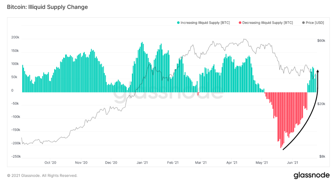
Accumulation by “strong hands” and experiencedmarket participants continues. Willy Woo's Illiquid Supply Change metric, also known as the Rick Astley Indicator, continues to continue the trend of strong accumulation by entities that statistically demonstrate a very low probability of selling coins. For several weeks now, we have been seeing a reversal in this metric from the drawdown that occurred during the initial price drop that brought us into the current $30-40K range. Last week, this indicator spent only 3 days in the green zone, and these were not large bars, However, this week we have received strong confirmation of the positive trend, with 7 fairly large green daily bars in a row and a 30-day supply flow from liquid to illiquid, reaching ₿95,800 on Monday.
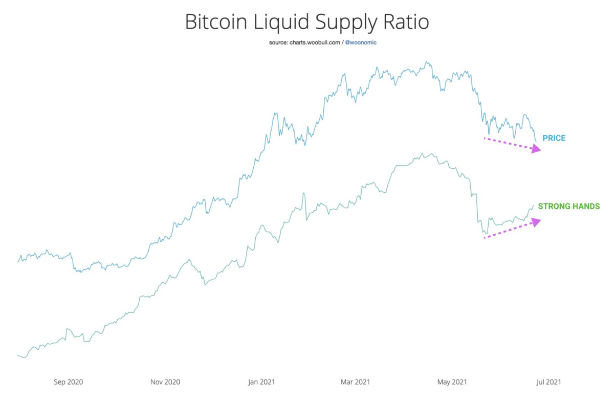
As a variation of this metric, I suggestedWillie Wu's idea of a ratio based on a simple ratio of liquid and illiquid supply. This ratio is very similar to the above metric, describing essentially the same thing, but representing the trend line of this simple ratio. Willy Woo prepared a chart of this ratio for me and noticed something interesting: a clear bullish divergence with price (this is when the oscillator makes a larger low, while the price makes a smaller low). The last time such a clear divergence was observed was during the recovery after the correction at the end of January this year. This confirms the idea of re-accumulation, which is not the first time I have expressed it. To put it simply, as the price decreases, the tendency to buy with “strong hands” increases.
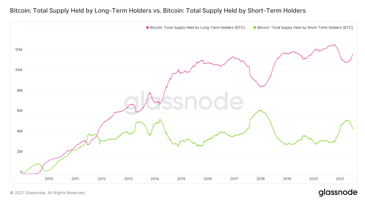
By the way, yes, sales still come from the mainway from younger network actors. Again, I've written about this before, but all indications are that the age of coins traded on-chain is trending downward. This week, long-term holders' (LTH) purchases have significantly outpaced short-term holders' (STH) sales by ₿21,136.
Last week LTH was added to itssavings of ₿120,739, while STH reduced their holdings by ₿97,333. It is worth noting, however, that some of these STH entities simply moved into the cohort of long-term owners due to the “maturation” of the coins they held (the threshold value between these groups is traditionally 155 days). This divergence between them in the chart below can be interpreted differently depending on your view of the market structure based on other factors; it resembles both what happened at the end of a bull market and what happened in the middle of both previous bull markets. You can see massive divergence between the two pumps in 2013, as well as a more moderate but still noticeable divergence in late 2016. This means that experienced users in those cases were setting the stage for a continuation of the bullish rally. And I suspect that's what's happening now, with other on-chain metrics not signaling that Bitcoin is in a bear market.
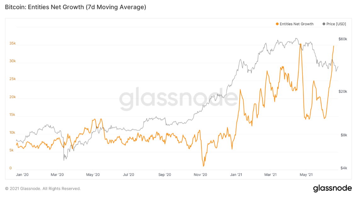
Although the number of new whales (subjects with balancemore than ₿1000) is still not increasing, the decisive factor for the continuation of the bullish trend, in my opinion, may be that the total number of new network subjects shows a very distinct W-shaped recovery. I would be very curious to know what proportion of these new users are in Latin America. Be that as it may, this surge is unlike what happened at the end of any of the previous bullish cycles.
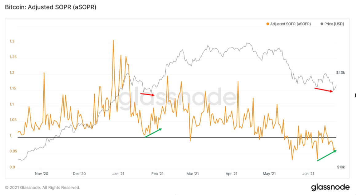
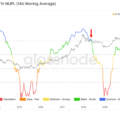
Next in line is SOPR - a metric to whichwe apply, probably, every week, and taking into account the profit received from the sale of on-chain coins on each specific day. Similar to the Supply Ratio, the SOPR chart shows a clear bullish divergence towards the BTC price. In my understanding, this suggests that any strong surrender that should have occurred has already occurred, and the tendency to panic behavior and the willingness to sell at a loss dissipate. This is the clearest bullish divergence seen in this indicator since late January. It is worth noting that even then it coincided with the bullish divergence in the liquid supply ratio.
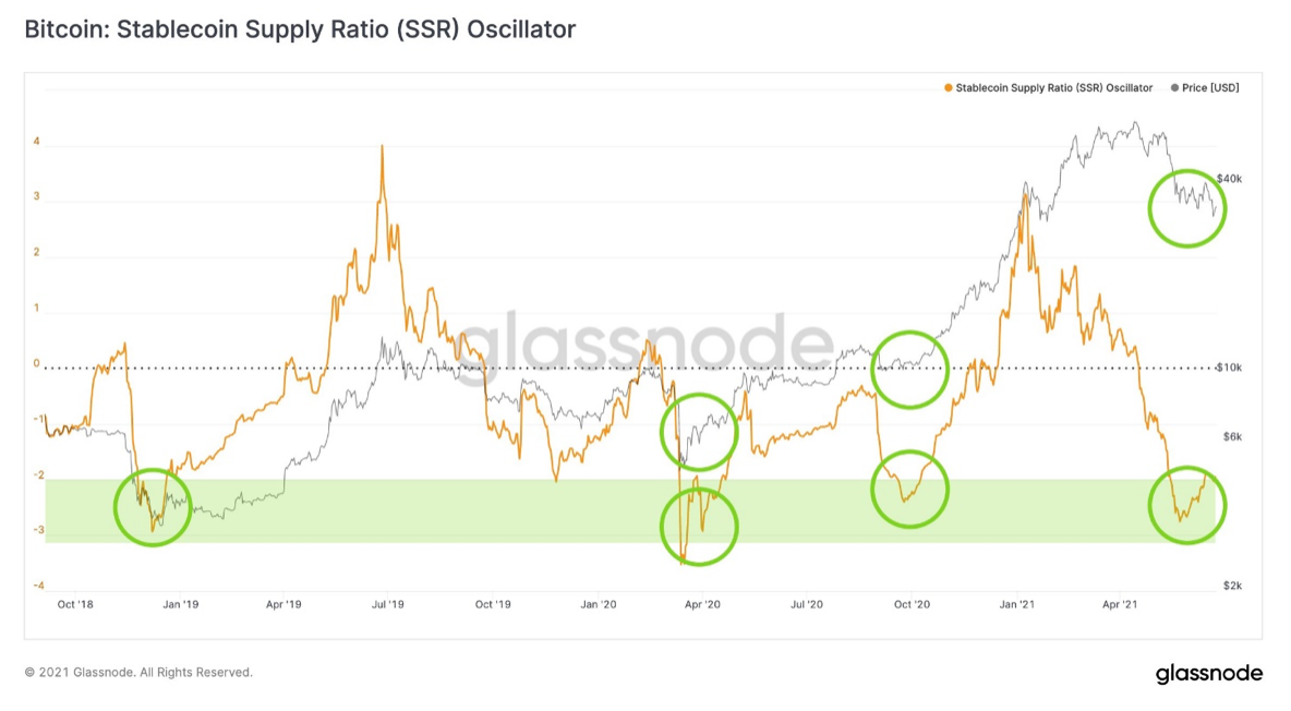
Now a new metric from Glassnode:Stablecoin Supply Ratio (SSR) oscillator. It shows that capital in the form of stablecoins is slowly returning to the market and re-investing. This chart shows that in terms of stablecoin flows, the current recovery resembles previous major corrections, such as in late 2018, March 2020, or the comparatively large drawdown in September 2020.
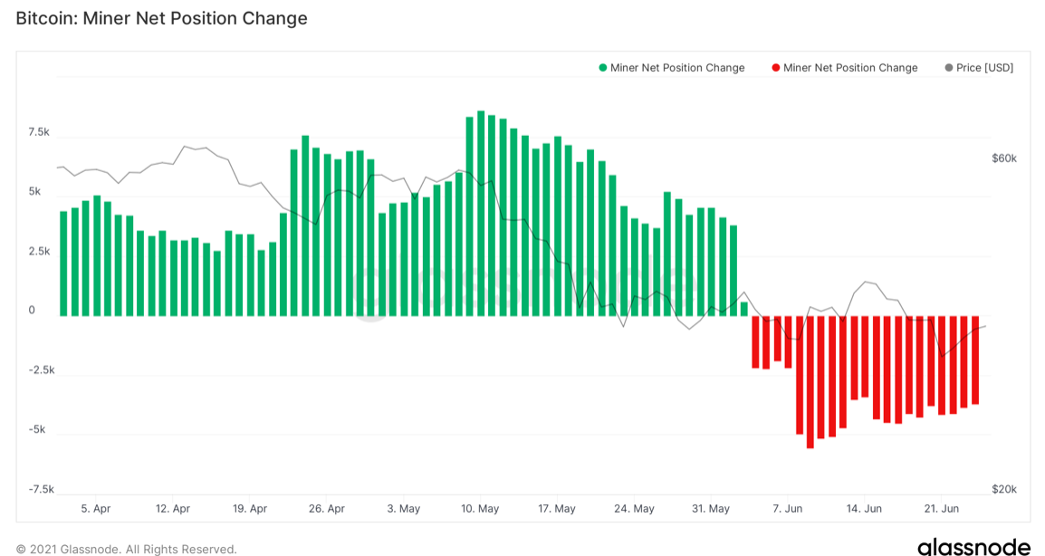
Tough measures against miners in China are real andthe consequences can be traced, including on-chain metrics. Firstly, a significant drop in the network hash rate is quite obvious. But in terms of selling pressure, miners are cutting their reserves somewhat. This is evidenced by Miner Net Position Change, a metric of the change in the net position of miners. However, this selling pressure does not appear to be very significant. Overall, according to Glassnode's "miner balance" metric, miners have reduced their savings by ₿5125 since the end of May.
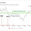
Finally, I would like to share another newmetric, this time mine. It is called OTC Desk Outflow Stoch RSI Signal (yes, you have to come up with something shorter) and shows how strong the trend of capital outflow from OTC broker addresses is. Here, of course, we are talking about tracking the behavior of "big money" - wealthy private and institutional players who use the services of over-the-counter brokers. This capital, of course, drives the market, so tracking these flows can provide a valuable signal about market structure.
RSI going out of the purple rangeis a signal to buy or sell. When the RSI value is below the designated range (no capital outflow from OTC brokers), this is a sell signal. Conversely, an RSI value above the range is a buy signal (a large outflow of funds from OTC broker addresses). Over the past year, these signals have been accurate more than 90% of the time. We have just received a buy signal, which means an increase in capital outflow from the addresses of OTC brokers (big capital buys on a decline). Note that I mentioned earlier that there are no new whales, so this shows that the "big business" behind these purchases is not new entrants, but rather old market entrants.

I hope you find this review helpful and look forward to the next release. Great weekend to everyone!
The article does not contain investment recommendations,all the opinions expressed express exclusively the personal opinions of the author and the respondents. Any activity related to investing and trading in the markets carries risks. Make your own decisions responsibly and independently.
</p>
Read this:
 Approaching Pain Threshold: On-Chain Pulse | June 1, 2021
 Onchain Pulse | May 11, 2021
 Let's measure the correction parameters: on-chain pulse | May 18, 2021
 Onchain Pulse | 04 May 2021
 Bitcoin is heavily oversold and “strong hands” continue to buy on the decline
 Whales accumulate BTC at around $48 thousand, on-chain data shows