Most of us know Bitcoin only by its current logo: a white “B” with two stripes on orangecircle.
The Orange Coin has become a recognizable symbol throughout the world, but Bitcoin has not been represented under such a sign.
Only the earliest Bitcoin community members remember the evolution of the logo. For those of you who don't know this, here's a little history lesson.
Bitcoin logo evolution
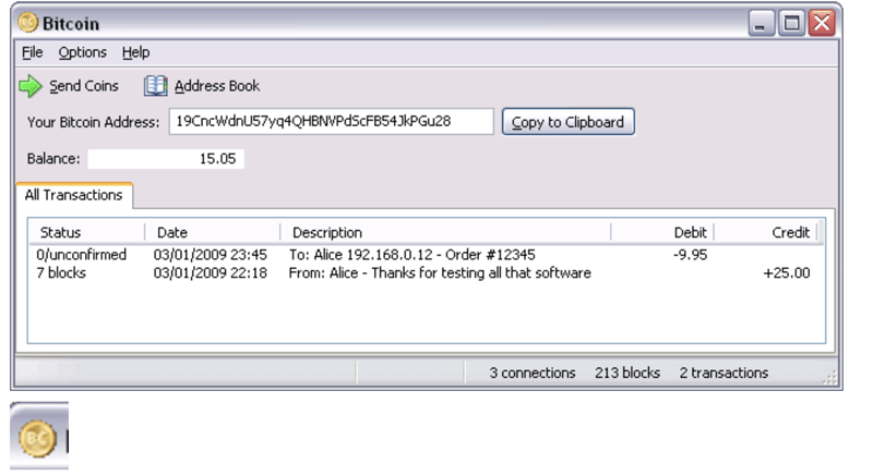
The first Bitcoin logo was created by Satoshi himself.Nakamoto: a gold coin with the inscription "BC". A rather interesting choice of color, especially considering the fact that many consider the comparison of bitcoin with gold to be an invention of bitcoin maximalists, while Satoshi himself presented BTC from the very beginning.

The community has well received the logo, although onBitcointalk periodically received suggestions for its replacement. One of these suggestions concerned the use of the Thai baht currency symbol (฿), which was a convenient temporary solution and may have inspired Satoshi to add dollar bands to the bitcoin symbol.
On February 24, 2010, he unveiled a new logo, which was also a gold coin, but with an inscribed "B" with two vertical stripes.

The reactions to Bitcointalk were mixed. Some said it was still too much like a baht; others found the logo too boring.
“Is this the official logo?" asked one user. “I understand how hard it is to make something truly professional if you don't have the skills (which I don't have) or the software (which I don't have either), so I don't mean to be rude, but wouldn't it be better if we accepted something… better?
Officially or not, this logo remainedmain logo until the end of 2010, when a user named bitboy left his first message on Bitcointalk with an updated Bitcoin logo. He kept the "B" symbol that Satoshi perfected, but made it white and placed it in a flat, bright orange circle, tilted to the right.
“The best bitcoin logo I've eversaw!" one user commented. This was a general consensus, as evidenced by the fact that the bitboy project will become the Bitcoin logo over the next decade.
Symbolism
In 2020, the bitboy logo is the most recognizable symbol of bitcoin. And, like the technology that it represents, the logo was created by an anonymous user without any commercial purpose.
Every aspect of the Bitcoin logo hasmathematical justification. These rationales are detailed (as well as specific instructions on how to make the perfect BTC logo from scratch) in this Medium post. The author, Phil Wilson, helped design the second logo that Satoshi introduced in February 2010, and the orange one we know today.
And the one that we know today is riddled with symbolism.
For example, the number eight appears many times inthe size and geometry of Bitcoin's design (for example, "B" rotates clockwise by 13.888 degrees — more on this below). According to internet language Leet/1337, the eight resembles the letter B, which Wilson says is short for "Block." Many of the templates used to create the Bitcoin logo design contain the number eight.
Since eight — this is B which means block inWith this symbolism, each new template is like adding a new block to the logo. Each time the size of the shape changes (as it did several times during the logo design process), it reflects the change in data size of each new block.
The font Trebuchet that was used inlogo, was inspired by the Trebuchet catapult, which was Wilson's favorite weapon in the computer game Age of Empires. Using vertical lines from the dollar sign, Wilson wanted to create the impression that "these lines are not really from the bitcoin symbol, but from the dollar symbol that was" imprinted "into the earth by bitcoin."
The coin was colored in orange frompractical and aesthetic goals. According to Wilson, it was supposed to be a color that could be printed / printed “both on websites and in print media”, and one that “stood out among all [other currencies / payment options]”.
The circle was therefore chosen by analogy with a coin; the circle is also “warm and friendly” and “continuous, endless and forever like bitcoin”.
Now to the question that is probably being askedmost beginners: why is the letter “B” tilted to the right? Wilson explains this: “14° was obtained by adding 12.5 (100/8), where the previous value was divided by 10. 12.5 + 1.25 + 0.125 + 0.0125 + 0.00125 + 0.000125 + 0, 0000125 + 0.00000125 + 0.000000125 + 0.0000000125 + 0.00000000125 + 0.000000000125… This is approximately 13,888 per period. When using a graphics editor that rounds the rotation angle to the nearest full percent, the angle becomes 14°. The angle represents the constant movement of the blockchain.”
And finally, the internet currency logo would beincomplete without a link to the "Hitchhiker's Guide to the Galaxy". On the logo, the orange circle is scaled to 525% to give it the exact diameter. Why? Naturally, because "525% is 12.5x42."
And why is the secret of the universe included in the Bitcoin logo? “This technology is supposed to be the answer to the central question of life, the universe, and all that,” Wilson explained.
</p> 5
/
5
(
1
voice
)


