The great thing about the Bitcoin market is that it's not about Bitcoin at this point. So what's it about?then?
Rates.
If you have read our reviews, you probably already know about it.
This does not mean that nothing can be seen with on-chain analysis. After all, in the long run, what hodlers do really matters.
But if you're looking for big direction (or lack thereof) in 6 months, then everyone's eyeing US Treasury rates for now.
A year ago, the yield curve looked something like this:
- short-term rates are fixed at zero,
- then rise steeply from there.
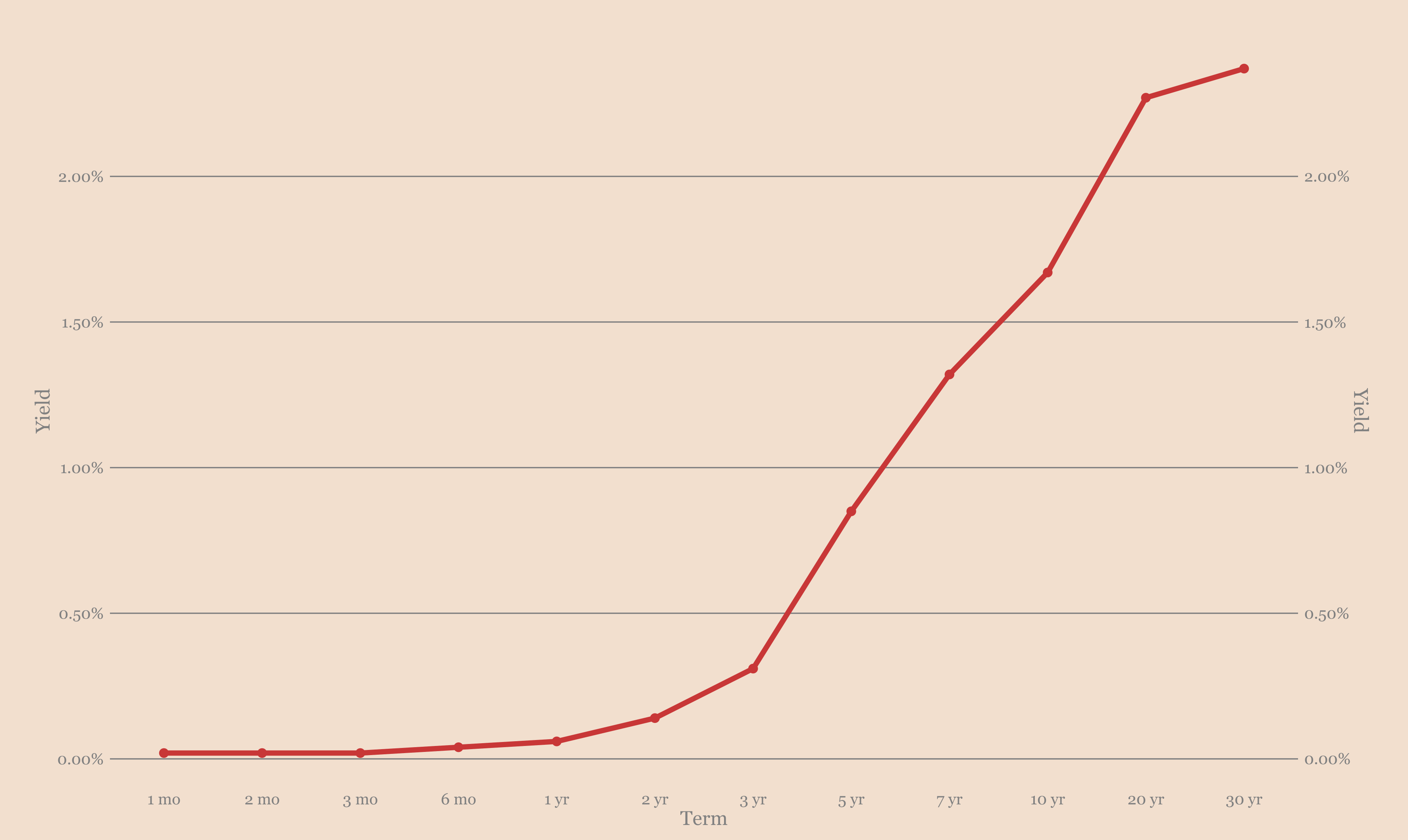
Treasury yield curve
Now it looks like this:
- the very short end and the very long end of the curve barely moved,
- but the middle looks much less steep than before.
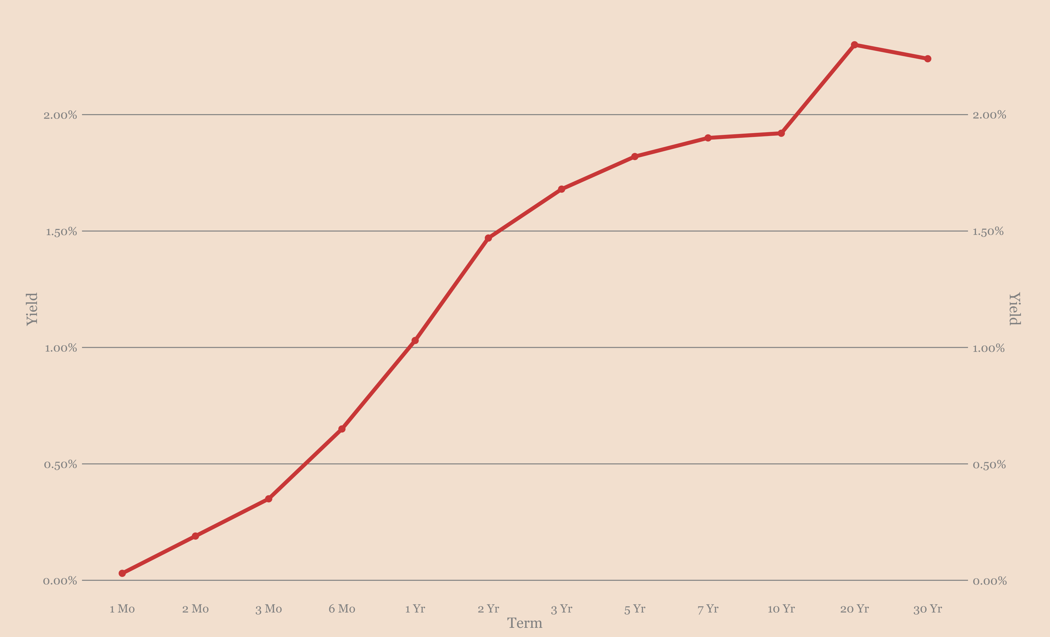
Treasury yield curve
So, are we heading for another inversion of the curve?profitability? I mean, that would be bad news, right? As a rule, this is a clear sign that another recession is coming. So should we really worry at the current stage.
Now, I'm not a bond trader, but one way to look at this transformation is to plot a heatmap of its evolution over time:
- the horizontal axis is the time since 2020 just before the pandemic;
- along the vertical axis - the duration of the bond is from 1 month to 30 years;
- each vertical slice encodes the yield curve for a given day, and the darker the color, the higher the yield.
Take some time and look at the heatmap from left to right.
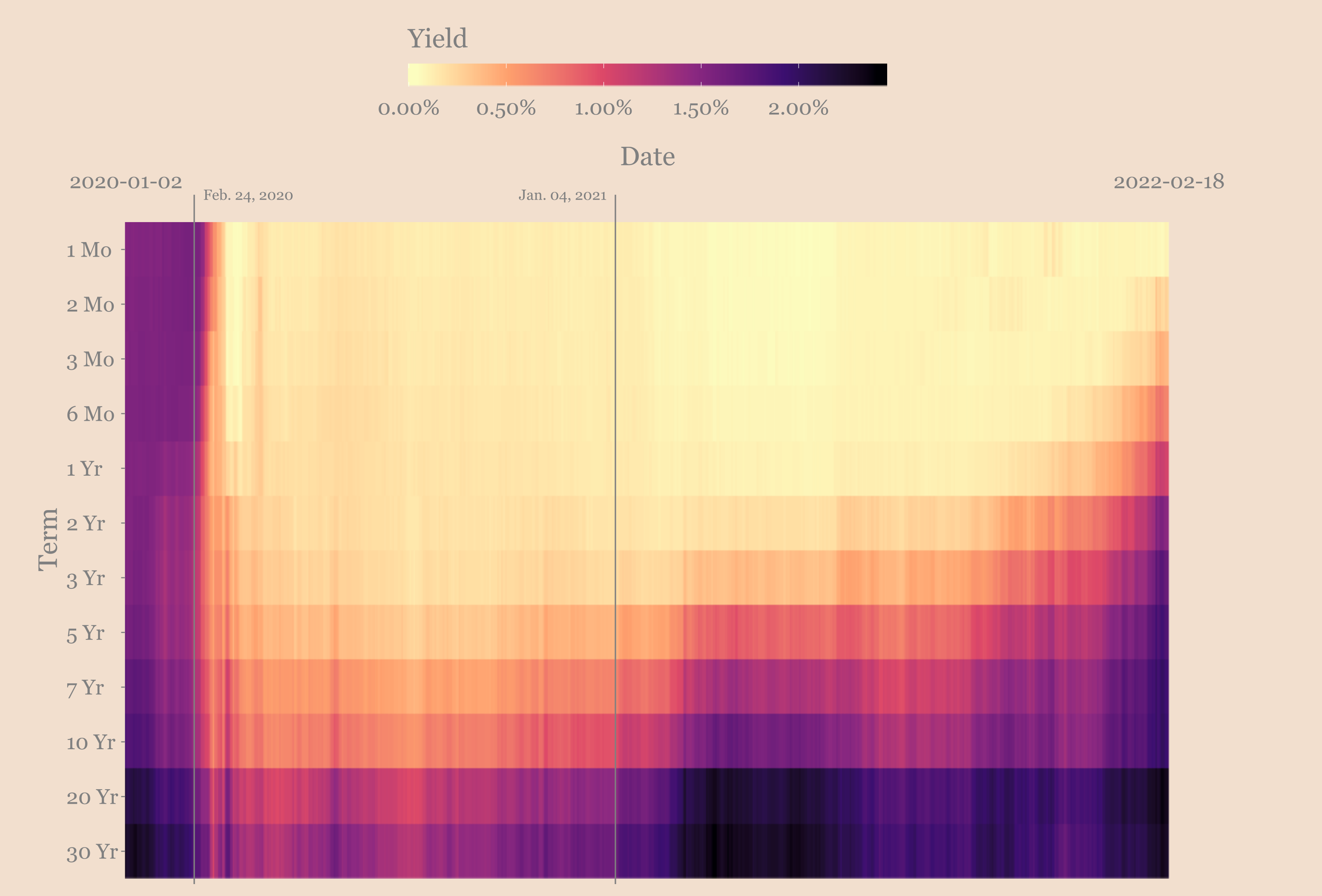
Evolution of the yield curve
Before the pandemic, we had a pretty standard yield curve. The long end is taller than the short end, but it doesn't look particularly cool overall.
Then at some point before February 2020 we saw some flattening and moderate inversion where the short end of the curve is darker than the middle of the range.
After COVID, the economy comes to a standstill, and the stockthe market is collapsing. Then, before the Fed intervenes in full force, we see some complete reversal, followed by not much over the next year.
Since then, the short end of the curve has been pegged to zero by the Fed, making short-term borrowing super-cheap and a rather steep curve.
But you can see that asinflation is becoming more and more obvious to everyone, the curve is becoming less steep, and the short end is gradually getting darker as traders anticipate a Fed rate hike.
Does this look like we're close to another inversion?
I'm not saying we won't get it, but iflook at the heat map, you can see that the current configuration does not even match what happened before the pandemic. So maybe we should wait and see what happens when the Fed starts raising rates next month before worrying about another recession.
What do hodlers think about this? To be honest, most of them probably don't care much about the bond market.
The big on-chain trend seems to be that the fewer players there are, the more they buy into what I consider to be a good strategy in the long run:
Don't aim for a deal that will make you 10x in 10 weeks. Instead, assume that instant success is usually achieved within ten years.
This is often how things work on a macro scale. You build your thesis, take a position, and wait for your ideas to be debunked or the deal to close.
If your thesis is that bitcoin will replace gold as the global store of wealth, then that hasn't worked yet.
But there is little to indicate that this will not happen.
So what are you doing?
Well, you are slowly accumulating coins and waiting to do your thing.
This is what small investors do. When you're not using margin lending, this is kind of the only reasonable option.
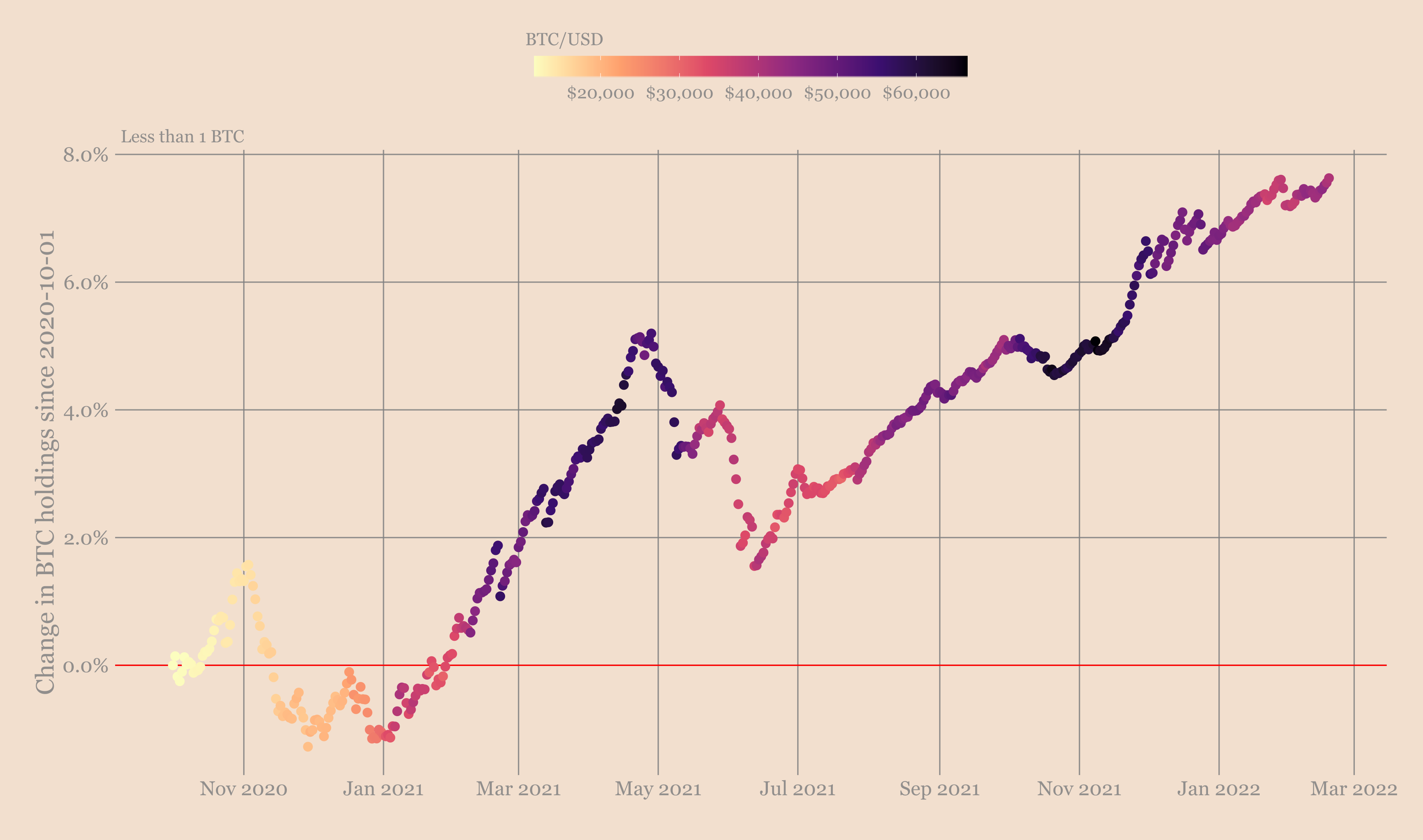
Small investors (addresses controlling less than 1 BTC)
But that's not what whales do...
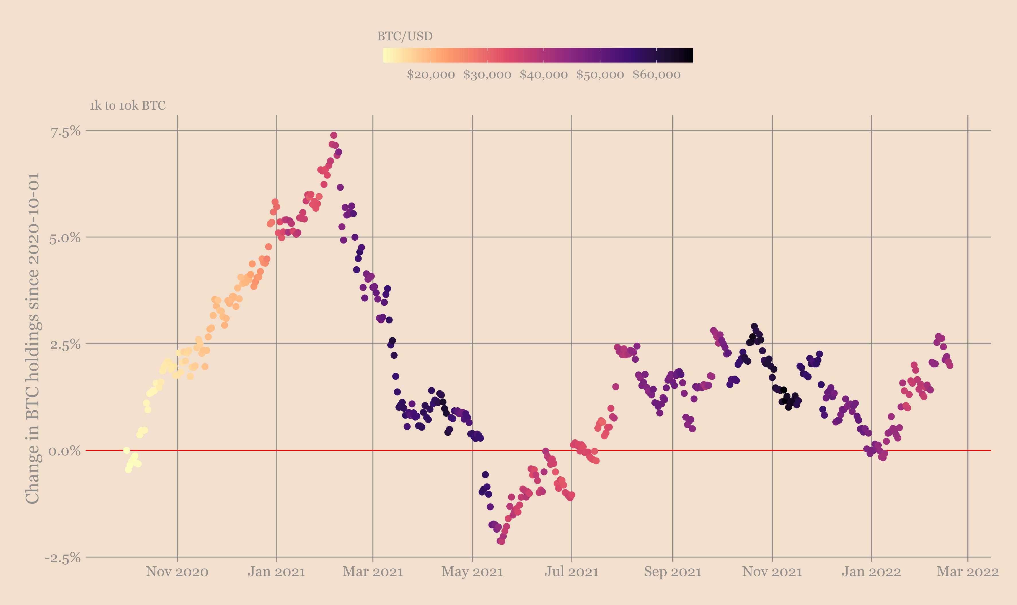
Whales (addresses controlling from 1000 to 10000 BTC)
If you stop for a moment and think about it, it kind of makes sense too.
When you have less than 1 BTC, your position is worth no more than $40K (taking into account the current average price).
But in the category of whales, one item costs from $40million to $400 million. When you play with positions of this order, you do not need a tenfold increase to lock in significant profits in dollar terms.
Maybe on the current scale of Bitcoin, this is what makes sense for the whales. This is where the unsustainable trend comes from.
There could be many other reasons for these patterns, so I am providing this potential explanation.
One thing that is very encouraging in the current cycle is the strength of BTC outflows from exchanges. We are about halfway through this halving and churn has been consistently high all this time.
Take a look for yourself.
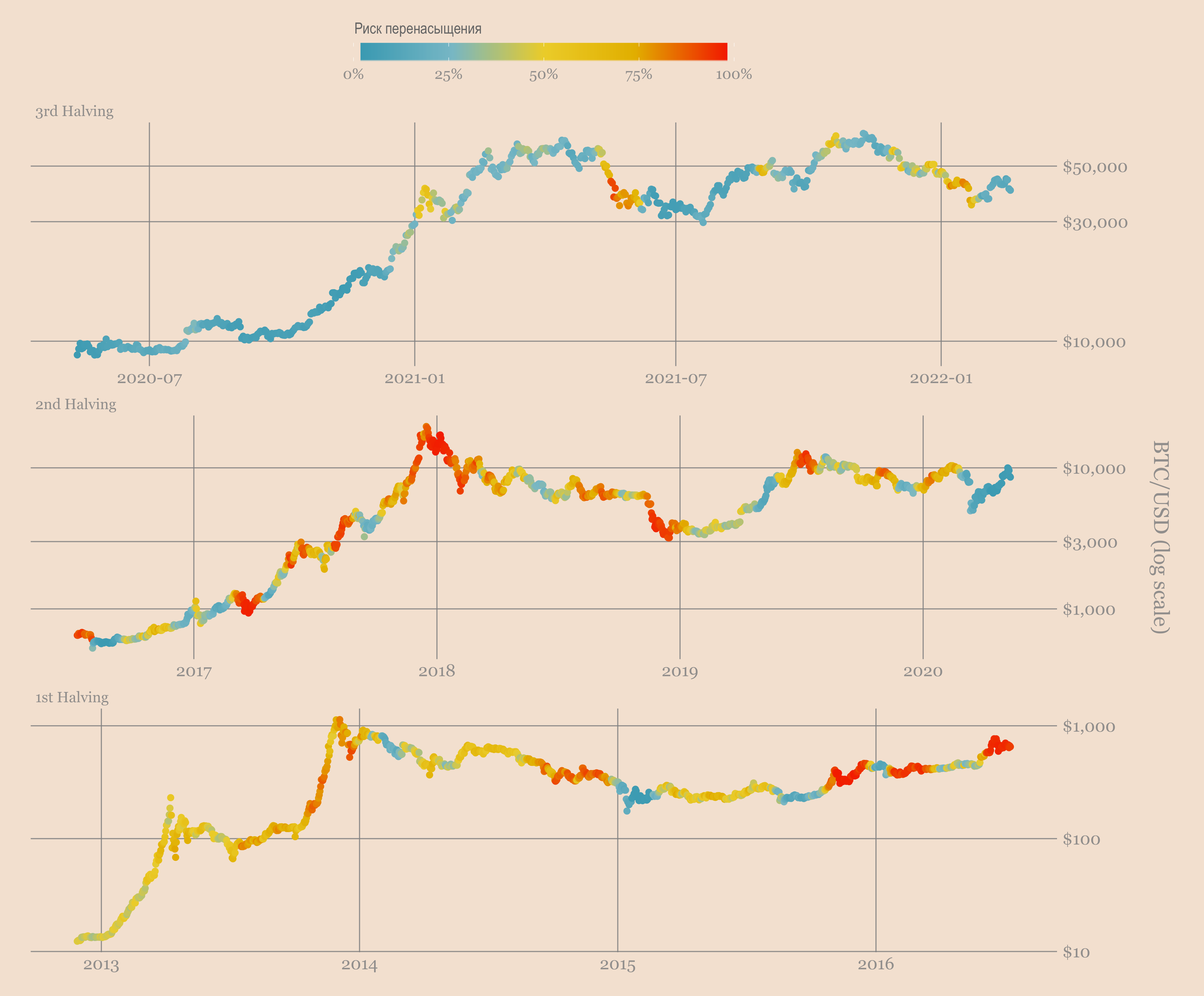
Capital flows at exchange addresses
This is another sign that bitcoin as an asset class is changing. The coins leave the exchanges and hopefully end up where they will serve as a long-term store of capital. Time will show.
However, things are not going well for shorter time periods. The whales are fed up, so the accumulation trend is losing momentum again.
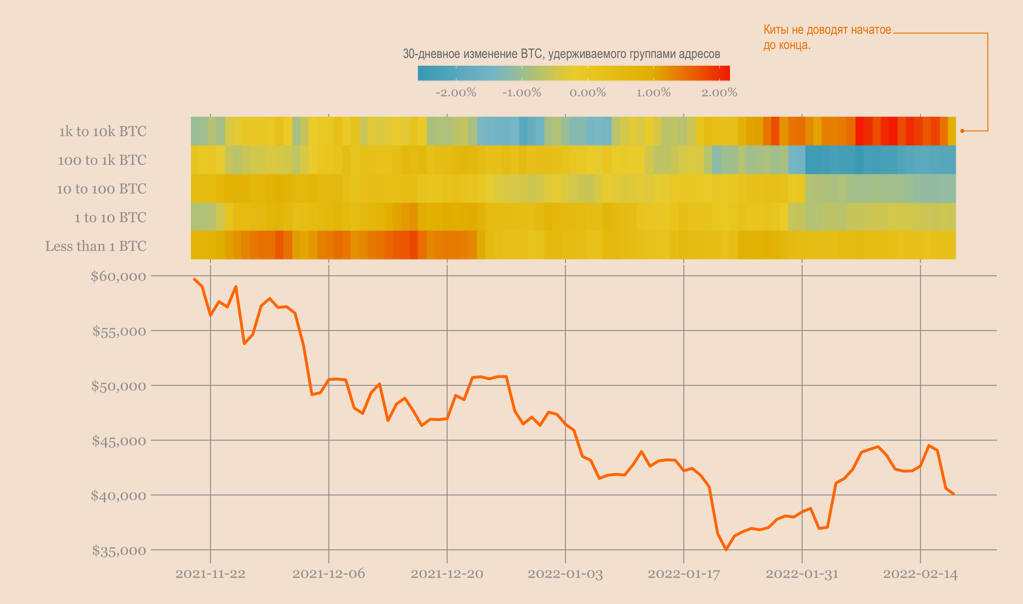
Whales, small investors and BTC/USD
Even though both whales and small investors are rising in a 30-day period, it doesn't look good.
Divergence.We have broken down bitcoin addresses by the number of coins they hold. Whales control from 1,000 to 10,000 BTC, small investors - less than 1 BTC. We will look at the 30-day change in total coin holdings for each group of addresses to analyze whether it is going up (coin accumulation) or going down (allocation).
Bitcoin will not come out of this drawdown with such weak momentum as this one.
However, this is a great time to accumulate satoshi and work towards achieving success in a 10-year period.
BitNews disclaim responsibility for anyinvestment recommendations that may be contained in this article. All the opinions expressed express exclusively the personal opinions of the author and the respondents. Any actions related to investments and trading on crypto markets involve the risk of losing the invested funds. Based on the data provided, you make investment decisions in a balanced, responsible manner and at your own risk.
Read this:
 Digitex Announces Launch of Blockfarm - Profitability Pharming Platform
 Shares of mining companies outpaced Bitcoin in profitability by five times
 I invest in cloud mining, my profitability indicators
 Cryptoearns – profitability aggregator for DeFi projects
 Cryptotrader hamster overtook Warren Buffett in profitability
Bitcoin became the leader in profitability for Russian investors during the spring crisis
Cryptotrader hamster overtook Warren Buffett in profitability
Bitcoin became the leader in profitability for Russian investors during the spring crisis