In this issue, Glassnode analysts prepared several unique, never-before-published charts. INin particular, they focused on the types of market participants currently active and, especially, the influence they have on market cycles.In conclusion, we will consider some macro-links, which, in our opinion, are extremely important to pay attention to right now.
Please note that the opinions of the authors should not be taken as investment advice.
The first few graphs can help you understand which types of actors have been the most active in the crypto market in recent weeks.
Below is a graph showing the ratio of [existing users] logins to new account creation on major exchanges and fiat gateways (blue curve).
In recent weeks, this ratio has reachedsame level as during most of the 2019 bull rally. This means that since the beginning of 2021, the growth in trading activity has been driven primarily by existing investors, and not by newcomers who have just registered an account.
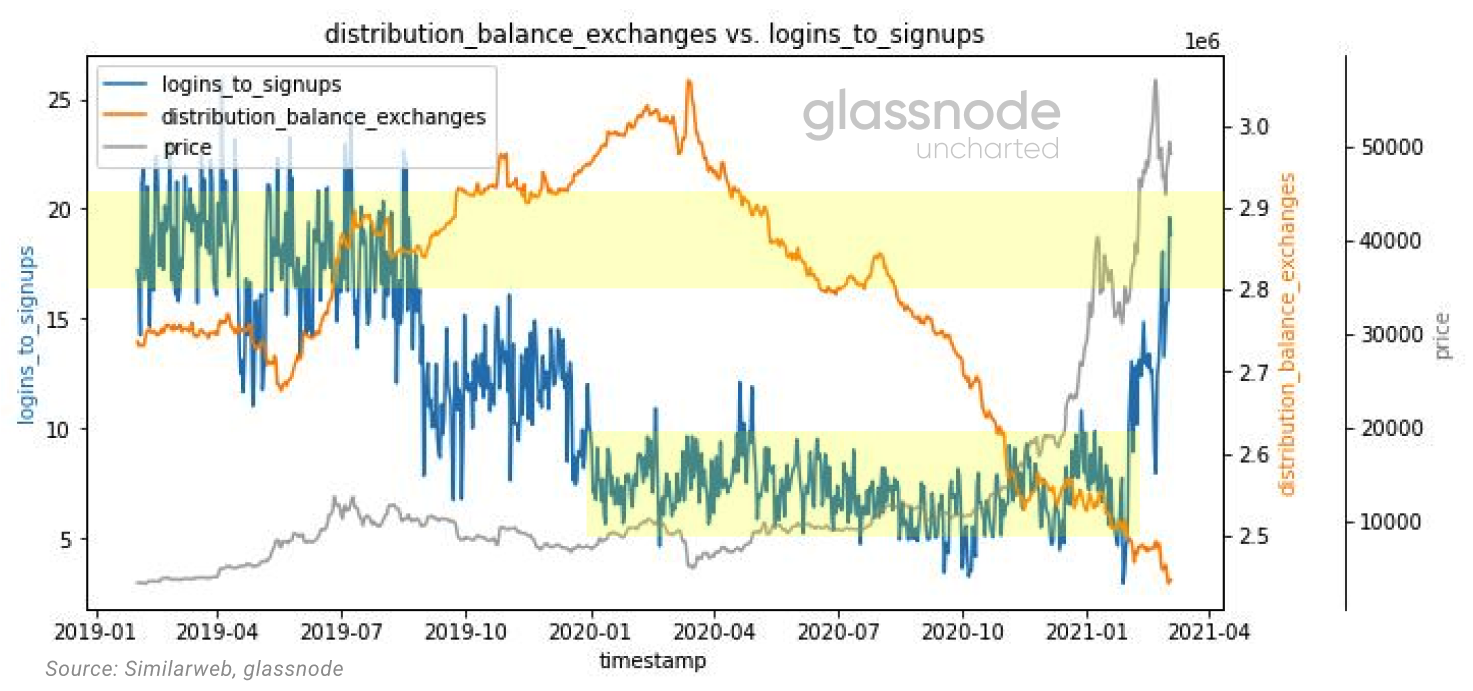
Logins / Signups ratio (blue curve), balance distribution on exchanges (orange curve), BTC price (gray curve)
The ratio of the total number of site views tologins paint the same picture. The downtrend in the blue curve in the chart below shows that the activity on these exchange sites has more than previously been related to trading rather than mere familiarization.
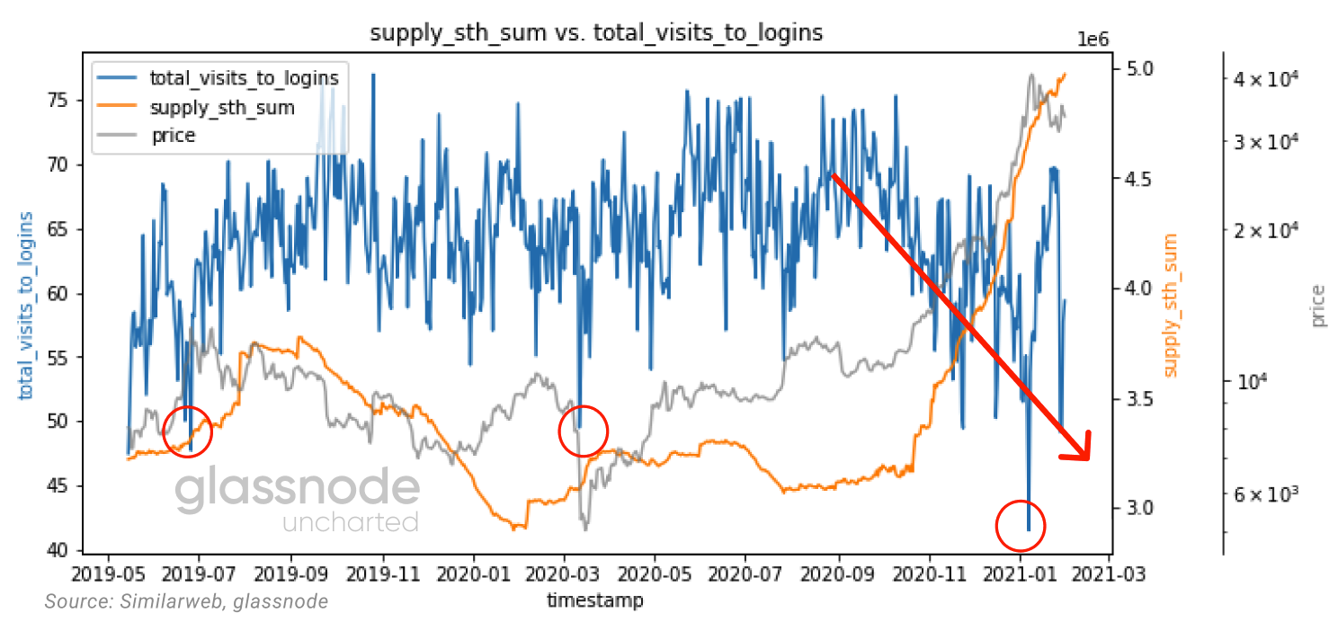
The ratio of the number of page views to logins (blue curve); supply held by short-term owners (orange curve); BTC price (gray curve)
The increase in supply held by short-term holders (coins that have changed hands in the last 155 days) coincides with an increase in futures trading volumes (we will look at this later).

Trading volume in the futures market (blue curve), supply in the hands of short-term owners (orange curve), BTC price (gray curve)
Interestingly, when approaching important pricelevels, the average login time on exchanges has also increased sharply. According to the "adjusted SOPR" (aSOPR), many of the profit-taking areas seem to coincide with areas of increased average duration of trading activity.

Average user session duration (blue curve), aSOPR indicator (orange curve), BTC price (gray curve)
Let's also pay attention to the amount of leverage involved in the system.
Futures to spot trading volume ratiothis bull market is mostly in an uptrend, but it is important that it remains within some reasonable range. Increased exposure on high leverage futures with weaker spot demand makes the system as a whole more fragile and overheated.

Ratio of futures to spot trading volume (blue curve)
As Binance recently tweeted,The level of leverage traders operate with is completely insane: in particular, 21% of traders on Binance Futures trade at 125x leverage. This means that we need to keep a close eye on funding rates for perpetual swaps, as the attractiveness of opening a short position will increase as they rise. After all, the higher the positive value of the funding rate, the more longs pay shorts.
Funding rates now seem to be at the same timeand curse and medicine. They create additional resistance on the way up, which at the same time contributes to a slower and more stable price rise.

Funding rate for perpetual swaps (all exchanges, bar chart), BTC price (gray curve). Link to online source
The time spread also indicates expectations of morehigh prices in the near future as we move further into contango between forwards and near-term expiring futures.

Time Spread CME (1-week MA)
To better understand the current state of the market,let's turn to the analysis of liquidity moving from long-term to short-term holders. This will give us the key to better understanding the mechanisms and entities that determine short-term price action.
It is interesting to note that at the last peak inJanuary selling pressure came from older holders, in particular from addresses aged 3-7 years. This means that long-term holders took profits and, more importantly, passed on that supply to BTCshort-term holders.
For a later peak of $58k.The ASOL indicator (user-adjusted average lifetime of spent output) indicates a much younger age of spent outputs, confirming that this offer, on average, came from younger network entities.

Entity-adjusted ASOL (purple curve), termspent output life (3-5 years, green curve), BTC price (gray curve), spent output lifetime (5-7 years, blue curve). Link to online source
The destruction of the old supply, highlighted in color in the graph above, creates a new supply (now 1 week to 1 month old) highlighted in the graph below.
So, since the beginning of January, 40% of short-termoffers are now held by subjects who have been active for a period of 1 week or more. to 1 month, making this cohort of investors more relevant than ever to understanding short- and medium-term price movements.

BTC supply held by short-termowners (blue curve); BTC price (gray curve); supply volume moving on-chain in the last 1 week. - 1 month (black curve). Link to online source
The increase in the number of short-term owners is also noticeable in the large surge in the number of new entities.

Net growth in the number of market participants (blue curve); supply volume moving on-chain in the last 1 week. - 1 month (black curve); BTC price (gray curve). Link to online source
So, as seen in the graph below, in Januarythe first major transfer of BTC supply occurred (first red arrow). It is clear that after the first peak, the speed of this transfer has slowed down (second red arrow).
It now becomes important to monitor the slope of this chart, which is indicative of the speed of the supply transfer and has indicated the formation of a top in past bullish cycles.

BTC supply volume held by long-term (black curve) and short-term (blue curve) holders; BTC price (gray curve). Link to online source
From a structural point of view we can seethe influence of short-term owners, breaking down the percentage composition of the “entity adjusted realized cap” into itshighly liquid, liquid and illiquidcomponents.Realized capitalizationgives us a market capitalization value based on the price at which circulating bitcoins last moved on-chain.
This is an important metric because it givesan idea of the relative weight of transactions made by short-term owners in the overall network capitalization. If we compare the current cycle with 2017/2018, we have reached a peak share of 30% for the first timehighly liquid offer.
It is also important to note that the increase in the speed of transition from liquid supply to highly liquid supply has historically been observed on the eve of global market tops (black arrows on the chart).

From the visualization above, two things become quite clear. First:highly liquid offertends to increase during the transition to bull markets (this effect has been observed since 2011). And second: there appears to be a strong bottom created byilliquid offer.
Although it is important to take into account the behavior when approaching the tophighly liquid offer, namely movementliquid offerdirectly confirms the fact of the formation of a local or global top.
To highlight this point, in the graph below we have discretized the metricadjusted SOPRonliquid and highly liquidoffer.

Spent Exit Profitability Ratio [SOPR]: liquid (red curve) and highly liquid (blue curve) entities
Now let's try to combine the above elements into a single volumetric picture.
We have determined that short-term wearers (specifically 1 week to 1 month) gain a lot of weight and form most of thehighly liquid offerbitcoin. On the other hand, long-term holders (in particular 1–3 years) are mainly responsible for the formationliquid offer... Collectively, these are the two main market forces operating in this regime.
We also talked about the importancerealized capitalizationas it defines the reference price for different categories of market participants, and in particular emphasizes their sensitivity to changes in the BTC price.
To get a holistic macro picture, we can combine all these elements into one metric called RHODL (Realized HODL Ratio) which is the ratio betweenshort-term(1 week – 1 month) andlong-term(1–2 years) by owners, normalized byrealized capitalization.This metric can tell you when we are entering an area of excessive cycle expansion (red area in the chart below).

If we compare the structural patterns of the beginning of the last two bull markets, it seems that they reproduce a similar pattern.
We believe that the current bull market is consolidating intothe features of similar cycles of 2013 and 2017, which means that soon we can reach a local top, as in 2013, and then continue to grow to form a common top of the cycle in late 2021 - early 2022. In terms of the RHODL ratio, we are not yet in the critical red zone, but we are clearly accelerating, as in 2013.

Link to online source
This is a view that from a structural point of viewof view, we have not yet reached excessive expansion, as evidenced by the LTH-SOPR indicator (SOPR for Long Time Holders), which indicates that we are at a level similar to the second peak of 2017. and approaching the local vertex.

LTH-SOPR (7-day moving median). Link to online source
However, the correction is unlikely to be as deep as in 2018.
As recently as this weekend, we saw the secondThe decline in liquid supply over the past three years proves once again that many new entrants have entered this market in the long term, and a potential “squeeze” in supply is ultimately inevitable.

Change in BTC liquid supply (bar chart), BTC price (gray curve). Link to online source
Of course, our arguments do not take into account the likelihood of exogenous black swans, such as a major stock market crash.
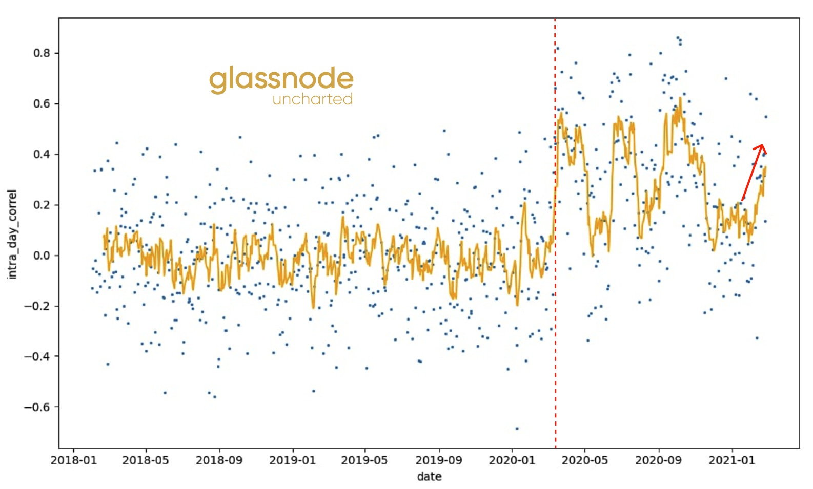
Following the financial crash of March 2020, there has been a fundamental shift in the perception of Bitcoin as an asset class.
Intraday correlation between bitcoin rate andthe share market has changed at a structural level due to the arrival of a new type of investor. Since the beginning of 2021, the correlation has been growing again, reminding that bitcoin is no longer in an isolated bubble and will depend, among other things, on external factors and forces.
Intraday correlation with the stock market
The 30-day MA of the stock market correlation also clearly shows that we are returning to the 2020 correlation levels.

That's all for today. Have a great week everyone!
The article does not contain investment recommendations,all the opinions expressed express exclusively the personal opinions of the author and the respondents. Any activity related to investing and trading in the markets carries risks. Make your own decisions responsibly and independently.
</p>
Read this:
 Through uncharted territories. Structural Analysis of the Bitcoin Market
 Bitcoin Market Structure Analysis
 Market Watch March 24, 2020
 Bitcoin's Computational Complexity Indicator Chart Hasn't Been So Bullish Since March
Traders Lost $ 1.7 Billion Amid Bitcoin's Record Fall Since March
Bitcoin's Computational Complexity Indicator Chart Hasn't Been So Bullish Since March
Traders Lost $ 1.7 Billion Amid Bitcoin's Record Fall Since March
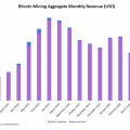 In June, Bitcoin miners' earnings fell to a minimum since March 2019