In the next review, the analyst Will Clementeanalyzes the current situation in the bitcoin market, with the help ofon-chain metrics separating signal from noise.
Dear readers, I hope all is well and a weeksuccessful for you. It has been another challenging week in the bitcoin market as news from Afghanistan, the likelihood of an imminent collapse of support measures in the US and the rise in the dollar have created tensions in all markets. At the same time, Wells Fargo and JPMorgan announced the launch of bitcoin funds in partnership with NYDIG, and Coinbase announced its decision to convert 10% of profits into cryptoassets. But let's move on to the overview, where we will try to understand the many interrelated factors that are worth noting this week.
Key points:
- Hashing capacities continue graduallyreturn to the network, mining profitability begins to decline after a significant increase as a result of the record difficulty adjustment that occurred last month.
- Bitcoin's realized capitalization is updating all-time highs.
- $20 billion in stablecoins are still sitting on exchanges ready to be allocated to crypto assets.
- Supply liquidity continues to dry up while net inflows to exchange addresses remain unchanged this week.
- The market has stabilized in a profitable state.
- Leverage ratio, open interest to market cap and funding rate are all still at relatively healthy levels.
- The number of on-chain transactions is starting to recover gradually.
- There are still no red flags on the use of liquidity to exit the market by long-term holders, with the exception of the relocation of a few 2-3-year-old UTXOs on Tuesday.
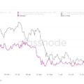
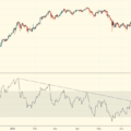
The BTC rate is currently above majorclusters of on-chain volume in the $30-40K region and around ~$45K. This shows how much of the Bitcoin money supply has been moved at a given price level. Large volume clusters may spontaneously act as support/resistance levels because they have been traded with large shares of the available BTC supply. The last such cluster to overcome on the way to new highs is between $56k and $59k.
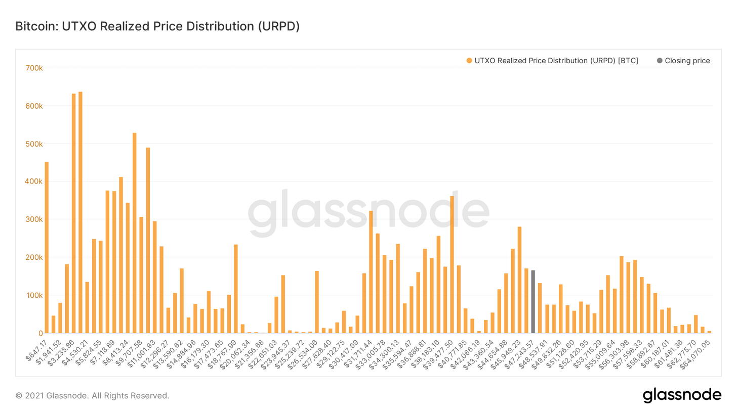
UTXO realized price distribution
After a sharp drop in the hash rate as a resultthe shutdown of Chinese miners and the subsequent record difficulty adjustment, the profitability of mining for the remaining industry participants in the network increased tremendously.
In the graph below, this is reflected by the green curve,profit ratio in BTC per hash. As hashing capacity gradually returns to the network, the profitability of each individual player in the industry begins to decline again, but still remains at a significantly higher level than before.
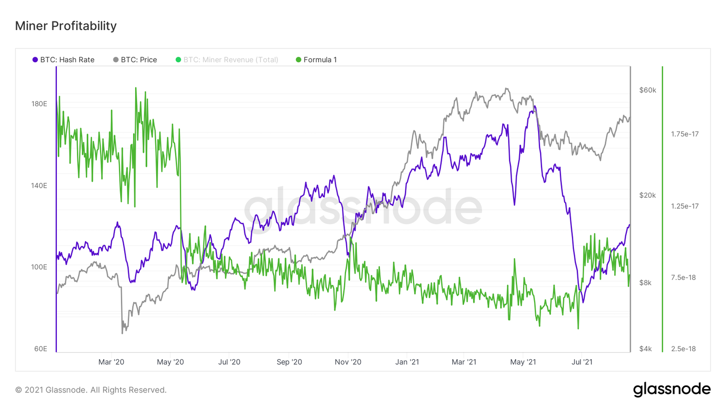
Mining profitability
This increase in profitability allowed the remainingon the network, miners to reduce the pressure of forced sales on the market, since they no longer need to sell that much BTC to cover their operating costs.

Change in net position of miners
Another mining metric, the ratio of the marketcapitalization to thermocapitalization, returns to growth again. This metric correlates Bitcoin's market capitalization with the total spending of miners on securing the network. This allows us to identify areas in which the market can be characterized as over- or, conversely, “sub-heated” in comparison with the costs of miners for network security.
It is noteworthy that this coefficient did not even come close to the zone that historically testified to the overheating of the market.

Market capitalization to thermal capitalization ratio
Next in line is the realized capitalization,which reached new historical highs this week. The realized capitalization, in contrast to the market one, is calculated by multiplying the volume of the current circulating supply by the cost of the last movement of each of the digital "coins".
For example, I bought BTC for $ 100K.at $ 1 / BTC and never moved them. Today these coins represent ~ $ 4.7 billion in market cap, but still only $ 100k in realized cap because that was their value at the time of the last move.
For traders focused more ontechnical analysis, we can say that the realized capitalization is like an on-chain version of VWAP. A breakout to new all-time highs in this metric suggests that bitcoins are no longer selling at a loss and also indicates strong capital inflows.

Realized capitalization
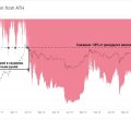
As the next step in the development of an idea realizedcapitalization, David Puell presented the MVRV metric, the ratio of market capitalization to realized. We will look at the MVRV-z version here, which is the MVRV coefficient adjusted for volatility and provides sharper signals for market peaks, while retaining the ability to indicate excellent buy zones in a bear market.
When the market cap is belowrealized, this, by definition, speaks of the surrender of the market. This metric correlates the BTC score in the margin spot order with the weighted average price that investors paid for their coins. This indicator is now showing a recovery similar to that seen in mid-2013. It is also noteworthy that at the beginning of this year we barely touched the historical level of market overheating.
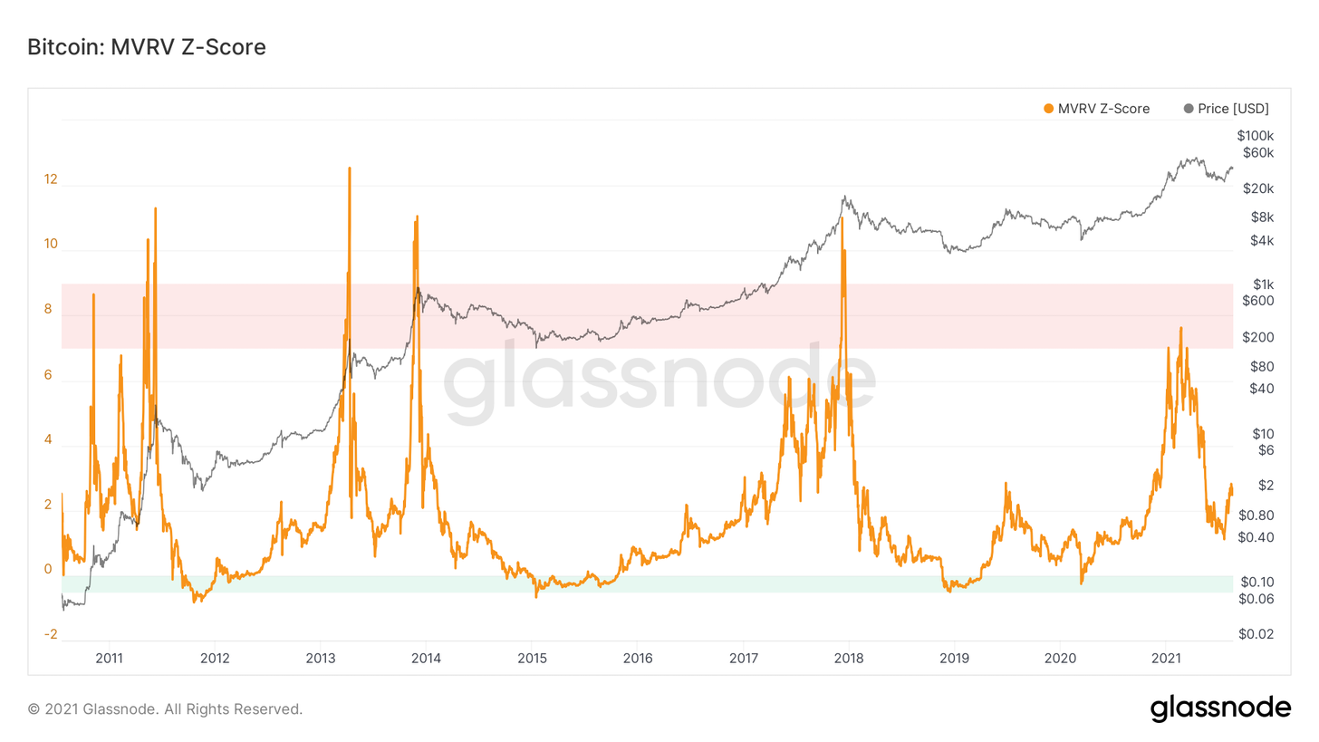
Z-score MVRV
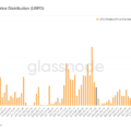
Further, I would like to consider severalavailable supply ratios: Illiquid Supply Shock (illiquid supply), Exchange Supply Shock (exchange supply) and LTH Supply Shock (supply in the hands of long-term holders). BTC supply continues to flow into "strong hands", which is confirmed by illiquid supply and supply ratios in the hands of long-term holders, however, the exchange supply remains neutral, continuing to move sideways.
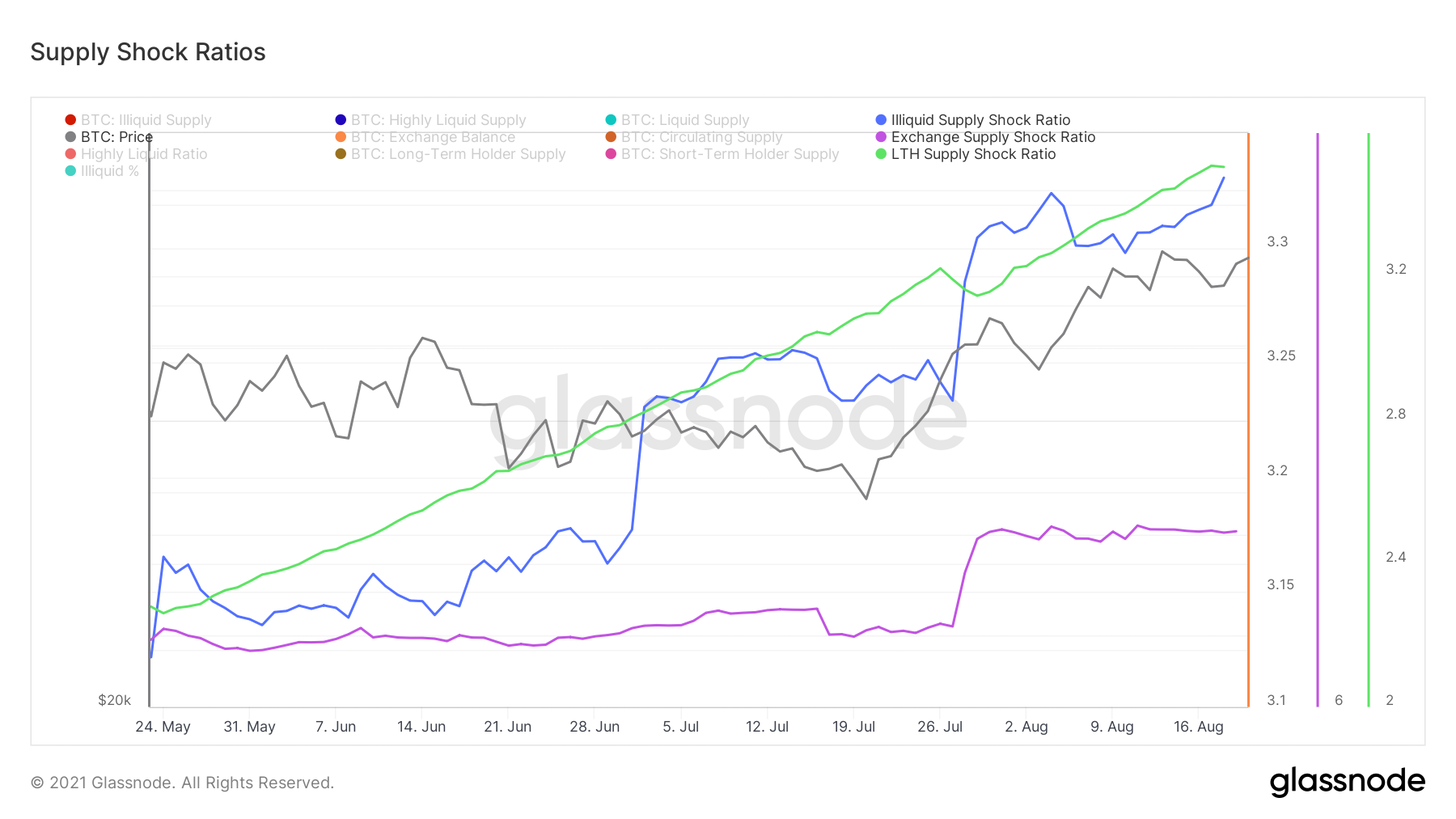
Supply Shock Ratios: Illiquid Supply (Blue Curve), Stock Offer (Purple), Long-Term Offer (Green)
If we take a broader picture and estimate the volumesupply in the hands of long-term holders as a percentage of the total circulating supply, it can be seen that long-term holders largely form the basis for a price reversal at the lower points of the trend. These network actors distribute their coins in bull markets and accumulate at the lows of bear markets until the market experiences a supply squeeze.
Currently, the indicator value is aggressiveis growing, with the only past episodes reminiscent of current accumulation occurring after the 2013, 2017 and mid-2013 bull rallies. What is most intriguing is the current growth rate.
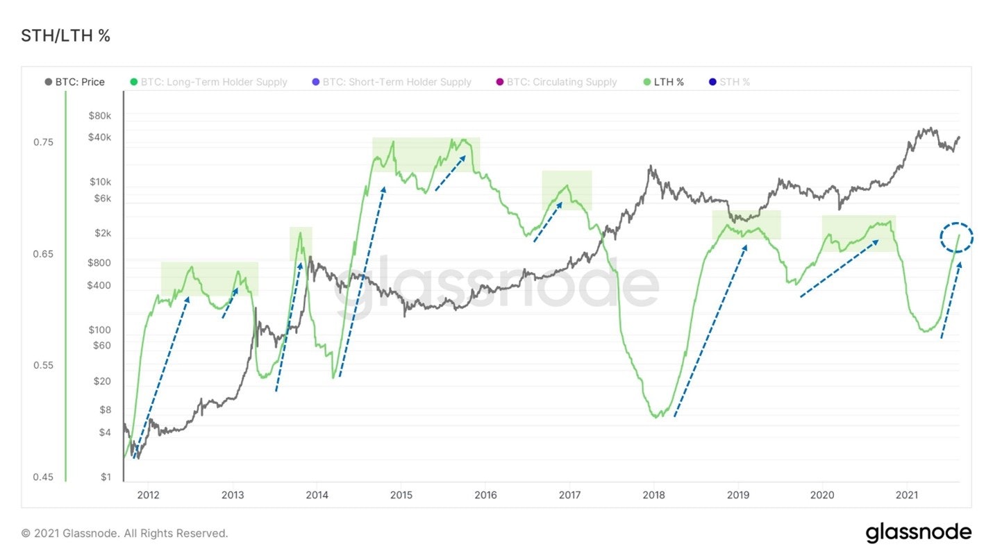
The ratio of the share of supply in the hands of short-term and long-term owners
Last week we looked at the Illiquid Supply Shock ratio in some detail, so I won't repeat myself, but I would like to put this metric in a broader perspective.
The current growth is completely different from the endthe 2017 bull market and the beginning of the subsequent bearish trend. Then the huge volume of supply turned into a liquid state, but now the opposite is happening. If this reminds me of anything, it is more likely a recovery at the end of the summer of 2017.
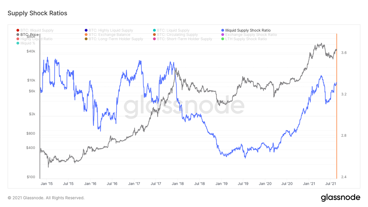
Illiquid Supply Shock Ratio
Continuing the topic, the factor that we useto determine whether the current rally at the macro level is just a "dead cat bounce" is the behavior of long-term holders or seasoned market participants.
And although on Tuesday one could see a splashmovement of coins 2-3 years ago, so far no significant cause for concern in this regard is visible. As mentioned above, the volume of supply in the hands of long-term holders continues to grow almost vertically and in terms of ASOL (average life of the spent outputs), Dormancy ratio (coin downtime) or CDD (coin days destroyed), too, so far nothing is alarming if not counting one spike in SOAB (Exits Spent by Age Group) on Tuesday.
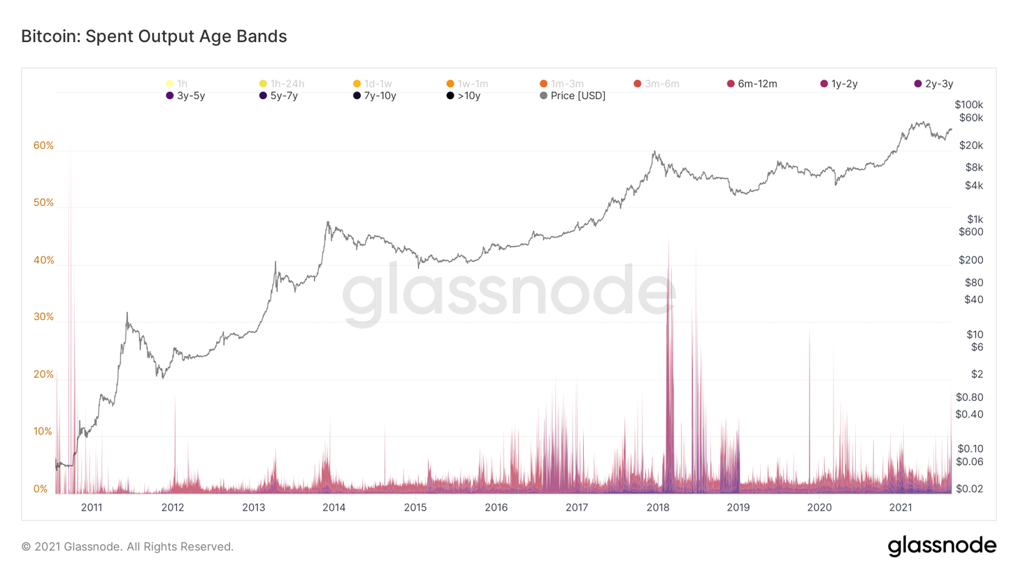
Outputs spent by age group
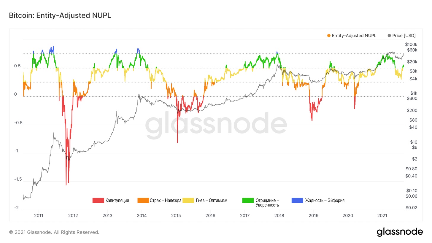
Now let's take a look at NUPL, the netunrealized profit / loss. The parameter of this metric is quite simple: at euphoric price peaks, market participants calm down and do not take profits, thereby creating the basis for large-scale capitulations.
As in mid-2013, the market pushed offthe zone of "fear / hope", without sinking into it, and bounced into the area of "denial / confidence". Note also that in the current cycle, the NUPL has not yet climbed into the "euphoria" zone (blue color of the chart).
Net unrealized profit / loss adjusted for users
Next in line is the supply coefficientstablecoins (Stablecoin Supply Ratio, or SSR), which is the ratio of stablecoin market capitalization to Bitcoin market capitalization and shows the overall purchasing power of stablecoins relative to Bitcoin.
If you superimpose Bollinger bands on this metric,An interesting pattern emerges: whenever the SSR chart falls below the lower line of the Bollinger Bands, it marks a macro market bottom formation. And after such a recent decline in SSR, it looks like stablecoins are now starting to return to the market.
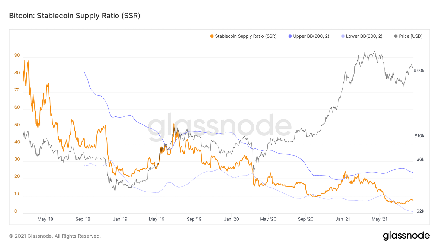
Stablecoin Supply Ratio
An additional perspective to evaluate the same phenomenoncomes from a new metric I came up with this week: the Stablecoin Exchange Reserve Ratio. This metric tracks the ratio of the number of stablecoins on exchange balance sheets to the total supply. The only limitation here is that stablecoins locked in smart contracts on other protocols were not filtered out. It appears that this ratio may be an adequate indicator of how much capital is outside the market. Multiplying this by the total supply of stablecoins, we find that there is currently about $20 billion in stablecoins on exchanges.
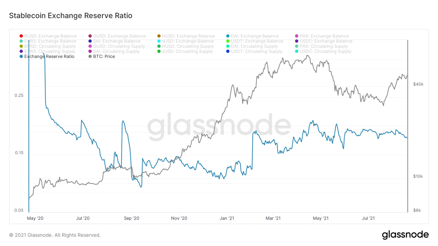
Exchange reserves ratio
Now let's take a look at the SOPR, the ratioprofitability of spent outputs. It tracks the profits generated by selling coins on each specific day. As usual, I use the corrected version (aSOPR) for the review, which filters out exits with an age of less than an hour. The one level that separates the bull and bear markets is marked with a black line.
In recent weeks, the indicator has reproduceda textbook trend reversal, first rebounding from 1 as a support, and now stabilizing above this threshold level. It is good to see the market trading in profit and successfully absorbing current sales.
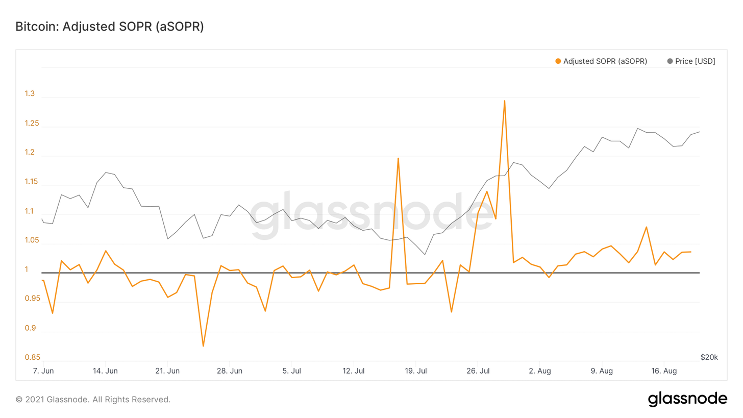
Adjusted profitability ratio of spent outputs
Now let's turn to the metrics that reflectnetwork activity. The number of active addresses and on-chain transactions is gradually moving towards growth, following the momentum of the current price rally. This is another positive sign and we would like to see this trend continue in the coming weeks.
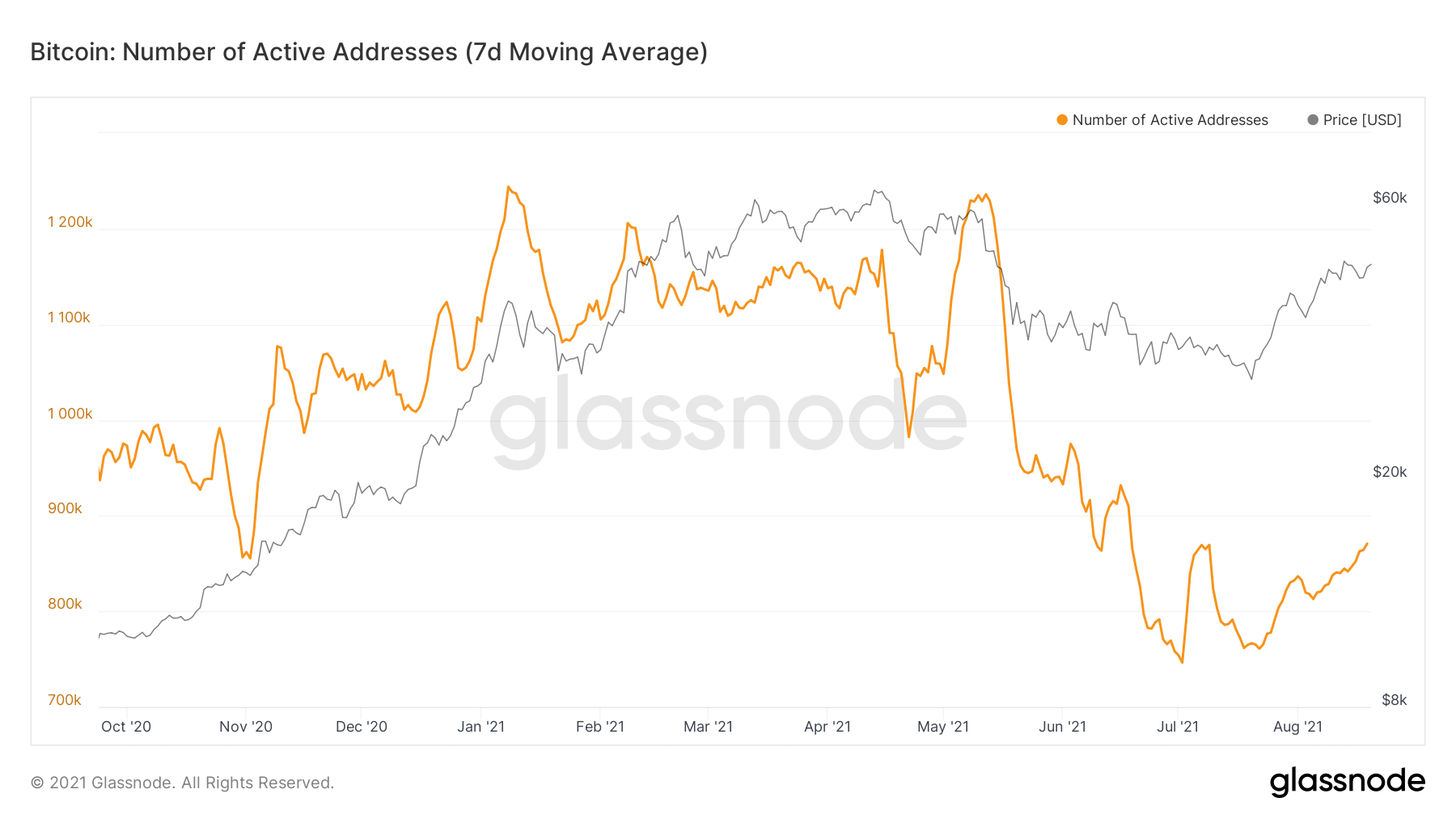
Number of active addresses (7d MA)
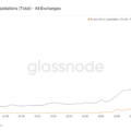
Last but not least:I would like to briefly touch on the derivatives market. The calculated leverage ratio for futures (see chart below) determines how secured traders' positions are by dividing the open interest in futures by the amount of BTC on exchange addresses.
And in this respect, we are still far fromFebruary values reached at similar price levels. The financing rate is also far from the February rate. If the funding rate does not clearly diverge from the price movement, then it is not worth giving this metric so much importance until there is an increase in open interest as part of Bitcoin's market capitalization.
Overall, the underlying metrics of the bitcoin derivatives market are still at healthy levels.

Estimated Leverage Ratio (all exchanges)
The article does not contain investment recommendations,all the opinions expressed express exclusively the personal opinions of the author and the respondents. Any activity related to investing and trading in the markets carries risks. Make your own decisions responsibly and independently.
</p>
Read this:
 Strong Savings and a Buy Signal in the Hash Ribbon - On-Chain Pulse from Aug 14, 2021
 Let's measure the correction parameters: on-chain pulse | May 18, 2021
 Could this be a repeat of October 2020 before the bull rally? - Onchain Pulse from August 7, 2021
 Sentence Compression Continues - Onchain Pulse from July 31, 2021
 Signs of Squeezing Supply - Onchain Pulse from July 24, 2021
 Onchain Pulse | 04 May 2021