In the next review, the analyst Will Clementeanalyzes the current situation in the bitcoin market, with the help ofon-chain metrics separating signal from noise.
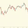
Dear readers, I hope all is well and the weekgood luck for you. It's been a solid week in the crypto markets, with the price of BTC rising from $40k to nearly $47k at the time of writing. Next, we will analyze the most important trends in the crypto market over the past week, primarily from the point of view of on-chain analysis.
As usual, I will immediately list the key points:
- Strong accumulation, as evidenced by several metrics at once.
- Big whales have been actively buying BTC over the past two weeks.
- Low funding rates for perpetual swaps, coupled with increased buying and on-chain accumulation, suggest that spot demand is at the heart of the current rally.
- Long-term owners do not use the current liquidity to exit, the market is on average trading again in profit.
- The hashrate shows signs of recovery, the Hash Ribbon indicator gives a buy signal, miners are accumulating (probably due to the high profitability of mining).
- The number of transactions is still low, however, of a relatively large volume.
One of the most interesting events in the last 1–2weeks is an increase in the balances of network subjects (addresses grouped into clusters based on an analysis of their activity) with more than ₿1000 (i.e. “whales”). This is after filtering out large recognizable on-chain entities such as exchanges, Grayscale, QBTC, Purpose ETF, etc. Since July 27, whales have added 107,150 BTC to their holdings.
Without straying far from this topic, we canconsider three metrics of supply shock in the bitcoin market, also indicative of accumulation. Let's take a look at each of them separately in order to better understand what they are.
Supply shock odds
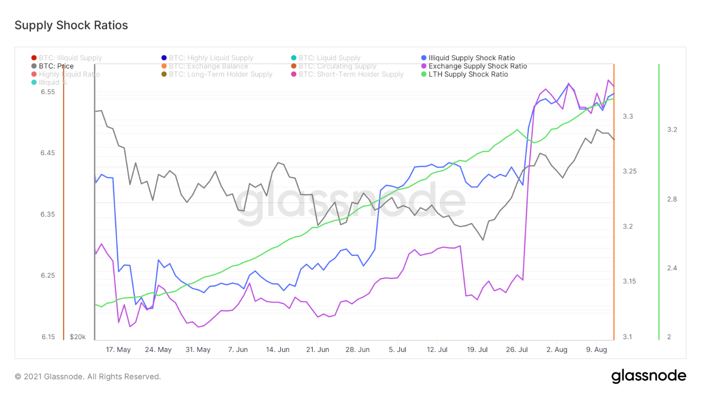
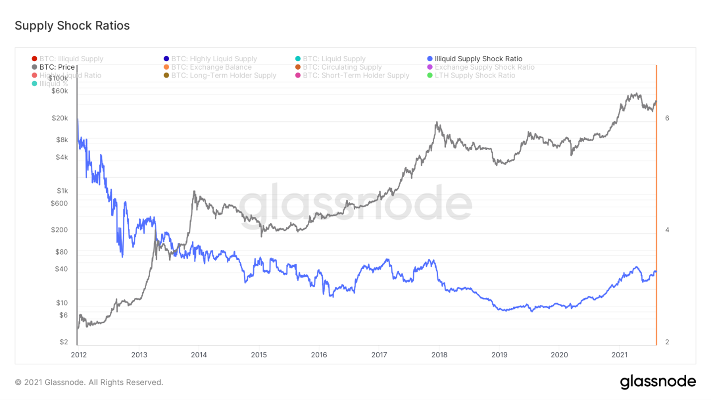
Let's start with the illiquid shock ratiosupply (Illiquid Supply Shock Ratio), a metric I created myself using Willy Woo. It monitors the ratio of the volume of BTC held by network entities with a short sales history ("strong hands") and the volume of BTC held by liquid and highly liquid entities ("weak hands"). Basically, this ratio reflects the flow of BTC from weak to strong hands. Looking at the bigger picture, it can be seen that throughout Bitcoin's speculative history, this ratio has been in a downtrend as much of the supply has become liquid. This continued until, after March 2020, the macro trend in the ratio reversed, and more and more coins began to accumulate in the hands of long-term investors.
To a greater approximation, it is clear that the coefficientserved as a leading indicator in May, when supply began to quickly move into liquidity. It was also a leading indicator in the last month before the current rally that followed the failure to break $30k support. The recovery in this metric since May 19 has been quite impressive, and it is now at the same levels as when BTC was trading at $55-$57 thousand at the beginning of this year.
Illiquid Supply Shock Ratio
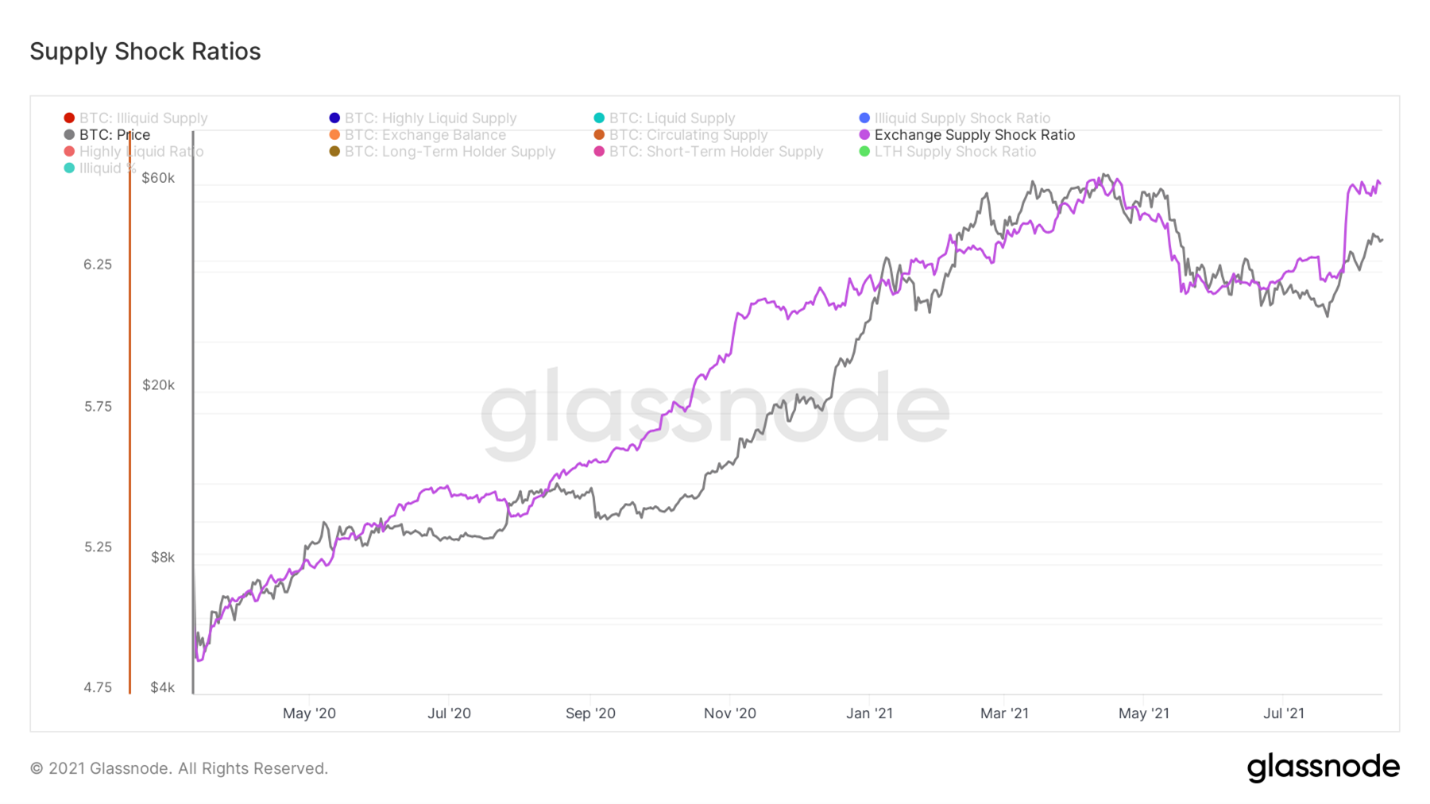
Next in line is the stock market shock coefficientoffers (Exchange Supply Shock Ratio). While illiquid supply speaks to the qualitative aspect of coin hoarding by buyers, exchange supply provides a more quantitative picture of overall hoarding. It tracks the ratio of the number of coins available for purchase on exchanges to the total circulating supply. Again, the metric has seen a strong recovery since May 19th, with supply available on exchanges down by 109,421 BTC over the past three weeks.
Supply shock coefficient
And the third metric:Long-term Holder Supply Shock Ratio. It is the ratio of the supply in the hands of network entities holding their coins for at least 155 days and the supply in the hands of short-term holders. The 155-day threshold used to determine long-term owners was deduced by Glassnode analysts as significant in terms of the likelihood of spending the held coins; the underlying research and analytics are published on their website.
Historically, when long-term ownersaccumulate a fairly large share of supply, this can have a shock effect on the market. Currently, this indicator is growing aggressively, along with the other two metrics I mentioned above.
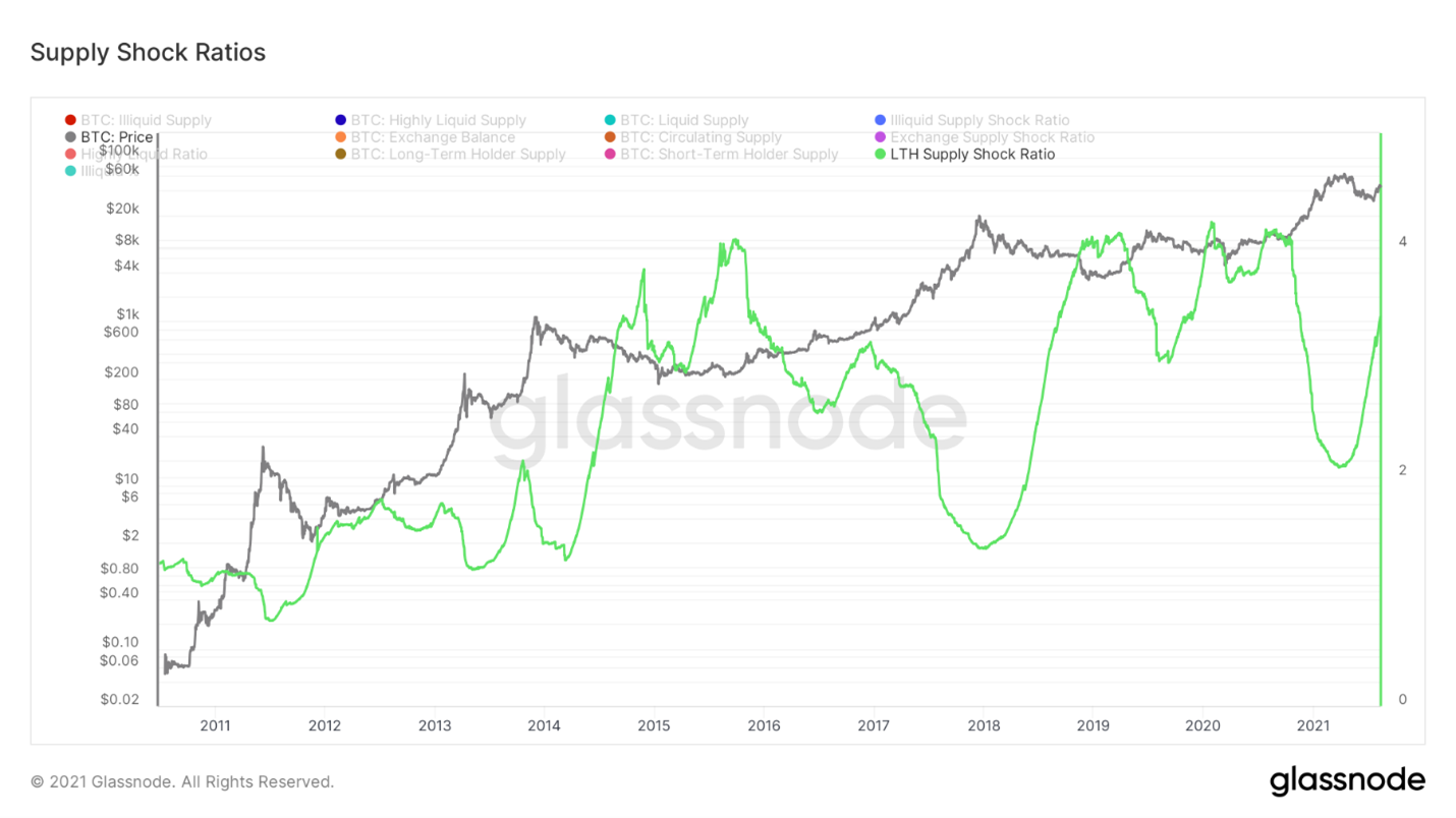
Supply shock ratio of long-term holders
One of the most common in recent yearsThe ideas about market structure are that the current rally is simply a “dead cat bounce” and that, from a macro perspective, the market is in the process of forming a smaller high before continuing the bearish trend.
Long-term owner data can give ussome idea of how likely such a development of events is. During the dead cat bounce in 2017 (a scenario that many seem to be taking as a basis even now), there was a strong sell-off from market participants who had not moved their coins for at least 6 months before. They used the first significant liquidity to exit the market. To date, we have not seen similar behavior from long-term owners, which, from an on-chain analysis point of view, refutes a negative bounce scenario ahead of a continuation of the bear market. Long-term owners sit quietly and are in no rush to sell their coins, at least not yet.
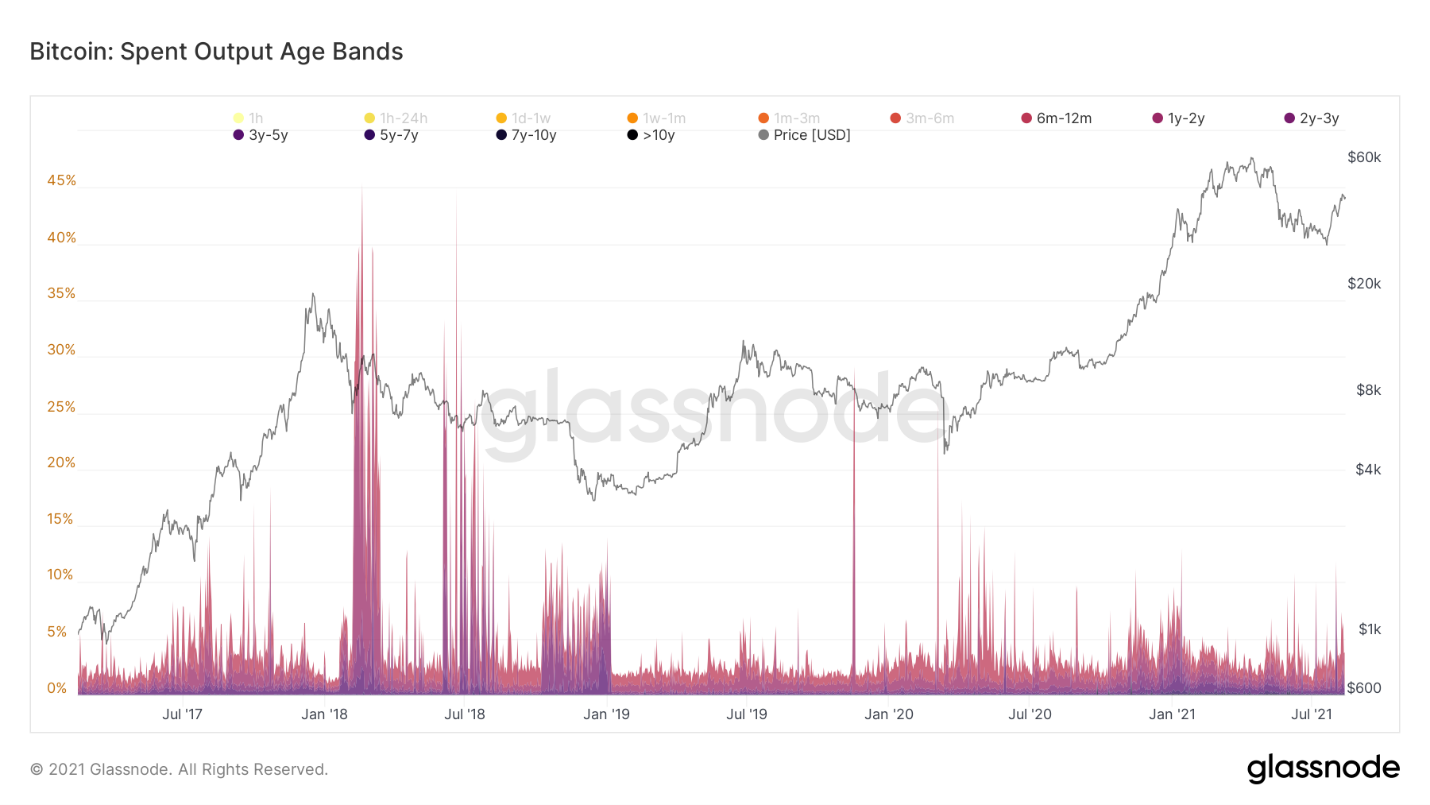
Ages of Outputs Spent
To assess the profitability of the transferred coins, you canUse SOPR (Output Spent Profitability Ratio) by filtering out outputs with less than an hour's lifetime to reduce signal noise. When the value is above 1, the coins traded on that day, on average, are sold at a profit. When below 1, sellers, on average, lose. In bear markets, the SOPR is mostly stable below 1, with this threshold serving as resistance, often signaling good times to sell. On the other hand, in bull markets, the SOPR holds above 1, consistently pushing back from this level, which often denotes good buy times.
In the last few weeks, the metricdemonstrated a classic retracement / trend reversal. After a large breakout of the threshold level, one could observe both a rebound from it as support in case of a decline in price, and a stable finding of the SOPR above 1. So far, we have received a successful retest, now we expect to see more stabilization above the threshold level, but so far everything looks good.
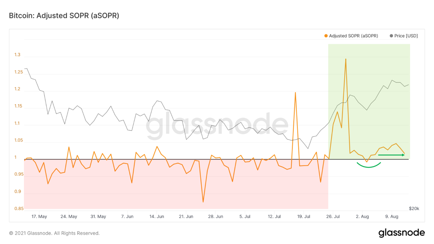
aSOPR
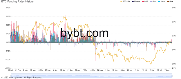
Now about the rates of financing.It is a mechanism by which the price of perpetual futures contracts is tied to the bitcoin exchange rate index (the weighted average rate of an asset across all major exchanges). When perpetual swaps are traded above the index, the funding rate is positive, and vice versa: when perpetual swaps are traded below the index price, the funding rate is negative. In other words, when everyone wants to take one side of the deal, funding encourages participants to take the other side by paying them (usually every 8 hours) a small fee to hold that position.
Such a low financing rate inCompared to the one that was at the same price levels in February, this rally is much healthier and is based on spot demand rather than derivatives.
Funding rate history
The level of leverage is also relatively small compared to what was observed in February at the same price levels. Again, this speaks in favor of the healthy nature of the current rally.
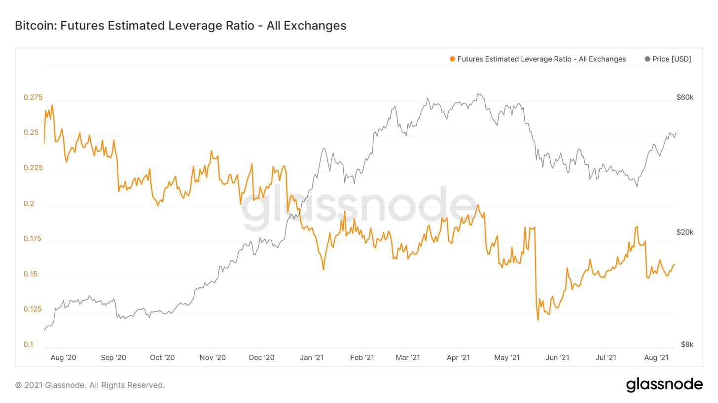
Estimated Leverage for BTC Futures (all exchanges)
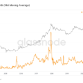
Hashrate, although far from the peak values of the beginningyears, but begins to gradually recover. This is, of course, a positive sign. Perhaps the migrated Chinese miners are gradually starting to reconnect their machines to the network. It also means better network security.

Average hash rate (7d MA)
With this hashrate recovery, the Hash indicatorRibbon has just generated a buy signal, historically one of the most reliable in the bitcoin market. A signal is generated when the 30-day moving average of the hashrate crosses above the 60-day moving average. In essence, this marks the end of the miner surrender phase, which means less pressure on the forced sell market.
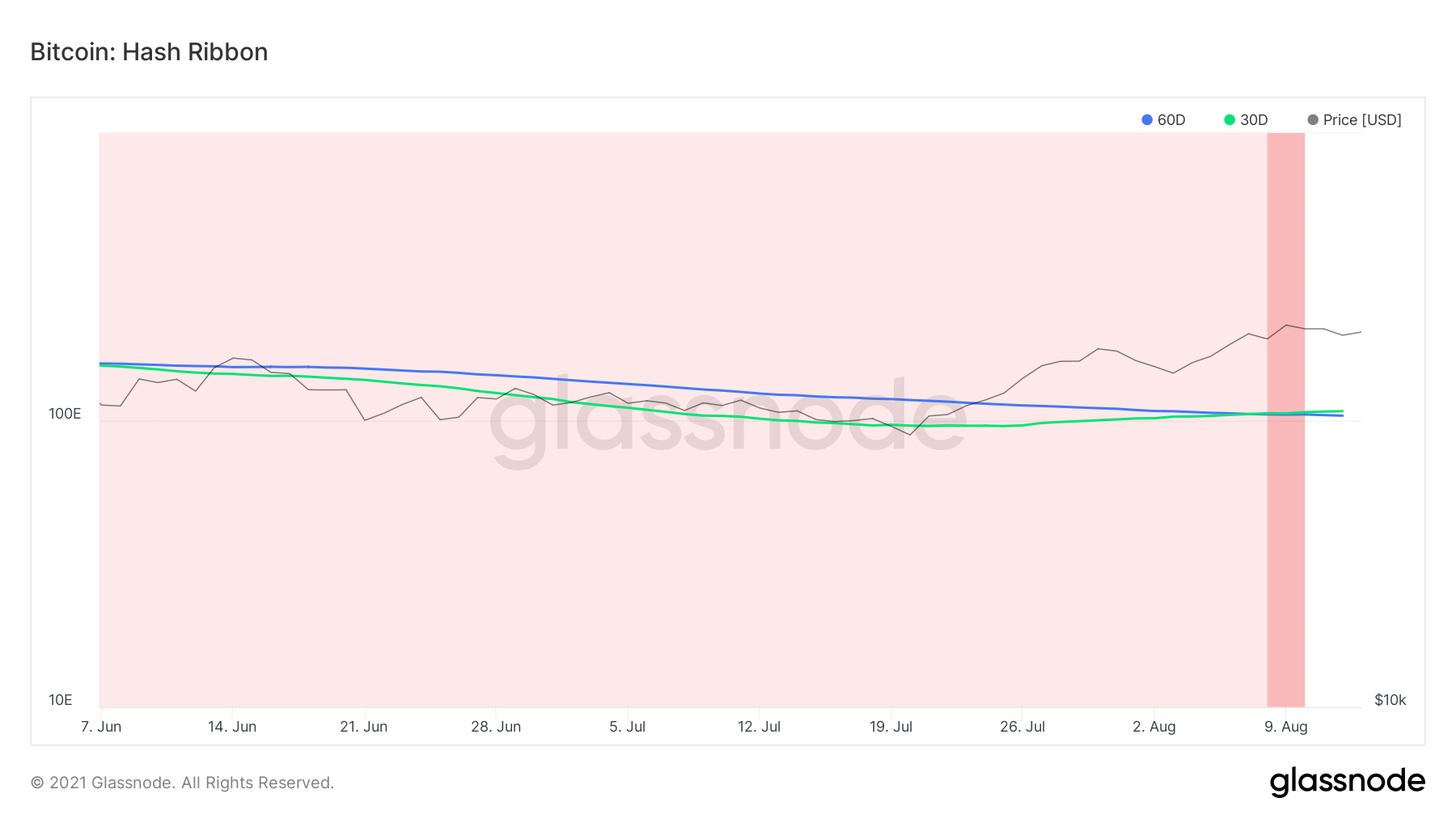
Hash Ribbon
The same can be seen in the change metric.net miner position, which tracks the 30-day change in miners' balances. There is a steady accumulation of this metric on the part of miners, probably due to the increased profitability of mining for those who stayed on the network, after adjusting the difficulty that followed the drop in the hash rate due to the shutdown of Chinese miners.
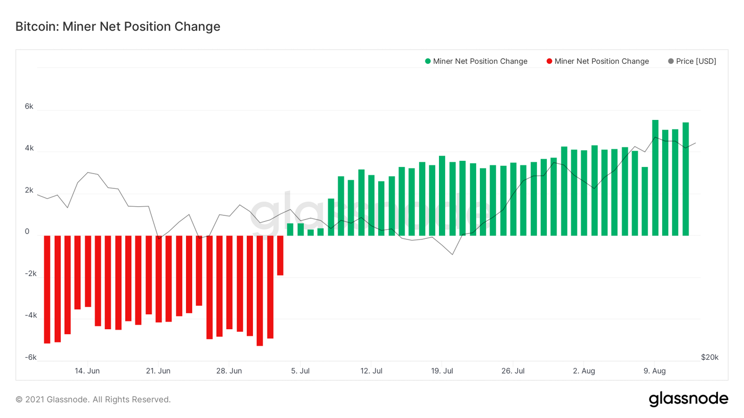
Change in net position of miners
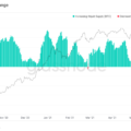
Finally, let's take a look at the number oftransactions (excluding internal movements between addresses belonging to the same network subject). Slow growth has been outlined here, but I would like to see the acceleration of this trend against the background of the rise in the price of BTC.
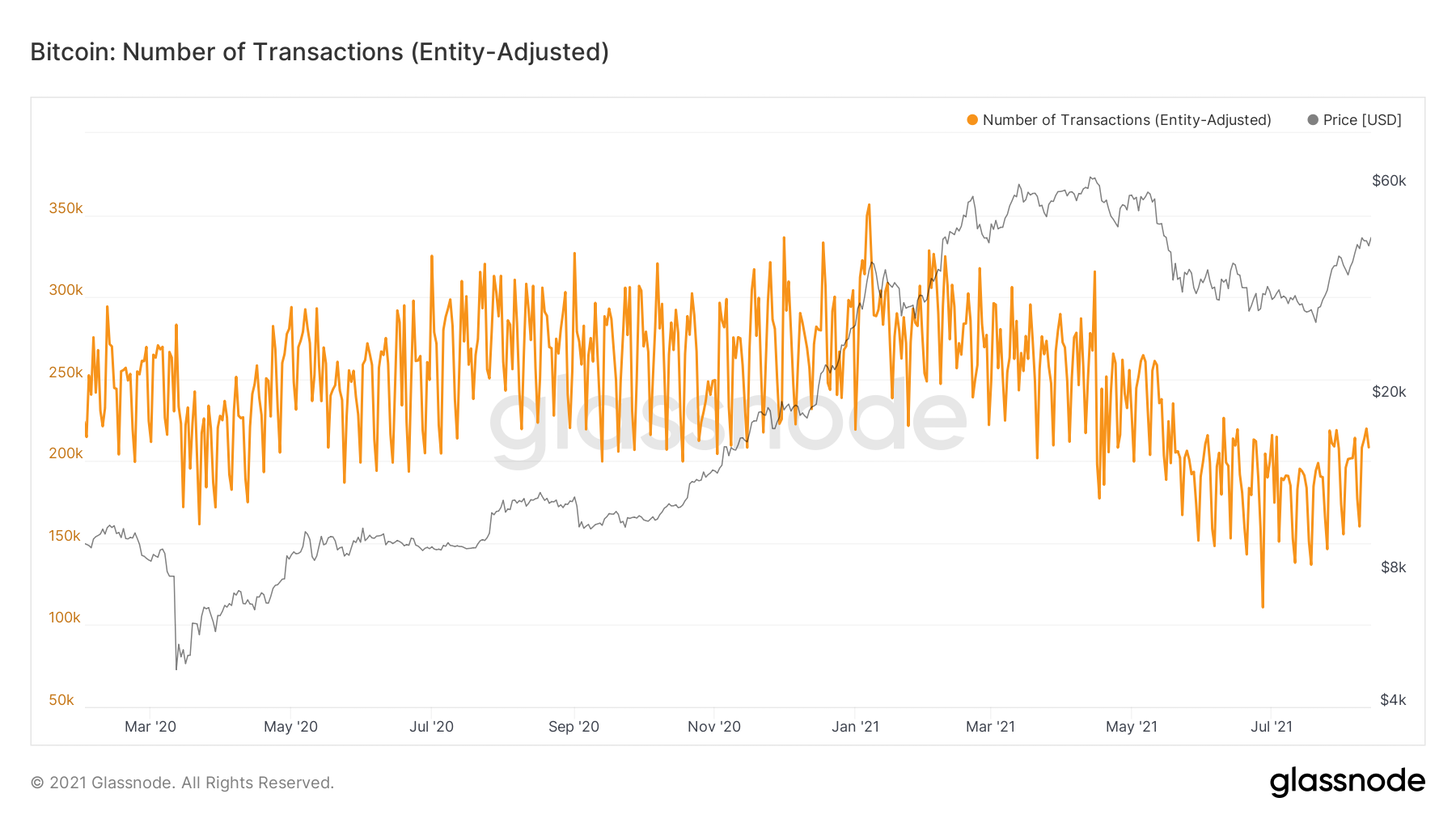
Number of transactions adjusted by user
If you pay attention to the volume of transactions indollar equivalent, we can see that, with a smaller number of transactions, they were, on average, larger. Notice the increase in remittance volume above $10 million, coinciding with the whale accumulation we discussed earlier.
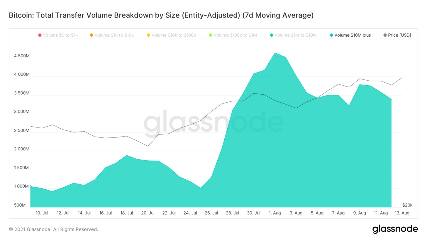
Total volume of transfers by size, adjusted for users (7d MA)
The article does not contain investment recommendations,all the opinions expressed express exclusively the personal opinions of the author and the respondents. Any activity related to investing and trading in the markets carries risks. Make your own decisions responsibly and independently.
</p>
Read this:
 Could this be a repeat of October 2020 before the bull rally? - Onchain Pulse from August 7, 2021
 Signs of Squeezing Supply - Onchain Pulse from July 24, 2021
 Sentence Compression Continues - Onchain Pulse from July 31, 2021
 Onchain Pulse | 04 May 2021
 Strong Hands Accumulate BTC Aggressively - Onchain Pulse from June 26, 2021
 Light Surge from New Whales - Onchain Pulse from July 10, 2021