In the new survey, the analyst Will Clementebreaks down the current situation in the Bitcoin market withon-chain metrics, separating signal from noise.
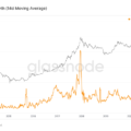
Dear readers, I hope you have a good week.After a brief raid below the range lows, it appears that the price action is beginning to reflect some of the trends I have been talking about in recent weeks. But it’s too early to celebrate. In the short term, BTC still needs to break through the $36.5K, $41-42K resistances and then rise above the 200-day moving average. Personally, I view a return above the 200-day MA as confirmation of a continuation of the bullish rally, but ideas on what constitutes a confirmation level may vary. Well, let's get to the review.
Key points:
- It’s too early to celebrate the continuation of the rally… Bye.
- RSI at 7-month resistance.
- Volatility appears to be poised for a breakout.
- The funding rate for perpetual swaps remains negative.
- Buyers with little sales history continue to actively accumulate BTC.
- Miners accumulate.
- Strong outflow of funds from OTC brokers.
- There are signs of a potential supply contraction.
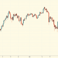
I'll start with a rare appearance in these reviewstechnical indicator, RSI (Relative Strength Index). RSI is a tool to help identify overbought and oversold zones of an asset. On the daily timeframe, the RSI has been in a downtrend for 7 months. The line of this trend on the indicator chart has already worked out as resistance 8 times. As of this writing, it looks like the market has finally managed to break through, although it remains to be seen how the day closes. But, be that as it may, this moment is worth paying attention to.
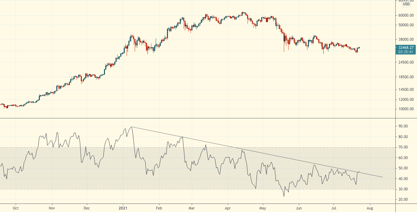
Chart executed in TradingView
Another non-on-chain indicator I follow isIs the funding rate for perpetual swaps. This is a mechanism by which the price of perpetual futures contracts is tied to the exchange rate index (the weighted average rate of an asset on all major exchanges). With a positive funding rate, longs pay shorts to keep their positions open; with a negative rate, vice versa. Experience has shown that a long period of a positive funding rate is a bearish factor, and a long period of a negative funding rate is a bullish factor. The predominantly negative financing rates have been held since the end of May. The previous period of negative rates for such a long period was observed after the pandemic-provoked collapse in March 2020. Negative funding for BTC perpetual swaps means two things: 1) traders are predominantly bearish and 2) spot BTC is being bought more actively than futures. The fact that the funding rate has remained negative throughout the local pump in recent days indicates the likelihood of a potential short squeeze.
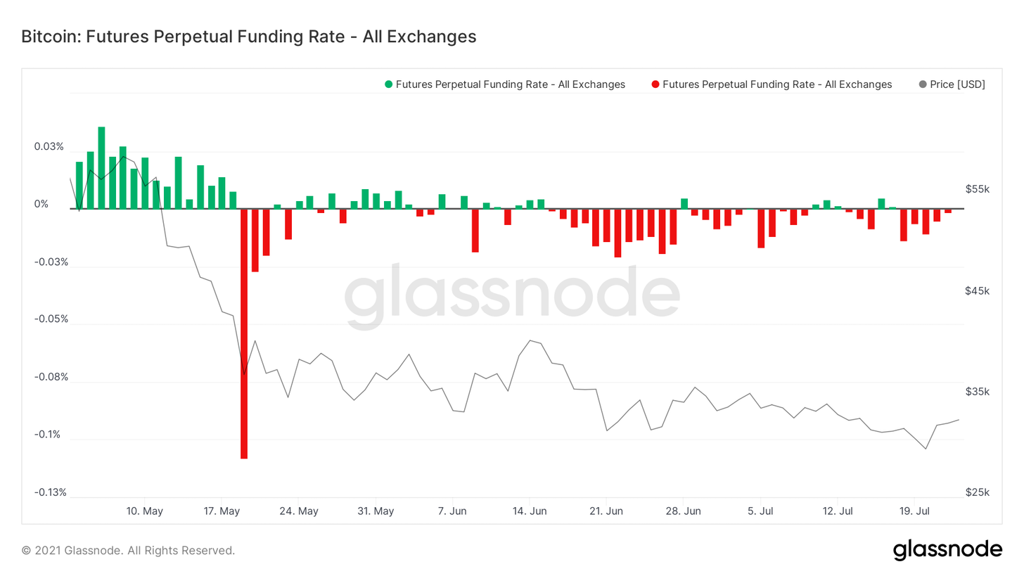
BTC Perpetual Swap Funding Rate
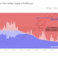
There is definitely hidden accumulation going on.The liquid supply coefficient indicates the flow of coins from “weak hands” to “strong” ones. The chart below appears to be ready for a third local uptrend. In recent weeks, this indicator has moved from a slow rise to a more aggressive accumulation. Bitcoin's supply shock is currently equivalent to the levels seen this spring at $50-60k per BTC.
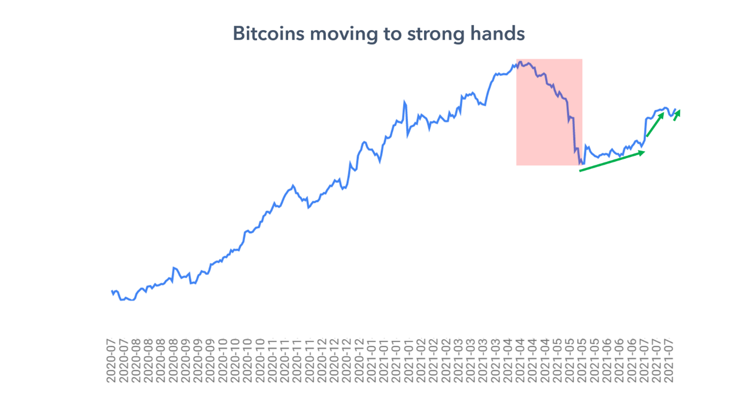
Liquidity supply ratio. BTC is flowing from "weak hands" to "strong"
By zooming out, you can see how the fallthe liquid supply ratio correlated with the fall in the exchange rate after the peak in 2017 and during the surrender of 2018. It can also be seen how a strong reduction in liquid supply drove the price of BTC up in 2020. However, there was a reversal in May: the young whales, apparently leading the sale, most likely closed the previously opened impulse positions or adhered to a market-neutral strategy, making money on the spread between the spot and futures prices. After a huge wave of coins that increased the volume of liquid supply, it became clear that the process of re-accumulation is likely to take some time. In recent weeks, as mentioned above, this process has shifted from a slow rise to a more aggressive accumulation.
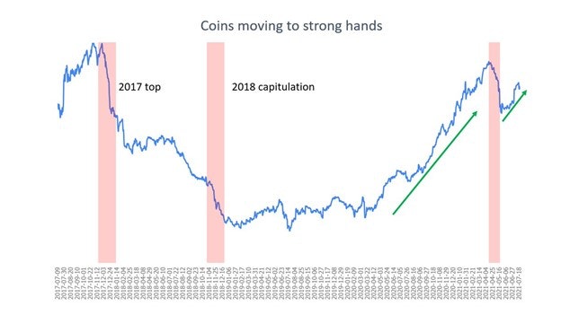
Liquidity supply ratio. BTC is flowing from "weak hands" to "strong"
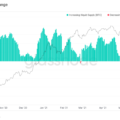
Next in line is the indicator that I created myself:RSI of BTC outflow from OTC brokers. It shows the strongest buy signal since last July. Intraday data of capital inflows / outflows from OTC brokers are quite noisy, so the indicator shows rather obvious outliers of strong outflows of funds from OTC brokers or the absence of such. Essentially, it is an alternative way to measure the purchasing power of institutional and wealthy private investors. This indicator has given some pretty good signals over the past year, but the reason I am focusing on the current signal is how strong the signal is.
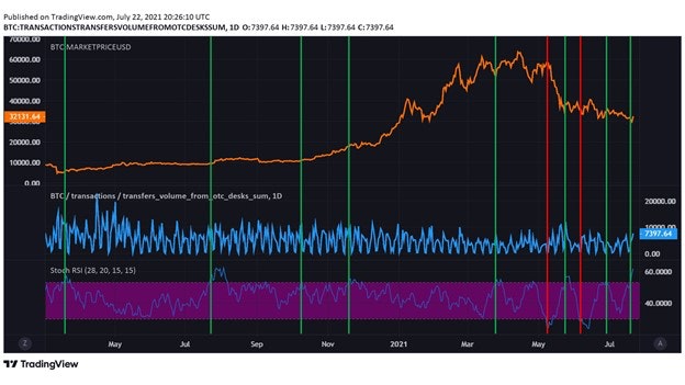
RSI of BTC outflow from OTC brokers
Here's another way to look at the same metric, but through the ratio of capital inflows and outflows from OTC brokers.
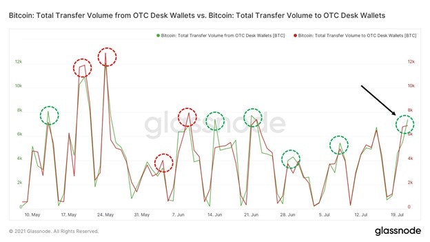
BTC inflow / outflow from OTC brokers
Delving deeper into the question of which categoriesusers accumulate BTC, this is what the graph of accumulation dynamics looks like, broken down by four main cohorts of users. I would add more, but Glassnode has a limit on the number of graphs that can be compared at once. It is probably necessary to clarify here that I am using the surrender of May 19, 2021 as a starting point for the figures given. So, during this period we see very strong buying demand from retail investors, as well as buying from mid-sized entities with capital of 10-100 BTC: small buyers added +37,266 BTC, “middle class” +29,280 BTC. As for the big guys, the dolphins and sharks are actually gradually distributing the coins, reducing their holdings by 17,980 BTC. The number of coins purchased by the 100-1000 BTC cohort of users at the start of the current bull market was unprecedented. Finally, whales with a balance of 1-10 thousand BTC have added 110,384 BTC to their holdings since May 19th.
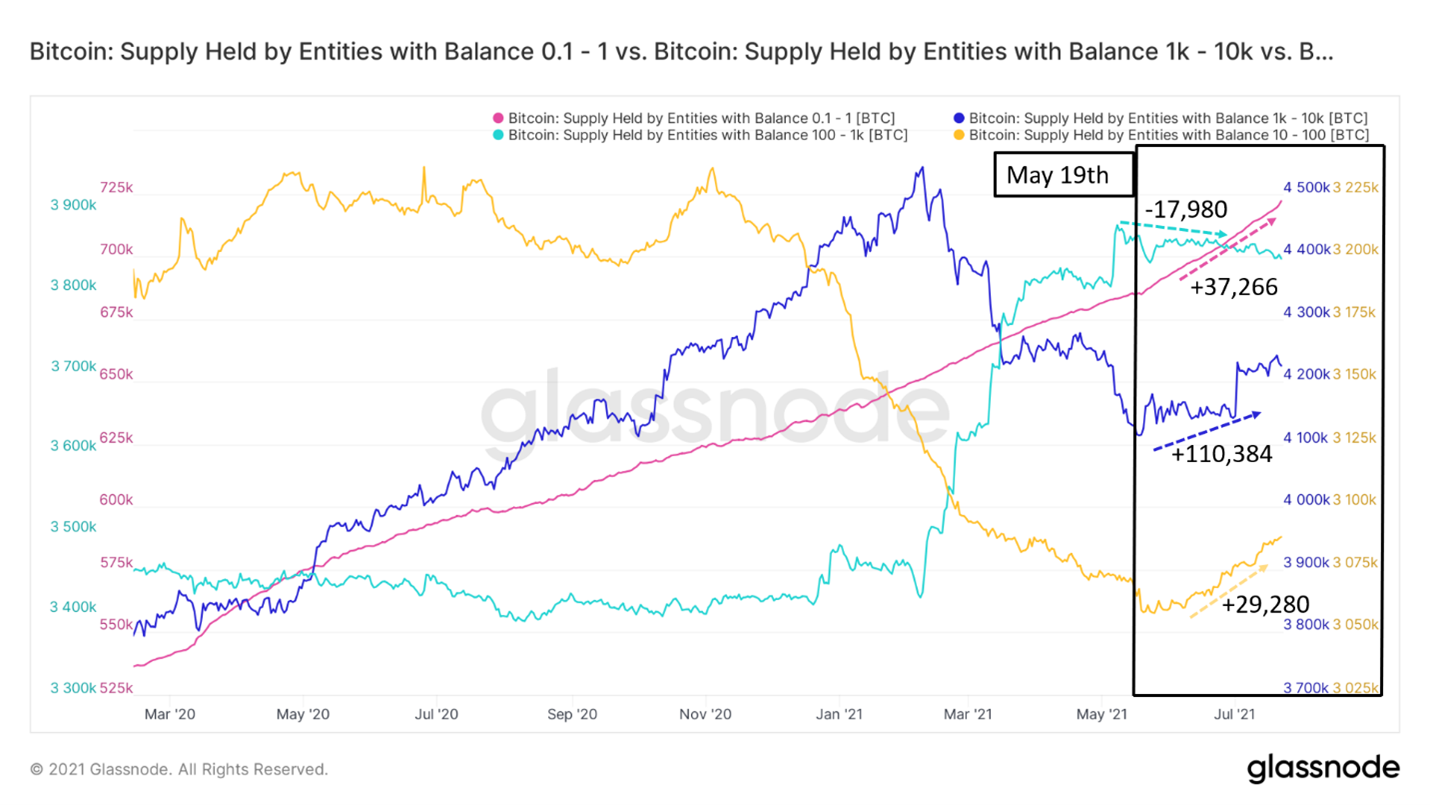
BTC supply held by four main cohorts of network actors
In general, sales mainly come from moreyoung market participants. This can be seen in the dynamics of the CDD and dormancy indicators, but during periods of low trading volumes, they naturally decline. So I suggest looking at ASOL, which is a measure of the average life of an output spent. In the current situation, this is the best way to determine the primary source of sales. ASOL essentially measures the average age of the coins sold. A downtrend suggests that the average age of the coins sold is getting lower and lower. Weak hands.
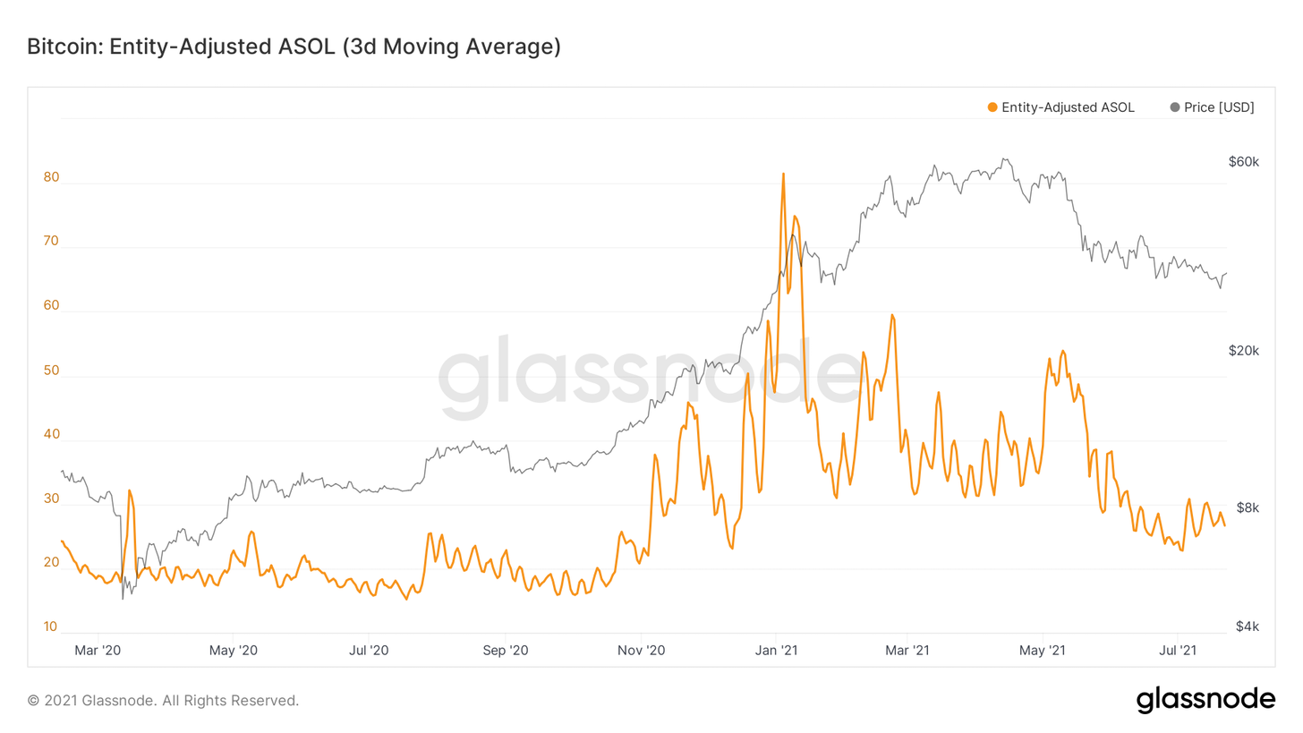
ASOL adjusted for users (3d MA)
At the same time, sales did not come from miners.This conclusion can be made when considering the volume of transfer of funds from miners to exchanges and changes in the net position of miners. As you can see, the volume of BTC transfers to the exchange by miners has been in a downtrend since February. And despite the local outburst due to the ban on mining in China and the migration of hash power provoked by this, the trend continues to decline, which indicates a decrease in sales pressure from miners.
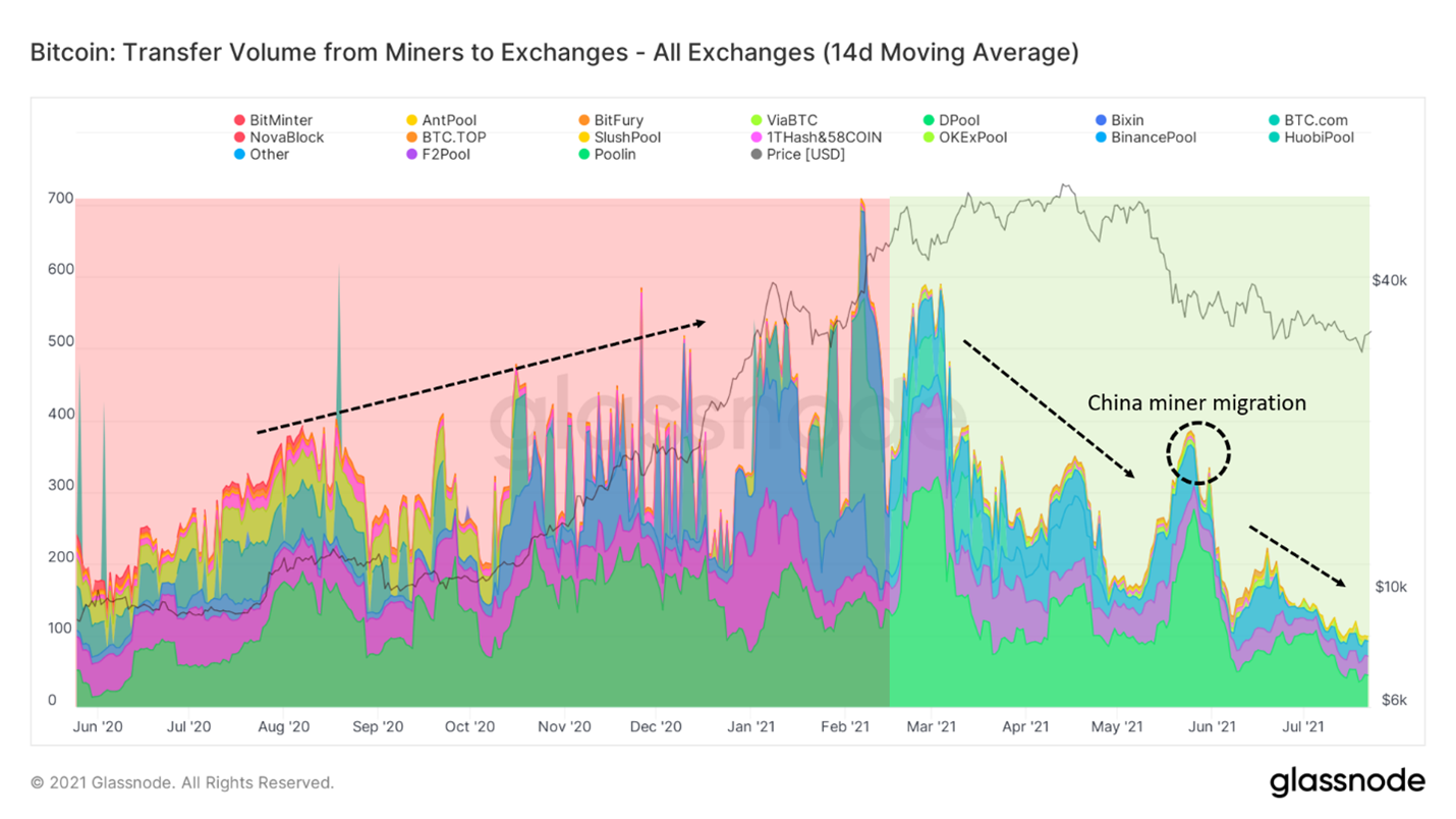
BTC transfer volume from miners to exchanges
And here is the change in the net position of miners. This indicator reflects the 30-day change in their balances. It also confirms the trend towards accumulation on the part of miners.
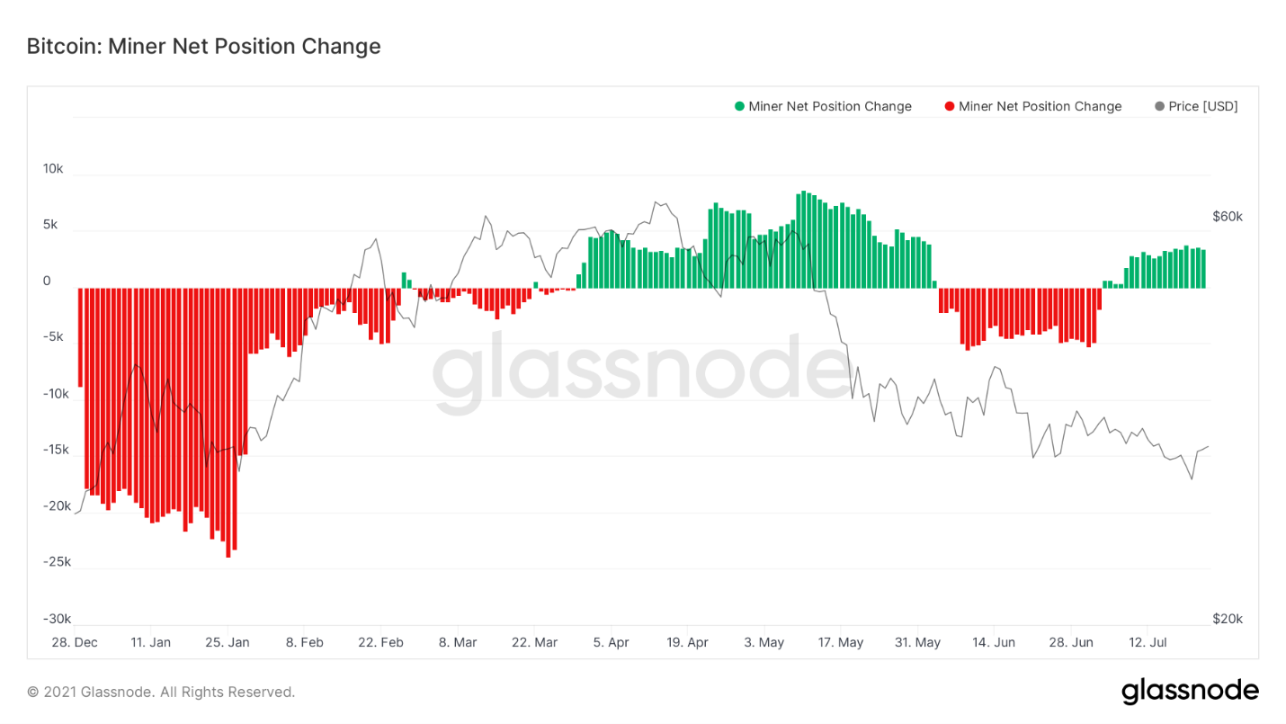
Change in net position of miners
Finally, one of my favorite charts:distribution of UTXO by selling price. In other words, it shows how many Bitcoins have moved at a given price level. The market briefly looked into the abyss, falling below $30K, but returned to the middle of a huge zone of trading volume. And notice that huge volume bar at $31,370, the highest since $10,300.
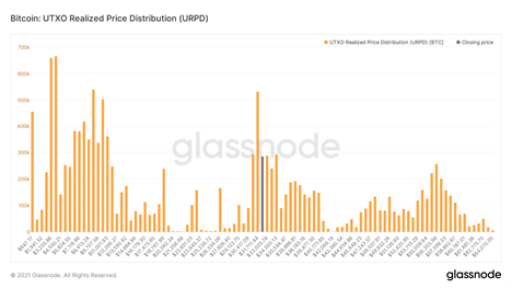
Distribution of UTXOs by selling price
That's all for me. I hope you enjoyed the review. Have a great weekend everyone (and they promise to be fun).
The article does not contain investment recommendations,all the opinions expressed express exclusively the personal opinions of the author and the respondents. Any activity related to investing and trading in the markets carries risks. Make your own decisions responsibly and independently.
</p>
Read this:
 The Calm Before the Storm - Onchain Pulse from July 17, 2021
 Light Surge from New Whales - Onchain Pulse from July 10, 2021
 Strong Hands Accumulate BTC Aggressively - Onchain Pulse from June 26, 2021
 Onchain Pulse | May 11, 2021
 Onchain Pulse | 04 May 2021
 Approaching Pain Threshold: On-Chain Pulse | June 1, 2021