Jarvis Labs' Ben Lilly on the difficult choices facing the Fed and the tool they are using to indirectlyinjecting liquidity into the market.
Mr. Arthur Hayes (legendary co-founderBitMEX pointed out in a recent article that it is the number of dollars that drives the markets, not the exchange rate or the cost of dollar borrowing. This essay gave me an idea, the development of which logically led me to the topic of the tools used by the Fed to inject liquidity indirectly into the market, as well as the consequences of such injections. It is also important that this remains the main tool for managing the economy between a rock and a hard place, when alternative routes look like minefields.
As we will see below, the Fed's mission is literallysense is impossible. Not to mention that time is running out. I am writing this text when there is still a day left before the speech of Jerome Powell (Fed Chairman) at the Jackson Hole conference on Friday, August 26, and the markets are in uncertainty, but rather expect the Fed to continue its tough policy. You will be reading this after the conference, and probably in a situation of greater clarity. However, we are talking about much more long-term trends. To a large extent, this post continues my own trilogy on market macrocycles, building on the ideas and models described in it. So today’s speculation about where the Fed is heading and what that means for the crypto markets won’t get old that soon anyway.
Returning to what Mr. Hayes wrote about in the article«Teach Me Daddy» (original / translation)… He said that the number of dollars in circulation matters much more than the price of these dollars. A simple example: let's imagine there are five people in a room, they buy 10 NFTs and each has $100. The market will find some price for these NFTs, which will be limited, among other things, by the number of dollars in the room. If you add more dollars to a room, NFT prices will rise. This kind of cause-and-effect relationship works very directly.
Those who have read Macrocycles 3:three-factor inflation” may remember similar reasoning in the context of inflation. In that essay, I discussed in some detail the inflation equation P = (MV)/Q, derived from the basic equation of the quantity theory of money:
MV = PQ
Where:
M = money supply;
V = velocity of money supply;
P = price level;
Q = number of transactions of goods and services.
But don't worry, I won't bore you with academic topics again. Just reminding you of the equations…
The variable M here denotes the number of dollars in circulation, and when it increases, then, all other things being equal, prices (P) increase. The number of dollars is inversely proportional to the value of money.
The explanation for the value of money is a little different,because it is also affected by performance. For example, you borrow money to earn more… And the higher the cost of borrowing, the more you need to earn. Otherwise, how will you repay that original loan? The people in our imaginary room "in a vacuum" buying and selling NFTs could use such credit to create a trading platform to facilitate transactions, or perhaps develop some accessories that could be sold to NFT holders.
That is why in our discussion of Fed liquiditywe can save the discussion of the value of money for another time and focus on the variable M (the amount of money) and how it affects asset prices.
With that out of the way, let's now look atFed liquidity chart. For those who haven't read Hayes's article, Arthur showed a graph that serves as an indicator of the amount of Fed-related money in the market. But let's move step by step. This way we can better understandwhythis acts as market liquidity… and why the Fed's runway is truly running out.
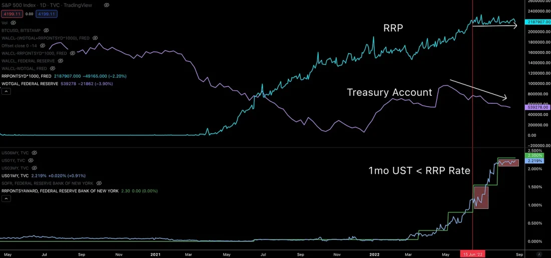
For starters, here is a chart of the Fed's balance sheets.US Reserve System (green curve) compared to the S&P500. This green line is essentially the Fed's upper liquidity line, which generally speaking affects asset prices.
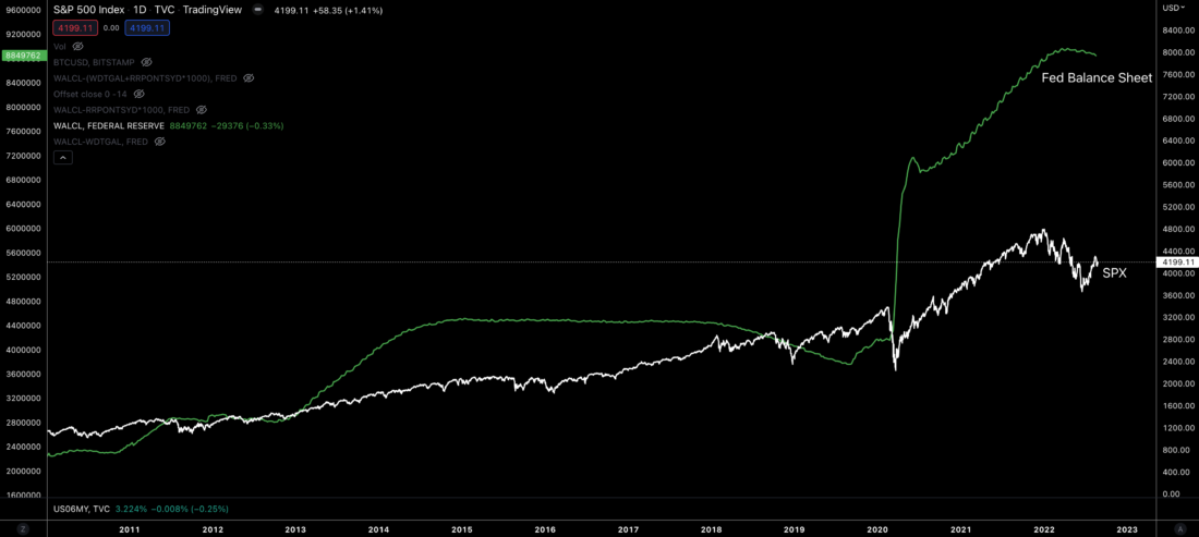
Looking at what constitutes thisbalance, we will see that part of it is actually a US Treasury account. So as the Ministry of Finance issues new bonds with different maturities, from 1 month to 30 years, the balance of this account grows.
It's a kind of savings account that can be used to finance spending or legislative initiatives designed to boost economic growth - in theory.
The blue line in the chart below is the Fed's balance sheet minus this Treasury Special Fund. Or, in other words, the balance of the account of the Ministry of Finance can be represented as the area between the green and blue curves.
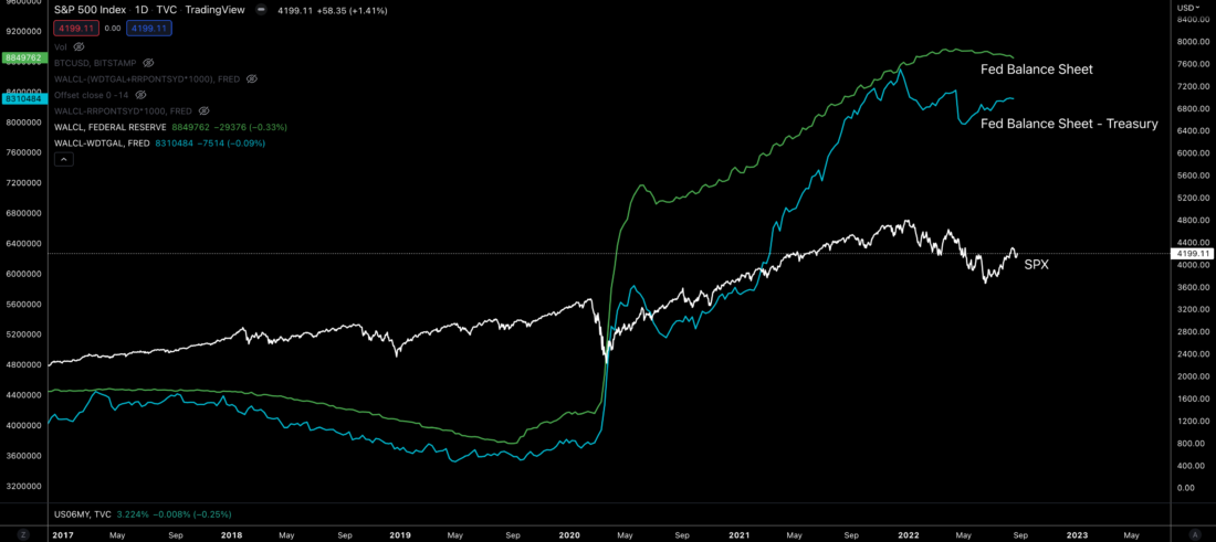
Next comes the more opaque part of the financialsystems. This is the reverse repo market (RRP). Here, very large banks can access the most secure collateral on the market overnight.
If you are a large institution with $100 billion in capitaland access to RRP, then you can get a small return by transferring cash capital to the Fed, and in exchange receiving reliable collateral in the form of US Treasury bonds (Treasuries).
In other words, the area between the green and yellow lines is the total equity in RRP.
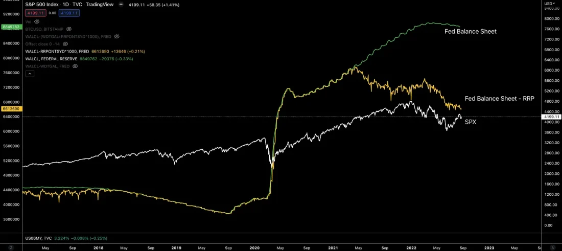
By subtracting the Treasury account and the capital held in RRP from the Fed's total balance, we essentially arrive at the sum of the Fed's "net" balance.
This is what it looks like…
Pretty slim.
But we will not stop there. Let's dig a little deeper because it will give us a better understanding of the battle the Fed is fighting.
The first question to be dealt withis how this Treasury account and RRP balance generate capital inflows into the financial markets? Or, more simply, how do they increase the amount of money in the market?
To begin with, access to the reverse repo marketOnly some of the largest institutions and other select insiders can get the Fed. The rest, who have cash on their balance sheet and who need to get some profit on them, are forced to look for the next best tool - short-term treasuries. Of these, the best are, as a rule, one-month bonds. Why? Nobody wants to hold long-term debt in the face of rising rates. If you can free up some cash next month to possibly get a higher return, that's ideal. This is why long-term treasuries tend not to rise when rates rise.
So capital not privileged enough toaccess to RRP, forced to look for the next best opportunity. This relationship is important to understand. To look at it a little more, let's look at the relationship between the amount of capital in RRP and 1-month Treasuries.
Purple curve at the bottom of the chart below −This is a graph of the yield of 1-month Treasuries. The green line it converges with is the RRP rate. When these lines converge, capital begins to flow into RRP. And shortly after the green line (RRP rate) began to rise, cash began pouring into the Fed's windows in full force as banks craved the safest yield available. The Fed also sought to get rid of some of this excess liquidity.
Then in Q1 and Q2 this year we saw another wave of RRP capital inflows as the RRP rate rose above the yield on 1-month debt.
This is important to note because the 1 monthprofitability became negative. And to avoid this, the Fed stepped in and absorbed almost a trillion dollars of demand. This reduction in demand contributed to an increase in the rate on 1-month debt. You can see this in the «Hikes» sector. below.
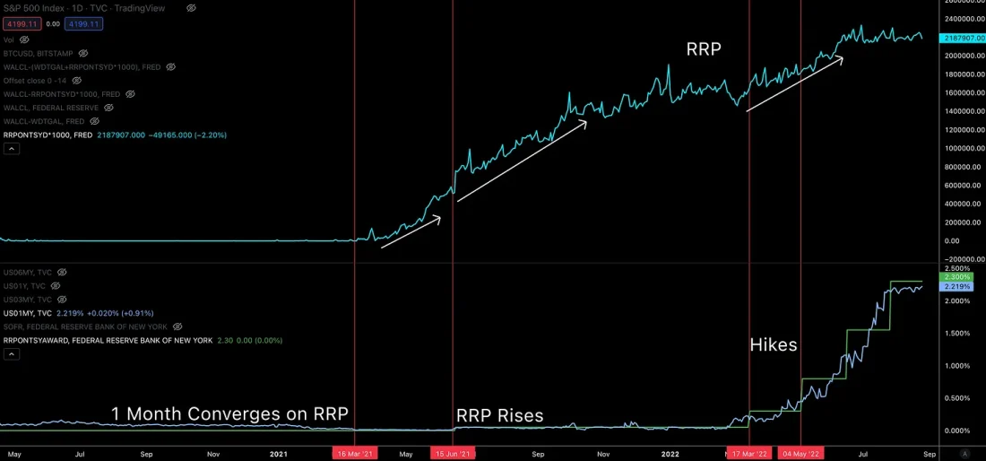
But this absorption of demand did not last forever.Notice in the chart above that the last two increases have taken the green line (RRP rate) above the purple line (1m Treasuries). Now it is below the RRP rate level (light blue line) and remains almost unchanged. That being said, it doesn't appear that RRP is short of cash. Commercial banks have $3.5 trillion on their balance sheets. Which indicates that the Fed will likely deny bankers access to RRP.
Why do they need it?Such a refusal leads to the fact that the capital, which is in search of the most reliable return, triggers a domino effect. Without access to RRP, this capital is channeled into 1-month treasuries - not ideal, but also good.
This surge in demand for treasuries again leads to a decrease in yield - now below the RRP rate. If the Fed had not refused the bankers, then the rate on 1-month debt would not have dropped so much.
The development of this dynamic is shown below. I noted the periods when the yield of 1-month. Treasury was below reverse repo rates.
This deployment in the market creates a kind ofcascade effect for cash capital. Capital, deprived of access to RRP, is forced to look for the next best option - further on the risk curve. Part of the capital previously placed in 1-month treasuries, in turn, can be forced out into corporate debt with a maximum rating. Capital formerly channeled into corporate debt could also move down a notch in terms of credit risk. Also, those who invest in blue-chip stocks that pay solid dividends can be pushed down a notch on the risk curve to other stocks.
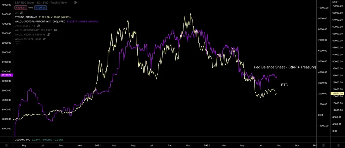
And in this process liquidity increases,passing through markets… including the crypto-asset market. This is partly why the crypto market, stocks, the dollar currency index, and seemingly much of the financial system are moving in unison. The number of dollars in the market plays a decisive role.
I like to compare this action and reactionmarkets on it with pumping a plumbing plunger. Jerome, of necessity, uses his financial plunger to push capital into the markets and back into the Fed.
Before continuing, let's briefly summarizesubtotals. The Fed can inject liquidity into the markets by restricting bankers' access to reverse repos. This increases the demand for the next best form of collateral, Treasuries, which in turn drives down their returns. When inflows to capital markets increase by limiting their access to reverse repos, these flows trigger a redistribution cascade down the risk curve. Buyers being forced out of the familiar tool are looking for the next best alternative, moving down the risk curve.
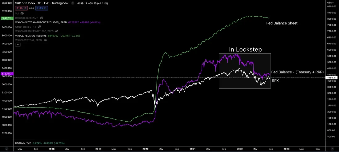
That is, the Fed's net liquidity - the purple line in the chart below - helps us understand when more dollars are entering the market.
And we are coming to what I consider to be a ticking time bomb and a key aspect that will soon have to come into play.
Time is running out
Those who have hacked their way through my series on macrocycles may remember an article called "Return Atrophy". In it, I wrote about yield inversion using charts like the one below.
The graph shows the yield for all Treasurieswith maturities ranging from 3 months to 30 years and the federal funds rate (white line at the bottom). To correlate this dynamics with market movements, a graph of the Nasdaq index has been added at the top.
Take a look at the chart before we get into the discussion, because this is one of my favorite charts for navigating macro market cycles.
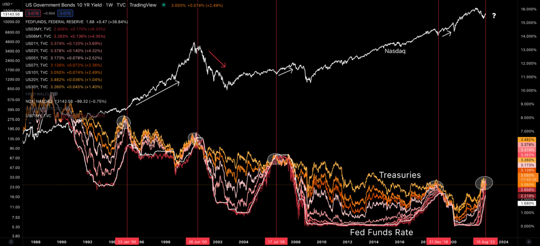
The first thing to pay attention to isareas marked with white circles. These are the moments when the yields on treasuries with different maturities overlap each other. That is, during these periods, 1-year US government bonds offer the same yield as 10- and even 30-year ones. Intuitively, this does not make sense, and therefore, as a rule, this is a signal of stress in the market. And just in case you missed it, the signal is still there.
Looking back at history, we can state thatthree out of four times this has happened, the markets have made record highs in fairly short order. But yes, in the episode next to the dot-com bubble, it didn’t turn out so well.
As for the markets, they seem to be quitewell positioned for big down moves - that's what I heard. And now that the Fed can use its magic plunger to pump liquidity into the markets, we seem to be even better prepared for this than we were two decades ago.
But here's the thing…
The rates cannot go higher. They literally hit the ceiling. This means that if the Fed continues to raise ratesANDwants Treasury yields to rise, then the government will have to issue a lot more bonds…ORThe Fed will have to raise RRP rates to reduce demand for Treasuries.
And this is where problems arise, because the government is already spending a lot on debt servicing and no improvement can be expected here in the foreseeable future, especially with rising rates.
For context, someone recently recalled a quote fromLuc Gromain (who drew this observation from Rogoff and Reinhart): "Since 1991, all 18 other governments with budget deficits over 11% of GDP and debt-to-GDP ratios over 110% have defaulted within two years."
In the US the ratio is over 120% and if the rate were to rise another 75 bps the deficit would be around 11% of GDP.
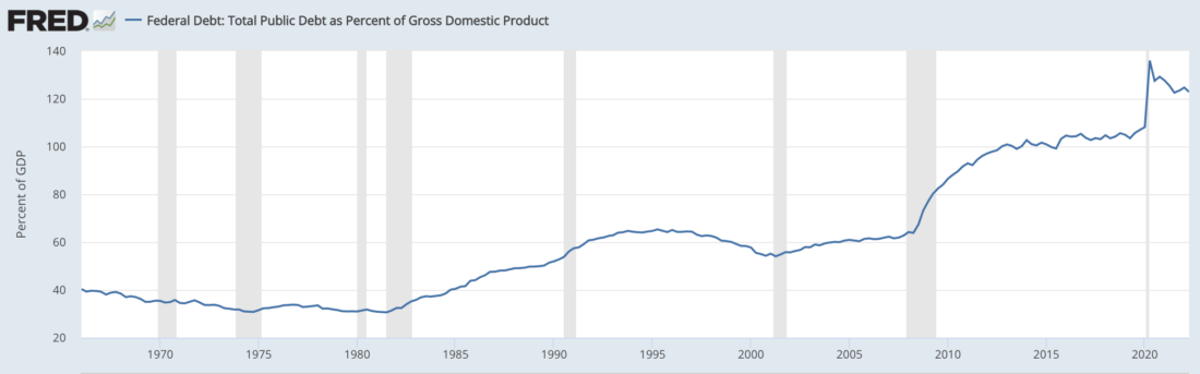
To me, that means there's still 25-50 bps of headroom left. Anything higher would mean the Fed is playing with fire.
In addition to this, my confidence is thatwe are close to the maximum of rate hikes, the Eurodollar market (see the article "The next phase of the markets") is already starting to price cut rates for the second half of 2023.
This tells us that the Fed is coming to an endtime to unload trillions of dollars of RRP liquidity, and she can't just leave it as is. And if it does unload liquidity, then yields will be distorted even more.
So where are they going to channel those trillions of dollars of liquidity? Here we find that there is no good answer to this question.
The US government is becoming unstable from the point of viewin terms of debt burden. So issuing even more bonds to absorb capital is not the best option. Releasing it to the market would cause asset prices to rise vertically, which would run counter to Powell's efforts to calm markets to combat inflation… Not to mention, it would lower yields and defeat the purpose of raising rates.
So now?
One of the ideas lying on the surface is buyingexternal debt. This would help reduce the high price of the dollar against other currencies and commodities. And therein lies the problem. The Fed does not want to raise commodity prices because it is fighting inflation. This runs counter to domestic political issues.
Not to mention it will drive up pricesfor gold. And perhaps the last thing the US wants is benefits for its sworn enemy, Russia, because its currency is now even more firmly pegged to commodity prices.
However, the text is already quite long, and such dispersion into the spheres of global politics is also a clear sign that it is probably time to wrap things up.
Time is running out, and the Fed needs to choose the least ofangry, in the direction of which they will apply their financial plunger. I am writing this on Thursday and I hope that in Friday's speech, Powell will clarify this. If not, I will continue to monitor the Fed liquidity indicator described here to see when more capital starts to flow into the market.
P.S. A small side note.My guess is that the US will point its plunger at Japan and Europe, as many expect. The reason is that the United States is running out of opportunities on the global international stage. In addition, they began to send more government officials to Taiwan, causing concern in China. Not to mention the billions of dollars sent to Ukraine to buy weapons.
It doesn't look like the United States is goingretreat. Why? I think this is partly due to the depletion of the Fed's resources. In addition, creating political allies may seem wise in their eyes in case they seek war as a way out of this financial turmoil.
If the US does start buying foreign debt, it will most likely lead to a fall in the dollar and an increase in asset prices. But time will tell.
BitNews disclaim responsibility for anyinvestment recommendations that may be contained in this article. All the opinions expressed express exclusively the personal opinions of the author and the respondents. Any actions related to investments and trading on crypto markets involve the risk of losing the invested funds. Based on the data provided, you make investment decisions in a balanced, responsible manner and at your own risk.
Based on source
Read this:
 CEX.io – Crypto Mania or Hidden Cheating!
 The US Navy has created a weapon that suppresses the desire of a person to talk
 Boeing develops a 250 kW laser weapon and a supersonic missile defense system
 New laser weapon can shoot down 60mm mortar rounds
 Japan develops mobile laser weapons to counter drone attacks
 How bearish trends unfold in the stock market