In the new survey, the analyst Will Clementebreaks down the current situation in the Bitcoin market withon-chain metrics, separating signal from noise.
Dear readers, I hope you have a successful week.Bitcoin is showing strength, but now we are waiting for this momentum to continue over the next week. We will consider the key levels from the point of view of on-chain indicators, which are worth paying special attention to. Let's move on to the review.
As usual, I will immediately list the key points:
- The BTC price is still consolidating at the resistance at the top of the multi-month range.
- Each user cohort shows net savings, but retail investors are leading the way.
- Both the qualitative and the quantitative measures of the supply shock / deficit show strong upward trends.
- On-chain activity is still low, fewer transactions, but larger on average.
- The market is trading in profit, with the SOPR showing a rebound from 1, which I mentioned as a desirable sign of strength in my last review.
- Full reset in Dormancy Flow ratio.
- Continuation of the general trend towards accumulation among miners.
What to look for:
- The possibility of another retest of the mid-range around $35-37.5 thousand remains, however, in my opinion, the likelihood of this is low.
- The $42K breakout is a breakout of the on-chain volume cluster.
- $45 thousand - 200 days. M.A.
- $48-50 thousand - key structure of TA, important level formed during distribution, round number / psychological level.
- $53K is the “middle of the channel” in the on-chain BTC price model and has historically been the defining level for the price trend.
- A potential buy signal in the Hash Ribbon.
- Will long-term owners aggressively dump their coins at the first liquidity to exit?
- A stabilization of the SOPR indicator above 1 would be a good sign.
- An increase in on-chain activity and a filling of the mempool would be a good sign.
First, let's take a look at the URPD(distribution of the UTXO realized price) - in fact, an on-chain volume profile. This metric shows the amount of BTC moved at a given price level. The market has carved a path through this re-accumulation zone between $ 31K and $ 42K; 21.71% of Bitcoin's circulating supply has been moved within this range to date. At $ 39.5K alone, 2.61% of available supply was moved - the highest volume column after $ 3.8K.
As potential resistance levels on the way up, I would single out $ 42K (at the time of writing the review, the breakout has yet to be confirmed) and a 200-day moving average at ~ $ 45K.
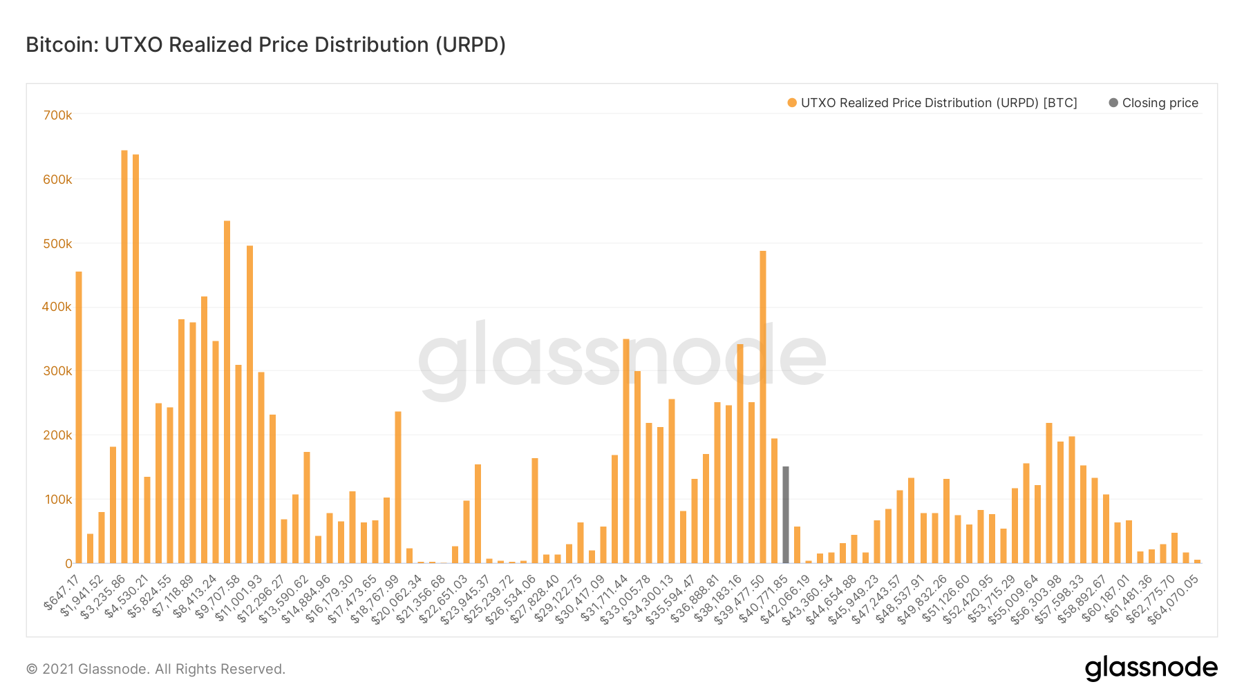
UTXO realized price distribution
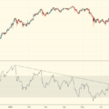
When the market price falls below the realized price- this is an excellent signal to start active accumulation at the potentially low point of the market macro trend. This is due to the fact that the price is below the average price that investors paid for their coins, that is, the market is by definition in surrender.
Reaching the orange and red lines in thisthe price model has historically signified severe market overheating and euphoria among investors. A price rise above the yellow line has historically served as confirmation of the strength of a bullish trend. In 2013, after breaking through the yellow line, the price went into vertical growth, while the bear market began after falling below this line. In 2017, it served as resistance before it was turned into support, after which the market moved into the final phase of the bullish trend. This same line acted as resistance for the dead cat bounce in 2018. It also served as support in early 2021 and marked the transition to a serious correction in May, and now it would be good to see a break above this level to confirm the strength of the trend. Today he is at ~ $ 53 thousand.
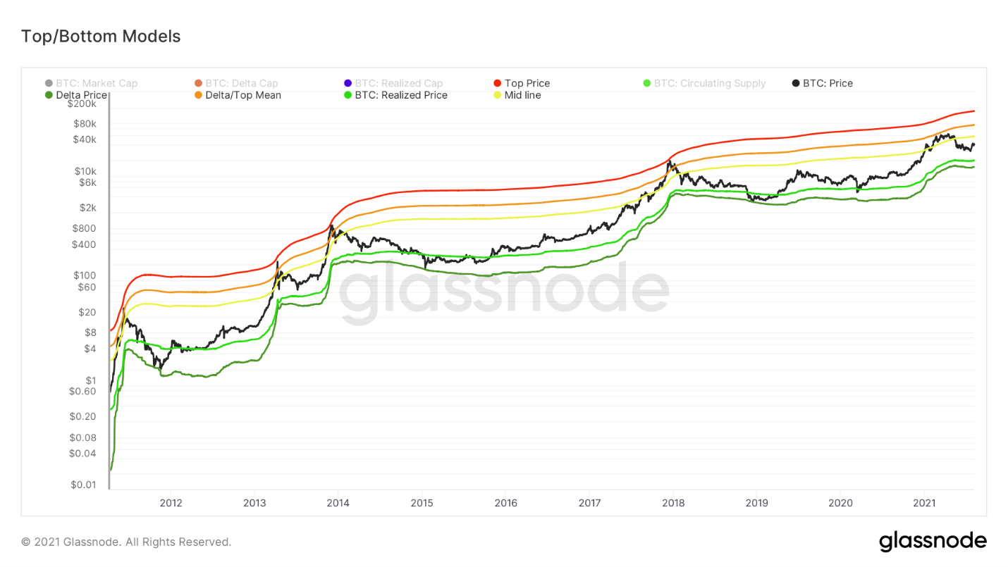
On-chain BTC price model
The accumulation continues, and see thatconfirmation can be done in different ways. The blue curve in the chart below shows the Illiquid Supply Shock Ratio, which tracks the movement of coins from liquid actors (weak hands) to illiquid ones (strong hands). The purple curve is the Exchange Supply Shock Ratio, which tracks the supply held at exchange addresses versus total circulating supply. Both metrics show strong growth, and the price of BTC is somewhat lagging. I am still patiently waiting for these huge multi-month discrepancies to be fully reflected in the price.
It should also be noted that the RSI indicator forIlliquid Supply Change RSI also signals a buy zone in terms of a macro trend. I'm not including the picture this time, but if you're interested, you can see it in the last issue.
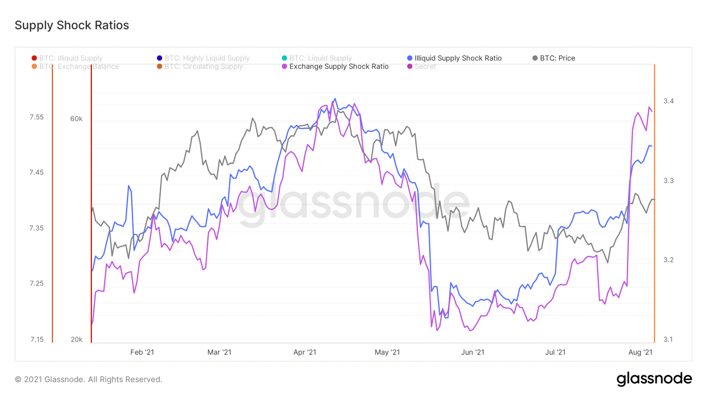
Supply shock odds
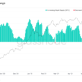
When breaking down the demand for BTC by sizeUser capital shows that almost all cohorts demonstrate strong accumulation. The cohort of small retail users in particular caught my attention. This metric is obtained by dividing the number of all on-chain entities with capital less than 10 BTC by the total circulating supply. The result provides insight into how much of the total supply is held by retail investors. And this figure has been showing almost J-shaped growth since the end of May. This, along with new highs in user growth, indicates a healthy increase in network adoption and coin distribution.
Note:the net increase in the number of users is in an upward trend, while the number of new network entities is on a downward trend. This means that the number of inactive network actors is decreasing even faster than the number of new actors. In my opinion, this indicates that new users who come to the network remain in it.
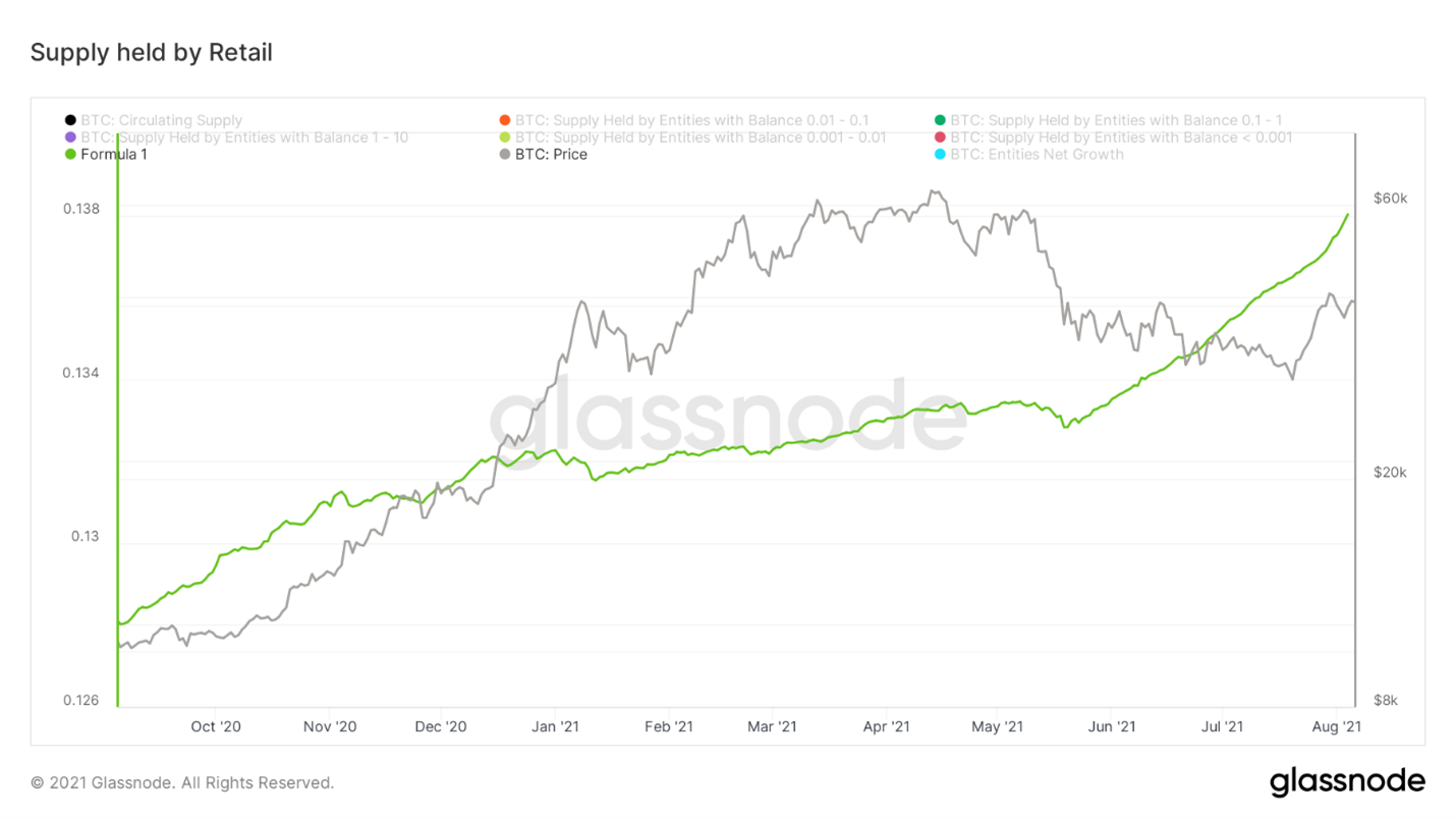
Retail Investor Hold Offer
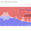
On a similar note, let's pay attention tothe dynamics of the distribution of supply between short-term and long-term owners, which we have been following for some time. The share of long-term investments continues to grow, while the share of short-term investments is decreasing. This means that a) short-term users mature to the 155-day (5 months) threshold and move into the long-term category, and b) short-term users make up the majority of sales. And metrics like CDD (coin days destroyed), Dormancy (coin downtime), SOAB (spent outputs by age group), and ASOL (average spent output lifespan) all paint a similar picture.
Long-term owners now control more than66% of the supply, the share of short-term dropped to almost 20%. Ahead of the bull rally in October last year, long-term ownership reached just over 68%.
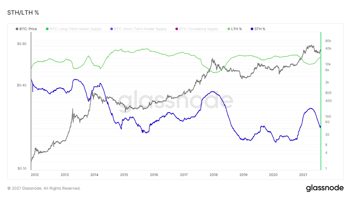
Share of supply held by short-term (blue curve) and long-term (green curve) owners
Further on the program I have prepared a coefficientDormancy Flow by David Puell. It reflects the current market capitalization divided by the average annual coin downtime value (in USD). Dormancy is Coin Days Destroyed adjusted for users. The chart below shows that whenever (and March 2020 also counts), when the Dormancy Flow ratio dropped into the green area, this signaled a bottom formation at the macro level. We just bounced off this green rectangle: this is almost a complete reload of the metric.
The Dormancy Flow chart also showsa kind of downtrend. This is a consequence of a decrease in volume, which causes fewer coin-days to be destroyed, but also indicates, on average, a small age of the coins being sold. So, again, this indicates that new market entrants were selling while long-term investors were accumulating BTC.
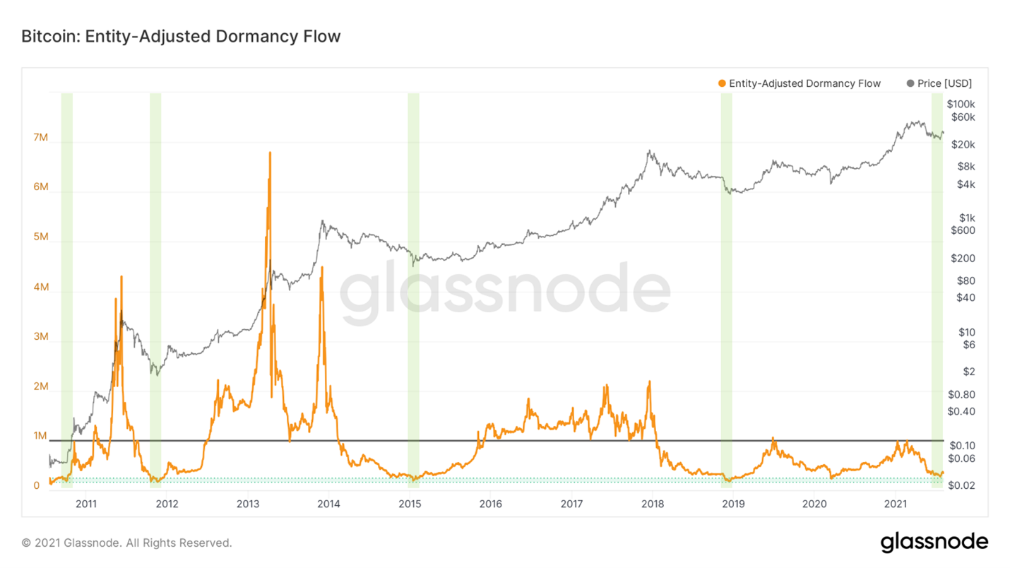
User-adjusted Dormancy Flow Ratio
Next up is aSOPR, or SOPR,adjusted by the age of the outputs (outputs younger than 1 hour are filtered out here to reduce the noise in the metric). This indicator reflects the profit margin held by coins traded on the market. In the last review, I noted a break above 1, into the net profit area, but mentioned that it would be desirable to stabilize above this level or push off from it if the price declines. This past week we got a slight price cut after the first close to $42k where aSOPR actually bounced off level 1 as we wanted. Now, to confirm the positive trend, it would be desirable to see some stabilization above 1.
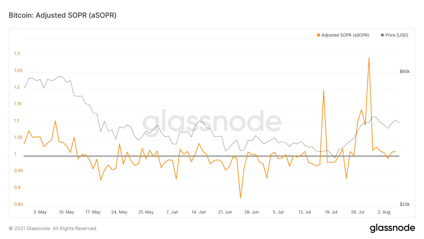
aSOPR
As far as the position of miners is concerned, nothing has changed here: the general trend towards accumulation is still valid and is even increasing slightly.
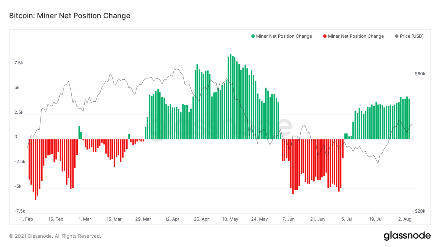
Change in net position of miners
The biggest bearish argument regardingBitcoin from the point of view of on-chain analysis is a significant reduction in on-chain activity. The market is still unable to get out of its deep rut in terms of mempool occupancy, number of transactions, active addresses, etc. I would like to see a recovery in these indicators, which I personally view as lagging indicators in relation to price. Indeed, if the BTC price breaks through to the target levels outlined above, it would be desirable for this momentum to be accompanied by some growth in on-chain activity metrics.
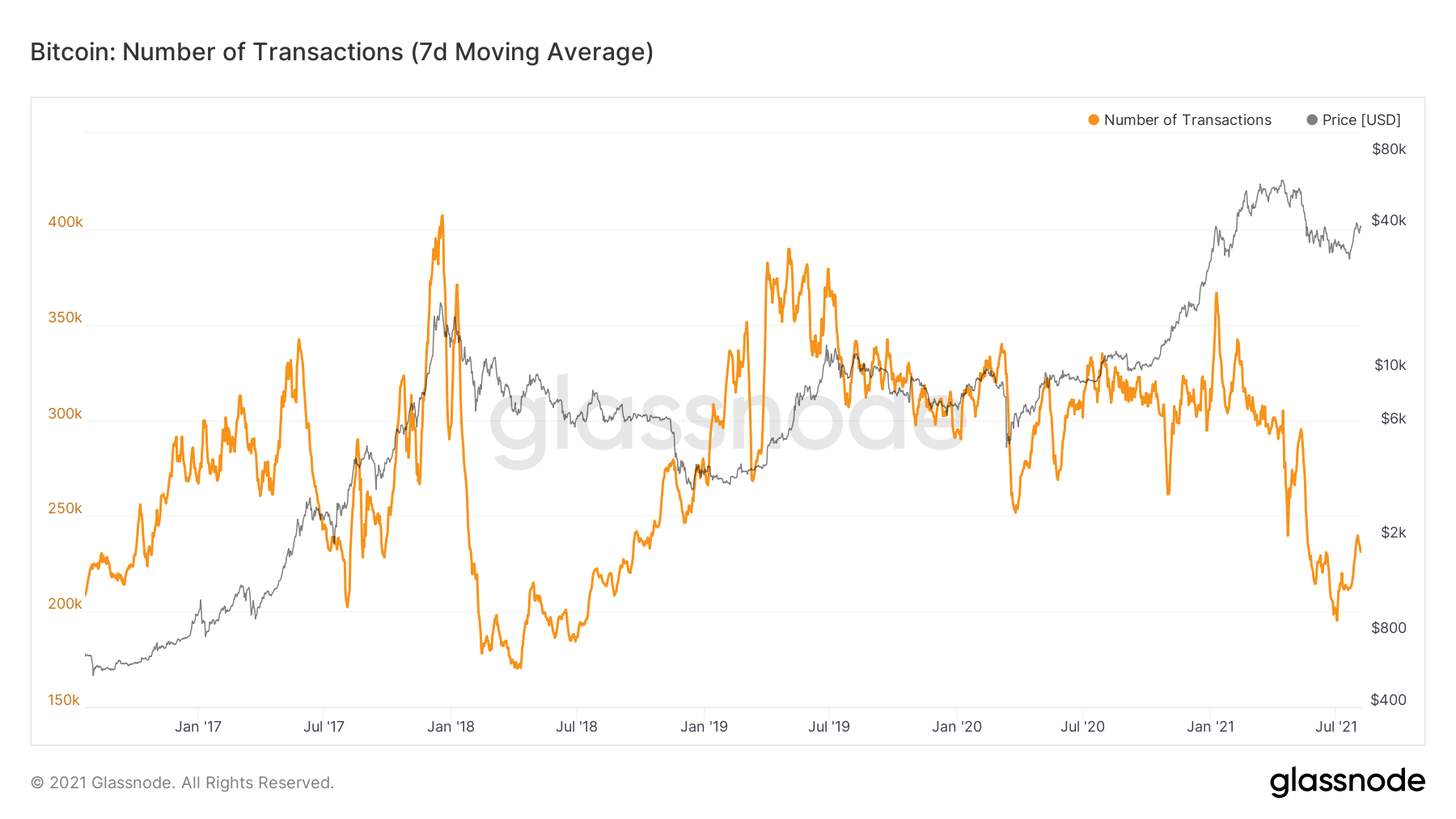
Number of on-chain transactions (7-day MA)
That's all for me. Have a great weekend everyone and good luck!
The article does not contain investment recommendations,all the opinions expressed express exclusively the personal opinions of the author and the respondents. Any activity related to investing and trading in the markets carries risks. Make your own decisions responsibly and independently.
</p>
Read this:
 The Calm Before the Storm - Onchain Pulse from July 17, 2021
 Onchain Pulse | May 11, 2021
 Approaching Pain Threshold: On-Chain Pulse | June 1, 2021
 Strong Hands Accumulate BTC Aggressively - Onchain Pulse from June 26, 2021
 Sentence Compression Continues - Onchain Pulse from July 31, 2021
 Signs of Squeezing Supply - Onchain Pulse from July 24, 2021